Chapter 2. Forms

- Patterns
Sign In, Registration, Registration with Personalization, Checkout, Calculator, Search Form, Multi-Step, Long Form
Most web applications rely extensively on forms for data entry and configuration. And although we have compelling research and design strategies for effective form design, there are still horrible forms all over the Web. We do our best to muddle through them to set up online accounts, buy merchandise, submit applications, answer surveys, and the like.

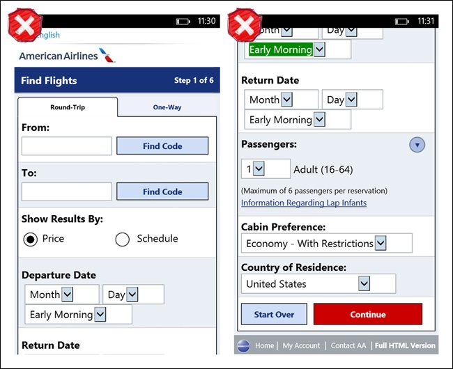
Figure 2-1. American Airlines flight booking on Windows Phone: poor form design
Sometimes we succeed, but often we donât. Form abandonment (users who fail to complete and submit forms before giving up) is an enormous and costly problem. But compared to mobile, the Web is pretty forgiving, because mobile formsârendered on devices that have small screen sizes and restricted user inputâgive you, the designer, virtually no leeway for bad design.
So before you design any mobile forms, I highly recommend brushing up on form basics with these resources:
Web Form Design: Filling in the Blanks (http://amzn.to/1g364lv) by Luke Wroblewski (Rosenfeld Media, 2011)
Forms on Mobile Devices: Modern Solutions (http://bit.ly/1g369pc) by Luke Wroblewski
Better Mobile Form Design (http://bit.ly/1g36zvV) by Luke Wroblewski ...
Get Mobile Design Pattern Gallery, 2nd Edition now with the O’Reilly learning platform.
O’Reilly members experience books, live events, courses curated by job role, and more from O’Reilly and nearly 200 top publishers.

