Chapter 4. Feedback

A 56-year-old man punched his fist through the glass and into the electronics of the machine. “Yes, I broke the machine and I’d do it again,” he told the security guards. (He was sentenced to 90 days in jail.) Another man, 59-year-old Douglas Batiste, was also arrested for assaulting a machine—by urinating on it. A woman caused $1,800 in damages to another machine by slapping it three times.[24] And 67-year-old Albert Lee Clark, after complaining to an employee and getting no satisfaction, went to his car and got his gun. He came back inside and shot the machine several times.[25]
What device is causing so much rage? Slot machines.
Slot machines are a multi-billion-dollar business. Slot machines take in $7 out of every $10 spent on gambling. Collectively, the money they generate is in the tens of billions, far surpassing the revenue of other forms of entertainment, such as movies, video games, and even pornography.[26] The reason that slot machines—microinteraction devices for sure—work so well at taking money from people is because of the feedback they provide. Most (read: all) of this feedback is insidious, designed specifically to keep people playing for as long as possible.
If you are the statistical anomaly who has never seen or played a slot machine, they work like this: you put coins, bills, or (in newer machines) paper tickets with barcodes into the machine. Pushing a button, tapping the touchscreen, or pulling a lever (the trigger) causes three (or more) seemingly independent “tumblers” to spin. When they stop spinning after a few seconds, if they are aligned in particular ways (if the symbols are the same on all three tumblers, for example), the player is a winner and money drops out of the slot machine. A committed player can do a few hundred (!) spins in an hour.
What really happens is that the rules are rigged in the slot machine’s favor; statistically, the slot machine will never pay out more than 90%, so the tumblers never “randomly” do anything, although the feedback makes it seem that way. If the tumblers actually worked the way they appear to work, the payback percentage would be 185% to 297%—obviously an undesirable outcome for casino owners. The outcome is “random but weighted.” Blank spaces and low-paying symbols appear more frequently than jackpot symbols—that is, less frequently than they would if the tumbler were actually (instead of just seemingly) random. Thanks to the feedback they get, players have no idea what the actual weighting is; an identical model can be weighted differently than the machine next to it. Since modern slot machines are networked devices, the weighting can even be adjusted from afar, on the fly.[27]
No matter how players trigger the tumblers—by pulling the lever harder, for example—players cannot influence or change the outcome. Some slot machines also have a stop button to stop the tumbler “manually” while they spin. This too doesn’t affect the outcome; it only provides an illusion of control.[28]
Not only are the tumblers weighted to prevent winning, but they are designed to incite what gambling researcher Kevin Harrigan calls the Aww Shucks Effect by frequently halting on a “near win,” or a failure that’s close to a success (see Figure 4-1). For example, the first two tumblers show the same symbol, but the third is blank. These near wins occur 12 times more often than they would by chance alone. Research has shown that near wins make people want to gamble more by activating the parts of the brain that are associated by wins—even though they didn’t win![29]

When a player does win, the win is usually small, although the feedback is disproportionate to the winning, so that players think they’ve won big. Lights flash, sounds play. And the sounds! In the New York Times profile of slot machine designer Joe Kaminkow, it notes:
Before Kaminkow’s arrival, [slot machine manufacturer] I.G.T.’s games weren’t quiet—hardly—but they didn’t take full advantage of the power of special effects like “smart sounds”—bright bursts of music. So Kaminkow decreed that every action, every spin of the wheel, every outcome, would have its own unique sound. The typical slot machine featured maybe 15 “sound events” when Kaminkow first arrived at I.G.T. [in 1999]; now that average is closer to 400. And the deeper a player gets into a game, the quicker and usually louder the music.[30]
The slot machine microinteraction is so addictive because it provides, via feedback, intermittent reinforcement of behavior. Slot machine players keep performing the same behavior until they are eventually rewarded. With slot machines, if payout was predictable—if the player won every other time, for example—players would quickly get bored or annoyed. What keeps people playing is the very unpredictability of the payouts, plus the promise that very rarely there will be a big jackpot. In general, this is not the kind of reinforcement you want for most microinteractions, where you want consistent feedback with positive reinforcement (via feedback) of desirable behavior. Predictability is desirable.
Slot machines teach us that feedback is extremely powerful and can make or break a microinteraction. Visuals and sound combine to make an engaging experience out of what could be a repetitive, dull activity of pulling a lever over and over. Obviously, they do this to their mind-blowingly lucrative benefit and you certainly don’t want every microinteraction being like a flashing, noisy slot machine, but the lesson is the same: feedback provides the character, the personality, of the microinteraction.
Feedback Illuminates the Rules
Unlike slot machines, which are designed to deliberately obscure the rules, with microinteractions the true purpose of feedback is to help users understand how the rules of the microinteraction work. If a user pushes a button, something should happen that indicates two things: that the button has been pushed, and what has happened as a result of that button being pushed. Slot machines will certainly tell you the first half (that the lever was pulled), just not the second half (what is happening behind the scenes) because if they did, people probably wouldn’t play—or at least not as much. But since feedback doesn’t have to tell users how the microinteraction actually works—what the rules actually are—the feedback should be just enough for users to make a working mental model of the microinteraction. Along with the affordances of the trigger, feedback should let users know what they can and cannot do with the microinteraction.
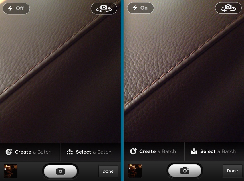
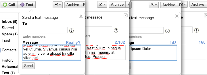
One caveat: you can have legitimate, nondeceitful reasons for not wanting users to know how the rules work; for example, users may not need to know every time a sensor is triggered or every time the device goes out to fetch data, only if something significant changes. For example, you don’t often need to know when there is no new email message, only when there is a new one. The first principle of feedback for microinteractions is to not overburden users with feedback. Ask: what is the least amount of feedback that can be delivered to convey what is going on (Figures 4-2 and 4-3)?
Feedback should be driven by need: what does the user need to know and when (how often)? Then it is up to the designer to determine what format that feedback should take: visual, audible, or haptic, or some combination thereof.


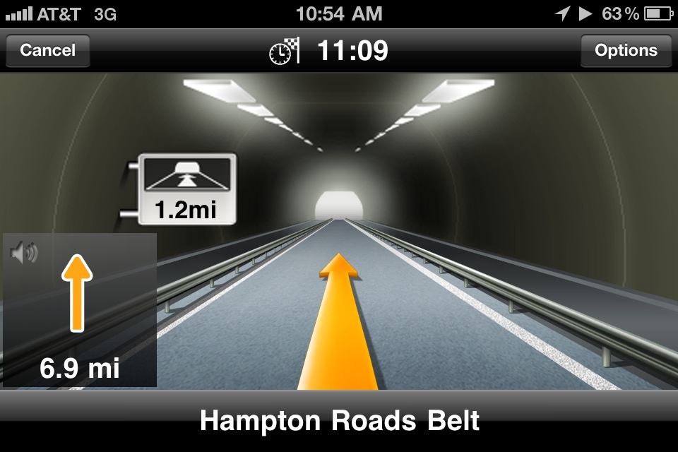
Immediately after a manual trigger or following/during a manual adjustment of a rule. All user-initiated actions should be accompanied by a system acknowledgment (see Figure 4-6). Pushing a button should indicate what happened.
On any system-initiated triggers in which the state of the microinteraction (or the surrounding feature) has changed significantly. The significance will vary by context and will have to be determined on a case-by-case basis by the designer. Some microinteractions will (and should) run in the background. An example is an email client checking to see if there are new messages. Users might not need to know every time it checks, but will want to know when there are new messages.
Whenever a user reaches the edge (or beyond) of a rule. This would be the case of an error about to occur. Ideally, this state would never occur, but it’s sometimes necessary, such as when a user enters a wrong value (e.g., a password) into a field. Another example is reaching the bottom of a scrolling list when there are no more items to display.
Whenever the system cannot execute a command. For instance, if the microinteraction cannot send a message because the device is offline. One caveat to this is that multiple attempts to execute the command could occur before the feedback that something is amiss. It might take several tries to connect to a network, for example, and knowing this, you might wait to show an error message until after several attempts have been made.
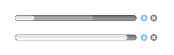
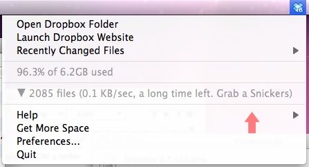
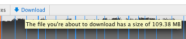
Showing progress on any critical process, particularly if that process will take a long time. If your microinteraction is about uploading or downloading, for example, it would be appropriate to estimate duration of the process (see Figure 4-7).
Feedback could occur:
At the beginning or end of a process. For example, after an item has finished downloading.
At the beginning or end of a mode or when switching between modes.
Always look for moments where the feedback can demystify what the microinteraction is doing; without feedback, the user will never understand the rules.
Feedback Is for Humans
While there is certainly machine-to-machine feedback, the feedback we’re most concerned with is communicating to the human beings using the product. For microinteractions, that message is usually one of the following:
Something has happened
You did something
A process has started
A process has ended
A process is ongoing
You can’t do that
Once you know what message you want to send, the only decisions remaining are how these messages manifest. The kind of feedback you can provide depends entirely upon the type of hardware the microinteraction is on. On a mobile phone, you might have visual, audible, and haptic feedback possible. On a piece of consumer electronics, feedback could only be visual, in the form of LEDs.


Let’s take a microinteraction appliance like a dishwasher as an example. The dishwasher process goes something like this: a user selects a setting, turns the dishwasher on, the dishwasher washes the dishes and stops. If someone opens the dishwasher midprocess, it complains. Now, if the dishwasher has a screen, each of these actions could be accompanied by a message on the screen (“Washing Dishes. 20 minutes until complete.”). If there is no screen, there might be only LEDs and sounds to convey these messages. One option might be that an LED blinks while the dishwasher is running, and a chime sounds when the washing cycle is completed.
Text (written) feedback is not always an option (for example, if there is no screen or simply no screen real estate). Once we move past actual words—and let’s not forget that a substantial portion of the planet’s population is illiterate: 793 million adults, according to the Central Intelligence Agency—we have to convey messages via other means: sound, iconography, images, light, and haptics. Since they are not text (and even words can be vague and slippery), they can be open to interpretation. What does that blinking LED mean? When the icon changes color, what is it trying to convey? Some feedback is clearly learned over time: when that icon lights up and I click it, I see there is a new message. The “penalty” for clicking (or acting on) any feedback that might be misinterpreted should be none. If I can’t guess that the blinking LED means the dishwasher is in use, opening the dishwasher shouldn’t spray me with scalding hot water. In fact, neurologically, errors improve performance; how humans learn is when our expectation doesn’t match the outcome.
The second principle of feedback is that the best feedback is never arbitrary: it always exists to convey a message that helps users, and there is a deep connection between the action causing the feedback and the feedback itself. Pressing a button to turn on a device and hearing a beep is practically meaningless, as there is no relationship between the trigger (pressing the button) or the resulting action (the device turning on) and the resulting sound. It would be much better to either have a click (the sound of a button being pushed) or some visual/sound cue of the device powering up, such as a note that increases in pitch. Arbitrary feedback makes it harder to connect actions to results, and thus harder for users to understand what is happening. The best microinteractions couple the trigger to the rule to the feedback, so that each feels like a “natural” extension of the other.
Less Is More
The more methods of feedback you use, the more intrusive the feedback is. An animation accompanied by a sound and a haptic buzz is far more attention getting than any of those alone. The third principle for microinteractions feedback is to convey the most with the least. Decide what message you wish to convey (“Downloading has begun”) then determine what is the least amount of feedback you could provide to convey that message. The more important the feedback is, the more prominent (and multichannel) it should be.
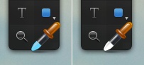
The fourth principle of feedback is to use the overlooked as a means of message delivery. Many microinteractions contain conventional parts of any interface—as they should. These overlooked parts of the UI—scrollbars, cursors, progress bars, tooltips/hovers, etc.—can be used for feedback delivery. This way, nothing that isn’t already there will get added to the screen, but it can communicate slightly more than is usual (Figure 4-13). For example, a cursor could change color to gray if the user is rolling over an inactive button.
Feedback as a Personality-Delivery Mechanism
Unlike the more utilitarian trigger and any controls for the rules, feedback can be a means of creating a personality for your microinteraction—and for your product as a whole. Feedback can be the moment to inject a little edge or a touch of humor into your microinteraction (see Figures 4-14 and 4-15).
The reason you’d want to do that is that, as pointed out previously, feedback is for humans. We respond well to human responses to situations, even from machines. Humans anthropomorphize our products already, attributing them motivations and characteristics that they do not possess. Your laptop didn’t deliberately crash and your phone isn’t mad at you. Designers can use this human tendency to our advantage by deliberately adding personality to products. This works particularly well for microinteractions; because of their brevity, moments of personality are more likely to be endearing, not intrusive or annoying.
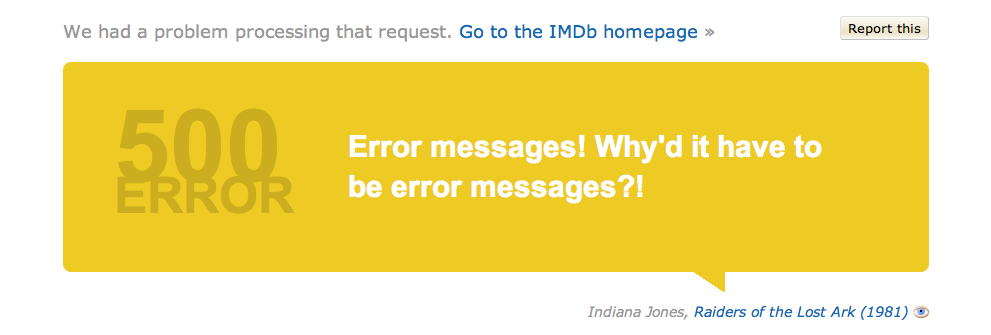
Take Apple’s natural-language software agent Siri, for example. Siri easily could have been extremely utilitarian, and indeed, for most answers, “she”—it—is. But for questions with ambiguous or no possible factual responses like “What is the meaning of life?” Siri offers up responses such as “I don’t know. But I think there’s an app for that.” In other words, what could have been potentially an error message (“I’m sorry. I can’t answer that.”) became something humorous and engaging. Indeed, errors or moments that could be frustrating for users such as a long download are the perfect place to show personality to relieve tension (see Figure 4-16).
Feedback with personality can, of course, be annoying if not done well or overdone. You probably don’t want the login microinteraction giving you attitude every time you want to log in. And you might not want an app to chastise you if you forget your password: “Forgot your password again? FAIL!” What you should strive for is a veneer of personality. In the same way that being too human is creepy for robots—the so-called “uncanny valley”[31]—so too is too much personality detrimental for microinteractions. A little personality goes a long way (Figure 4-17). Making them too human-like not only sets expectations high—users will assume the microinteraction is smarter than it probably is—but can also come across as tone-deaf, creepy, or obnoxious.
Speaking of creepy, while you want to collect and use behavioral data (and be transparent about what data you’re collecting) to improve (or create) the microinteraction over time, being obvious (providing feedback) about collecting that data is a fast way to appear intrusive and predatory. You want people to be delighted with the personalization that data collection can provide, without being disgusted that data collection is going on.
Feedback Methods
We experience feedback through our five senses, but mostly through the three main ways we’ll examine here: sight, hearing, and touch.
Visual
Let’s face it: most feedback is visual. There’s a reason for that, of course, in that we’re often looking directly at what we’re interacting with, so it is logical to make the feedback visual. Visual feedback can take many forms, from the blinking cursor that indicates where text should go, to text on a screen, to a glowing LED, to a transition between screens.
Unless no screen or LED is available, assume that your default feedback is visual. Almost every user-initiated action (with the exception of actions users cannot do, such as clicking where there is no target) should be accompanied by visual feedback. With system-initiated triggers and rules, only some should have accompanying visual feedback—namely those that would require human intervention (e.g., an error indicator) or those that provide information a user may want to act upon (e.g., a badge indicating a new voicemail has arrived). Ask what the user needs to see to make a decision, then show that in as subtle a way as possible. Often what the user needs to be aware of is resources: time, effort, unread messages, etc.
Don’t show redundant visual feedback. For instance, never have a tooltip that mirrors the button label. Any visual feedback must add to clarity, not to clutter. Similarly, don’t overdo a visual effect; the more frequent the feedback is, the less intrusive it should be. Don’t make something blink unless it must be paid attention to.
Visual feedback should also ideally occur near or at the point of user input. Don’t have an error message appear at the top of the screen when the Submit button is on the bottom. As noted in Chapter 2, when we’re attentive to something, our field of vision narrows. Anything outside of that field of vision can be overlooked. If you need to place visual feedback away from the locus of attention, adding movement to it (e.g., having it fade in) can draw attention to it.
Animation
Our brains respond powerfully to movement, so use animation sparingly. If you can do without animation, avoid it. Your microinteraction will be faster and less cognitively challenging without it. That being said, tiny, brief animations can add interest and convey meaning if done well (Figure 4-22).
The most important part of animation in microinteractions is that it indicates—accurately—a behavioral model of how the microinteraction works. Don’t have a panel slide in from the left if it isn’t going to slide out to the right, or if the user accesses it by swiping down. Animation for animation’s sake is deadly. The best animations communicate something to the user: about the structure of the microinteraction, what to look at, what process is happening, etc.
Google’s Android engineers Chet Haase and Romain Guy have devised a set of UI characteristics for animation. Animations should be:
- Fast
Do not delay the activity
- Smooth
Stuttering or choppy movements ruin the effect and make the microinteraction seem broken
- Natural
They seemingly obey natural laws, such as gravity and inertia
- Simple
Meaningful, understandable
- Purposeful
Not just as eye candy
On this last point, designer and engineer Bill Scott outlines the reasons for using animation:[32]
Maintaining context while changing views. Scrolling a list or a flipping through a carousel allows you see the previous and next items.
Explaining what just happened. That poof of smoke means the item was deleted.
Showing relationships between objects. For example, animating one item going into another at the end of a drag-and-drop.
Focusing attention. As an item changes value, an animation can make that change more obvious.
Improving perceived performance. Progress bars don’t decrease the time needed for a download to happen, but they do make the time seem less grating.
Creating an illusion of virtual space. How (and where) panels slide in and out, for example. Transitions can be an important part of microinteraction animations as users move from one state to another, or from one mode to another. Transitions help give a sense of location and navigation, letting users know where they are and where they are going to.
Encouraging deeper engagement. Interesting animations invite interaction.
Scott has a valuable rule for animation timing: make any animation half as long as you think it should be. And then possibly halve the timing again (as detailed in Designing Web Interfaces, O’Reilly). Animation should make the microinteraction more efficient (by illuminating the mental model or providing a means of directing attention) or at least seem more efficient, not less.
Messages
Designer Catriona Cornett tells of her experience updating the in-car Ford SYNC system. After putting the update on a USB drive to plug in to the car, she read these instructions:
“Follow your printed out instructions exactly with your vehicle running. Approximately 60 seconds after you begin the installation, you will hear an ‘Installation Complete’ message. DO NOT REMOVE your USB drive or turn off your vehicle. You must wait an additional 4–18 minutes until you hear a second ‘Installation Complete’ message before you can remove your USB drive.”
OK, so, even though it will give me a message saying it’s complete, it’s really not, and if I didn’t read this little note about the process, it makes it sound like I could cause some form of irreversible damage. Great.[33]
“Installation Complete” is clear enough as a message, in the above described case, unfortunately it’s misleading. Any messages delivered as feedback to an action should—at a minimum—be accurate. As with instructional copy, any text as feedback should be short and clear. Avoid words like “error” and “warning” that provide no information and serve to only increase anxiety. Feedback text for any error messages should not only indicate what the error was, but also how to correct it. Ideally, it would even provide a mechanism for correcting the error alongside the message. For example, don’t tell a user only that an entered password is wrong, provide the form field to re-enter it and/or a means of retrieving it.
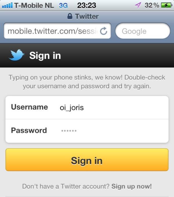
While any text should be direct (and human), it’s best to avoid using personal pronouns such as “you.” “You entered the wrong password” is far more accusatory and off-putting than “Password incorrect.” Likewise, avoid using “I,” “me,” or “my,” as these are the uncanny valley of feedback copy. Although they can have human-like responses, microinteractions aren’t human. Some voice interfaces like Siri can get away with using first-person pronouns, but in written form it can be jarring.
The ideal microinteraction text is measured in words, not lines, and certainly not paragraphs or even a single paragraph (Figure 4-25). Keep copy short and choose verbs carefully, focusing on actions that could or need to be taken: “Re-enter your password.”

Audio
As noted in Chapter 2, sound can be a powerful cue that arrives quickly in our brains—more quickly than visual feedback. We’re wired to respond to sound (and, as noted above, movement). Since it provides such a strong reaction, audio should be used sparingly. However, audio can be particularly useful on devices with no screens, or as part of microinteractions that work in the background when the user isn’t fully paying attention to them. It can also be useful in situations where looking at a screen can be unsafe, such as while driving.
In general, there are two ways to use audible feedback: for emphasis and for alerts. Audio for emphasis is typically for reinforcing a user-initiated action, as a confirmation that what the user thought happened actually did. Clicking a button and hearing a click is an example. These are often combined with visual feedback, and audio combined with visuals has been shown to be more effective than visuals alone.[34] The other kind of audio feedback—alerts—are typically indicators of system-initiated actions: a process has ended, a condition has changed, or something is wrong. A voice telling you to turn left in a navigation app is an example of an audio alert.
Any audio cue for a microinteraction should pass the Foghorn Test: is this action important enough that users would want to become aware of it when they cannot see it? Even if you think the answer is yes, you should possibly provide a mechanism to turn the sound off.
Like other feedback, audio can be adjusted if there is an understanding of the context of use. Some HTC phones buzz and ring loudly in their user’s pockets or purses (the phone knows it is there via sensor data) and diminish in volume as the user removes them. Some automobiles increase the volume of music to compensate as the engine gets louder. Similarly, if the user isn’t in the room with a device (detected via a proximity sensor) or the noise in the room is loud (detected by a microphone), volume and pitch could increase. And sound cues could also turn on (or increase in volume) if the device knows you are in a situation where visual cues are compromised, such as while driving (detected via GPS).
Sound designer Karen Kaushansky also cautions designers to consider the “non-use-case” when designing audio: when does audio not make sense? Broadcasting a sound—particularly voices—into an empty room in the middle of the night can be both startling and annoying.[35]
Earcons
There are two kinds of audio feedback: earcons and words. Earcons—a play on the word “icons” (“eye-cons”)—are short, distinct sounds meant to convey information.[36] The amount of information that earcons can convey is limited, however, and sometimes words are necessary. Words are recorded (spoken) or computer-generated text. Words are particularly useful for instructions or directions, although if your product has to be in many languages, localization of the text could be nontrivial. Speech is also much slower than earcons; what can be conveyed in a fraction of a second with an earcon could take several seconds in speech—a ping versus “You’ve got mail!”
Earcons are, by their very nature, abstract, so care should be taken to select a sound that could indicate the message being conveyed. For microinteractions, the best earcons are those that users (consciously or unconsciously) can relate to other sounds they have heard and make associations. For example, the click of a latch closing can be the earcon for the microinteraction ending, or an upward whoosh can accompany an item moving to the top of a list. Avoid earcons that are too shrill (except for critical warnings) or too soft (“Did I just hear that?”). As with animation, the best earcons are brief: under one second in duration, and usually a fraction of a second. One exception is an ambient sound to indicate an ongoing process, such as a drone to indicate a file being synced.
Any earcon should also match the emotional content being conveyed. Is the feedback urgent or just utilitarian? A warning or an announcement? The qualities of the earcon (timbre, pitch, duration, volume) should match what is being communicated.
If you want your earcon to be iconic and memorable (a Signature Sound), it should contain two to four pitches (notes) played in succession.[37] As you don’t necessarily want your microinteraction to be memorable, this trick should be used only once per microinteraction, if at all. Most microinteraction earcons should be a single-pitch sound, played once. Beware of playing any earcon in a loop, as even the softest, gentlest sound can be irritating played over and over and over.
Earcons should be unique to an action. Just as you want to avoid using the same visual feedback for different actions, you shouldn’t use the same—or even similar-sounding—earcons for dissimilar events. This is especially true for alert sounds that could be triggered independent of user actions. If the user is looking away from (or isn’t close to) the device, the user won’t be sure of which action just happened.
Speech
If you’re going to use words as audio feedback, keep the spoken message brief and clear. If there is a prompt for a response, make the choices clear, short, and few. Ideally with microinteractions, any voice responses would be “Yes” or “No,” or at worst a single word. As noted in Chapter 3, microinteractions are the place for smart defaults, not multiple choice. Any word prompt should be at the end of the message. Use “To turn sound off, say yes” instead of “Say yes to turn sound off.” Always end with the action.
With speech, your choice is to use actors to record the messages, or to use text-to-speech (TTS). Recorded messages have the advantage of feeling more human and can have more texture and nuance, although care has to be taken to make sure the actors convey the right message and tone via their inflections and pauses. The minus is that any time you change the message, it has to be rerecorded.
If the messages are dynamic (for example, turn-by-turn directions), TTS is probably your only option, as you would unlikely be able to record every street name. Although TTS has improved in recent years, it can still feel inhuman and impersonal, and some people actively dislike it, so use with care.
Haptics
Haptics, or as they are technically known, “vibrotactile feedback.” Haptics are vibrations, usually generated by tiny motors, which can create a strong, tactile buzz or more delicate tremors that can simulate texture on flat surfaces. Compared to the decades of visual and audio feedback, haptics is relatively new, with the majority of people only having experienced it with the advent of pagers and mobile phones.
Haptics, since they are mostly felt (although the vibration can make noise against a hard surface like a tabletop), are best utilized on devices the user will be in close proximity to (by holding, touching, wearing, or carrying), although they can also be embedded in objects like furniture to enhance entertainment like movies and games. Faces and hands (particularly fingertips) are the most sensitive to haptics, while legs and torso are much less so.
Even more than vision and hearing, our sense of touch (technically our cutaneous sense) is limited. Not by our skin, which is extensive (although of varying sensitivity to touch), but by our brains. There are four kinds of fibers known as mechanoreceptors that convey cutaneous sense, each of which can detect different frequencies. The different mechanoreceptors engage in crosstalk with each other, the result of which determines what we can feel—which, as it turns out, isn’t much. One researcher claims the amount of information we can get from touch is 1% that of hearing.[38] Most people can only easily detect three or four levels of vibration.[39] Thus, complex messages are not readily conveyed with haptics.
Luckily, complex messages are usually unnecessary with microinteractions. Haptics have three main uses for microinteraction feedback. The first is to enhance a physical action, such as by simulating the press of a button on a touchscreen, or by giving an added jolt when the ringer of your phone is turned off. The second (and currently most common) use of haptics is as an alert when audio isn’t available or is undesirable. The vehicle-initiated vibration of the steering wheel to wake a sleepy driver is an example of this use. The third (and thus far rarest) use is to create an artificial texture or friction on surfaces such as touchscreens. This can be used to slow down scrolling, for instance.
Because of humans’ limited ability to detect differences in haptics, they are currently best used in microinteractions for either subtle, ambient communication or for a disruptive alert. There’s very little middle ground, except perhaps in specialty devices, like those for musicians and surgeons, where varying levels of haptics can provide more physical feedback while doing an action like making music or performing surgery.
Feedback Rules
Feedback can also have its own set of rules that dictate its instantiation. Feedback rules define:
- Contextual Changes
Does the feedback change based on the known context? For instance, if it is night, does the volume increase? Decrease?
- Duration
How long does the feedback last? What dismisses it?
- Intensity
How bright/fast/loud/vibrating is the effect? Is it ambient or noticeable? Does the intensity grow in time, or remain constant?
- Repetition
Does the feedback repeat? How often? Does the effect remain forever, or just for a few seconds?

These rules can determine much of the character of the feedback.
If you don’t want your users feeling cheated and putting their fists through the screen as they do with slot machines, look to your feedback. Make the rules understandable, and inform them of changes in state when appropriate. Make the feedback consistent, rewarding positive behavior.
Sometimes it’s not just a piece of feedback that repeats, it’s the whole microinteraction. In Chapter 5, next, we’ll discuss how to use loops and modes to extend your microinteraction.
Summary
Understand what information the user needs to know and when. All feedback relies on this understanding.
Feedback is for understanding the rules of the microinteraction. Figure out which rules deserve feedback.
Determine what message you want to convey with feedback, then select the correct channel(s) for that message.
Look at context and see if the feedback can (or should) be altered by it.
Be human. Feedback can use a veneer of humanity to provide personality to the microinteraction.
Use preexisting UI elements to convey feedback messages. Add to what is already there if you can before adding another element.
Don’t make feedback arbitrary. Link the feedback to the control and/or the resulting behavior.
Whenever possible, have visual feedback for every user-initiated action. Add sound and haptics for emphasis and alerts.
[24] Nir, Sarah Maslin, “Failing to Hit Jackpot, and Hitting Machine Instead,” The New York Times, July 13, 2012.
[25] “Man charged with shooting slot machine,” Associated Press, February 13, 2012.
[26] Rivlin, Gary, “The Tug of the Newfangled Slot Machines,” The New York Times, May 9, 2004.
[27] Richtel, Matt, “From the Back Office, a Casino Can Change the Slot Machine in Seconds,” The New York Times, April 12, 2006.
[28] All from Kevin Harrigan’s “The Design of Slot Machine Games,” 2009.
[29] Clark, L, Laurence, A., Astley-Jones, F., Gray, N., “Gambling near-misses enhance motivation to gamble and recruit brain-related circuitry,” Neuron 61, 2009.
[30] Rivlin, Gary, “The Tug of the Newfangled Slot Machines.” The New York Times.
[31] For a more complete definition and analysis of the uncanny valley, see “The Truth About Robotic’s Uncanny Valley: Human-Like Robots and the Uncanny Valley,” Popular Mechanics. January 20, 2010.
[32] “Anti-Pattern: Animation Gone Wild - Borders.com,” July 16, 2008.
[33] “UX principles in action: Feedback systems and Ford SYNC”, July 11, 2011.
[34] Brown, Newsome, and Glinert, “An experiment into the use of auditory cues to reduce visual workload,” 1989.
[35] See “Guidelines for Designing with Audio,” Smashing Magazine.
[36] Blattner, Meera M., Sumikawa, Denise A., and Greenberg, Robert M., “Earcons and Icons: Their Structure and Common Design Principles,” Journal of Human-Computer Interaction, Volume 4, Issue 1, 1989.
[37] See previous footnote, and Kerman, Joseph, Listen, Bedford/St. Martin’s, 1980.
[38] R. T. Verrillo, A. J. Fraioli, and R. L. Smith, “Sensation magnitude of vibrotactile stimuli,” Perception & Psychophysics, vol. 6, pp. 366–372, 1969.
[39] Gill, John, “Guidelines for the design of accessible information and communication technology systems”. Royal Institute of the Blind, 2004, and F. A. Geldard and C. E. Sherrick, “Princeton cutaneous research project, report no. 38,” Princeton University, Princeton, NJ, 1974.
Get Microinteractions: Full Color Edition now with the O’Reilly learning platform.
O’Reilly members experience books, live events, courses curated by job role, and more from O’Reilly and nearly 200 top publishers.

