The
highlight rectangle is normally displayed with a thickness of 2
pixels.[3] This can
be changed using the -highlightthicknessoption:
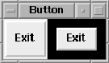
-highlightthickness => amountThe amount specified is any valid screen distance. In Figure 4-38, the Exit Button on the right has a
-highlightthickness of 10 and has the focus.
When the Button doesn’t have the keyboard focus, a small space
is left around it. If this extra space bothers you, you can set
-highlightthickness to 0 and the space won’t
display, even if that widget has the focus. It is bad style to set
the -highlightthickness to 0 without setting
-takefocus to 0.
The color of
the highlight rectangle can also be changed. There are two values for
this: the color of the highlight rectangle when the Button does not
have the focus and the color of the highlight rectangle when it does
have the focus. The option -highlightcolor is the
color of the highlight rectangle when the Button does have focus:
-highlightcolor => color
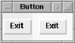
Figure 4-39 shows the right Button with the focus
and with -highlightcolor set to
'yellow'. Compare it to Figure 4-38 to see the difference.
To change
the color of the space left around the Button when it doesn’t
have the focus, use the option
-highlightbackground:
-highlightbackground => colorNormally, the highlight rectangle is the same color as the background of the window, which allows it to blend in with the background of the window or Frame that contains the Button.
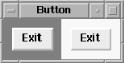
Figure 4-40 shows an example where both Buttons have the following configuration:
-highlightcolor => 'blue', -highlightbackground => 'yellow'
The left Button has the focus.
Get Mastering Perl/Tk now with the O’Reilly learning platform.
O’Reilly members experience books, live events, courses curated by job role, and more from O’Reilly and nearly 200 top publishers.

