The
simplest way to replace the text on your Button with an image is to
use a bitmap.[1] The image will take the
place of the text; you can’t display both at the same time. The
-bitmap option takes a string that specifies which
bitmap to use:
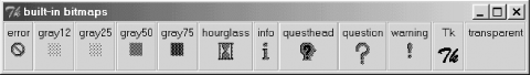
-bitmap => 'bitmapname'There are several built-in bitmaps: error,
gray12, gray25,
gray50, gray75,
hourglass, info,
questhead, question,
warning, Tk, and
transparent. Figure 4-7 shows
all the built-in bitmaps. To more easily show you the bitmaps, Figure 4-7 was grabbed from the
widget demonstration program.
Using -bitmap for a
Label is exactly the same as for a Button. You’ll notice that
the Tk bitmap is the same as that used in the
upper-left corner of the application. Here are some examples using
-bitmap when creating a Button:
$mw->Button(-bitmap => 'error', -command => \&handle_error)->pack;
To specify a bitmap from a
file, you need to put an @ in front of the path:
$mw->Button(-bitmap => '@/usr/nwalsh/mybitmap',
             -command => sub { exit })->pack;
Note that if you use
double quotes, you have to escape the @ with a
backslash (e.g., "\@/usr/nwalsh/mybitmap").
If you don’t want to use a bitmap,
or have a different format of file (such as a GIF), you can use the
-image option. First create an image pointer and
then use the -image option to display the image.
To create an image pointer, use the Photo method
to point to the image file, supplying the full pathname if the file
is not in the current directory. Then pass the image pointer as a
value to the -image option:
$image = $mw->Photo(-file => "bigredbutton.gif");
$mw->Button(-text => 'Exit', -command => sub { exit },
            -image => $image)->pack;
When using an image, only the image will
be displayed, because Buttons can display either a text string or an
image, not both. (In other words, -image will
always override -text.) To display a bitmap using
-image, use the Bitmap method
to create an image pointer.
Images are covered in extensive detail in Chapter 17. Figure 4-8 shows an example of a Button with a GIF file on it.

You can also use the
-bitmap option with Checkbuttons and Radiobuttons.
The bitmap will replace the text just as it does with a Button, and
the indicator will remain showing. To display a different type of
image (such as GIF), use the -image option. To
display a different image when the Checkbutton or Radiobutton is
selected, use the -image and
-selectimage options. Both
-image and -selectimage take an
image pointer created with the Photo method.
# Create Photo objects with gif files
$folder = $mw->Photo(-file => "folder.gif");
$openfolder = $mw->Photo(-file => 'openfolder.gif');

$leftframe->Checkbutton(-image => $folder,
	-selectimage => $openfolder)->pack(-expand => 1);
$leftframe->Checkbutton(-image => $folder,
	-selectimage => $openfolder)->pack(-expand => 1);

# Create Bitmap objects with bitmap files
$bmpopen = $mw->Bitmap(-file => 'openfolder.xbm');
$bmpfolder = $mw->Bitmap(-file => 'folder.xbm');
$rightframe->Radiobutton(-image => $bmpfolder,
	-selectimage => $bmpopen, -variable => \$vvv,
	-value => 1)->pack(-expand => 1);
$rightframe->Radiobutton(-image => $bmpfolder,
	-selectimage => $bmpopen, -variable => \$vvv,
	-value => 2)->pack(-expand => 1);
Figure 4-9 shows the resulting window.
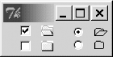
You’ll notice in this example
that in addition to the image changing when you click on the
Checkbutton, there’s also a selection indicator. If this seems
redundant, that’s because it is: the selection indicator is
unnecessary when using -selectimage, and
you’re better off using -indicatoron
=> 0 to disable the
indicator. Figure 4-10 shows the resulting images.
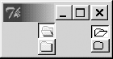
Both Checkbuttons and Radiobuttons look much like Button widgets with
the indicators turned off, but their behavior is very different. In
Figure 4-10, the very top two widgets are selected
(just as in Figure 4-9). When selected, a
Checkbutton will stay down (a relief of 'sunken')
and when unselected it will be up (relief of
'raised'). The same is true of a Radiobutton with
no indicator, but selecting a Radiobutton will cause all other
Radiobuttons in that group to be deselected. Using
-relief with -indicatoron
=> 0 is pointless; it
won’t change the relief of the Button.
[1] In deference to our Win32 readers, a Tk bitmap file refers to an X11 XBM file, not a Win32 BMP formatted file. For complete details, please refer to Chapter 17.
Get Mastering Perl/Tk now with the O’Reilly learning platform.
O’Reilly members experience books, live events, courses curated by job role, and more from O’Reilly and nearly 200 top publishers.

