Chapter 9. Updates, Transitions, and Motion
Until this point, we have used only static datasets. But real-world data almost always changes over time. And you might want your visualization to reflect those changes.
In D3 terms, those changes are handled by updates. The visual adjustments are made pretty with transitions, which can employ motion for perceptual benefit.
We’ll start by generating a visualization with one dataset, and then changing the data completely.
Modernizing the Bar Chart
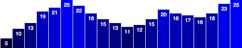
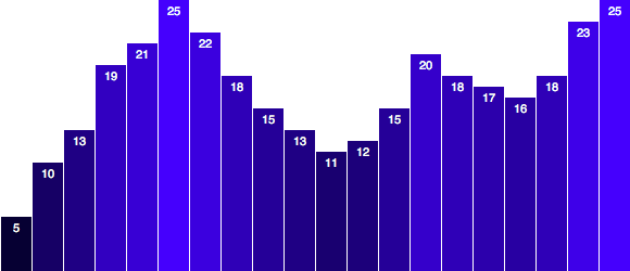
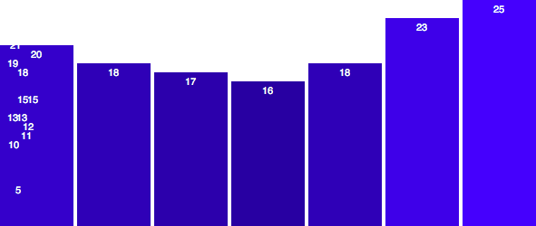
Let’s revisit our trusty old bar chart in Figure 9-1.
If you examine the code in 01_bar_chart.html, you’ll see that we used this static dataset:
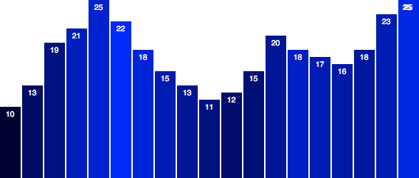
vardataset=[5,10,13,19,21,25,22,18,15,13,11,12,15,20,18,17,16,18,23,25];
Since then, we’ve learned how to write more flexible code, so our chart elements resize to accommodate different sized datasets (meaning shorter or longer arrays) and different data values (smaller or larger numbers). We accomplished that flexibility using D3 scales, so I’d like to start by bringing our bar chart up to speed.
Ready? Okay, just give me a sec…
Aaaaaand, done! Thanks for waiting.
Figure 9-2 looks pretty similar, but a lot has changed under the hood. You can follow along by opening up 02_bar_chart_with_scales.html.

To start, I adjusted the width and height, to make the chart taller and wider:
varw=600;varh=250;
Next, I introduced an ordinal scale to handle the left/right positioning of bars and labels along the x-axis:
varxScale=d3.scale.ordinal().domain(d3.range(dataset.length)).rangeRoundBands([0,w],0.05);
This may seem like gobbledegook, so I’ll walk through it one line at a time.
Ordinal Scales, Explained
First, in this line:
varxScale=d3.scale.ordinal()
we declare a new variable called xScale, just as we had done with our
scatterplot. Only here, instead of a linear scale, we create an
ordinal one. Ordinal scales are typically used for ordinal data,
typically categories with some inherent order to them, such as:
- freshman, sophomore, junior, senior
- grade B, grade A, grade AA
- strongly dislike, dislike, neutral, like, strongly like
We don’t have true ordinal data for use with this bar chart. Instead, we just want the bars to be drawn from left to right using the same order in which values occur in our dataset. D3’s ordinal scale is useful in this situation, when we have many visual elements (vertical bars) that are positioned in an arbitrary order (left to right), but must be evenly spaced. This will become clear in a moment.
.domain(d3.range(dataset.length))
This next line of code sets the input domain for the scale. Remember how
linear scales need a two-value array to set their domains, as in
[0, 100]? For a linear scale, that array would set the low and high
values of the domain. But ordinal domains are, well, ordinal, so they
don’t think in linear, quantitative terms. To set the domain of an
ordinal scale, you typically specify an array with the category names,
as in:
.domain(["freshman","sophomore","junior","senior"])
For our bar chart, we don’t have explicit categories, but we could
assign each data point or bar an ID value corresponding to its position
within the dataset array, as in 0, 1, 2, 3, and so on. So perhaps our
domain statement could read:
.domain([0,1,2,3,4,5,6,7,8,9,10,11,12,13,14,15,16,17,18,19])
It turns out there is a very simple way to quickly generate an array of
sequential numbers: the d3.range() method.
While viewing 02_bar_chart_with_scales.html, go ahead and open up the console, and type the following:
d3.range(10)
You should see the following output array:
[0, 1, 2, 3, 4, 5, 6, 7, 8, 9]
How nice is that? D3 saves you time once again (and the hassle of extra
for() loops).
Coming back to our code, it should now be clear what’s happening here:
.domain(d3.range(dataset.length))
-
dataset.length, in this case, is evaluted as20, because we have 20 items in our dataset. -
d3.range(20)is then evaluated, which returns this array:[0, 1, 2, 3, 4, 5, 6, 7, 8, 9, 10, 11, 12, 13, 14, 15, 16, 17, 18, 19]. -
Finally,
domain()sets the domain of our new ordinal scale to those values.
This might be somewhat confusing because we are using numbers (0, 1, 2…) as ordinal values, but ordinal values are typically nonnumeric.
Round Bands Are All the Range These Days
The great thing about d3.scale.ordinal() is it supports range
banding. Instead of returning a continuous range, as any quantitative
scale (like d3.scale.linear()) would, ordinal scales use discrete
ranges, meaning the output values are determined in advance, and could
be numeric or not.
We could use range() like everyone else, or we can be smooth and use
rangeBands(), which takes a low and high value, and automatically
divides it into even chunks or “bands,” based on the length of the
domain. For example:
.rangeBands([0,w])
this says “calculate even bands starting at 0 and ending at w, then set
this scale’s range to those bands.” In our case, we specified 20 values
in the domain, so D3 will calculate:
(w - 0) / xScale.domain().length
(600 - 0) / 20
600 / 20
30
In the end, each band will be 30 “wide.”
It is also possible to include a second parameter, which includes a bit
of spacing between each band. Here, I’ve used 0.2, meaning that 20 percent of
the width of each band will be used for spacing in between bands:
.rangeBands([0,w],0.2)
We can be even smoother and use rangeRoundBands(), which is the same
as rangeBands(), except that the output values are rounded to the
nearest whole pixel, so 12.3456 becomes just 12, for example. This is
helpful for keeping visual elements lined up precisely on the pixel
grid, for clean, sharp edges.
I’ll also decrease the amount of spacing to just 5 percent. So, our final line of code in that statement is:
.rangeRoundBands([0,w],0.05);
This gives us nice, clean pixel values, with a teensy bit of visual space between them.
Referencing the Ordinal Scale
Later in the code (and I recommend viewing the source), when we create
the rect elements, we set their horizontal, x-axis positions like so:
//Create barssvg.selectAll("rect").data(dataset).enter().append("rect").attr("x",function(d,i){returnxScale(i);// <-- Set x values})…
Note that, because we include d and i as parameters to the anonymous
function, D3 will automatically pass in the correct values. Of course,
d is the current datum, and i is its index value. So i will be
passed 0, 1, 2, 3, and so on.
Coincidentally (hmmm!), we used those same values (0, 1, 2, 3…) for our
ordinal scale’s input domain. So when we call xScale(i), xScale()
will look up the ordinal value i and return its associated output
(band) value. (You can verify all this for yourself in the console. Just
try typing xScale(0) or xScale(5).)
Even better, setting the widths of these bars just got a lot easier. Before using the ordinal scale, we had:
.attr("width",w/dataset.length-barPadding)
We don’t even need barPadding anymore because now the padding is built
into rangeRoundBands(). Setting the width of each rect needs only
this:
.attr("width",xScale.rangeBand())
Isn’t it nice when D3 does the math for you?
Updating Data
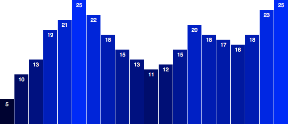
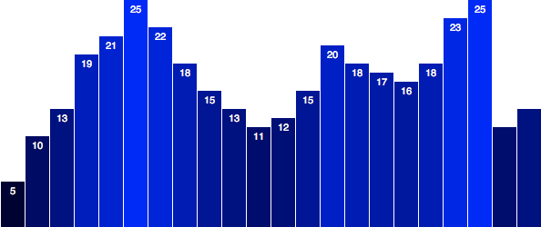
Okay, once again, we have the amazing bar chart shown in Figure 9-3, flexible enough to handle any data we can throw at it.
Or is it? Let’s see.
The simplest kind of update is when all data values are updated at the same time and the number of values stays the same.
The basic approach in this scenario is this:
- Modify the values in your dataset.
- Rebind the new values to the existing elements (thereby overwriting the original values).
- Set new attribute values as needed to update the visual display.
Before any of those steps can happen, though, some event needs to kick things off. So far, all of our code has executed immediately on page load. We could have our update run right after the initial drawing code, but it would happen imperceptibly fast. To make sure we can observe the change as it happens, we will separate our update code from everything else. We will need a “trigger,” something that happens after page load to apply the updates. How about a mouse click?
Interaction via Event Listeners
Any DOM element can be used, so rather than design a fancy button, I’ll
add a simple p paragraph to the HTML’s body:
<p>Click on this text to update the chart with new data values (once).</p>
Then, down at the end of our D3 code, let’s add the following:
d3.select("p").on("click",function(){//Do something on click});
This selects our new p, and then adds an event listener to that
element. Huh?
In JavaScript, events are happening all the time. Not exciting events,
like huge parties, but really insignificant events like mouseover and
click. Most of the time, these insignificant events go ignored (just
as in life, perhaps). But if someone is listening, then the event will
be heard, and can go down in posterity, or at least trigger some sort
of DOM interaction. (Rough JavaScript parallel of classic koan: if an
event occurs, and no listener hears it, did it ever happen at all?)
An event listener is an anonymous function that listens for a
specific event on a specific element or elements. D3’s method
selection.on() provides a nice shorthand for adding event listeners.
As you can see, on() takes two arguments: the event type ("click")
and the listener itself (the anonymous function).
In this case, the listener listens for a click event occurring on our
selection p. When that happens, the listener function is executed. You
can put whatever code you want in between the brackets of the anonymous
function:
d3.select("p").on("click",function(){//Do something mundane and annoying on clickalert("Hey, don't click that!");});
We’ll talk a lot more about interactivity in Chapter 10.
Changing the Data
Instead of generating annoying pop-ups, I’d rather simply update
dataset by overwriting its original values. This is step 1, from
earlier:
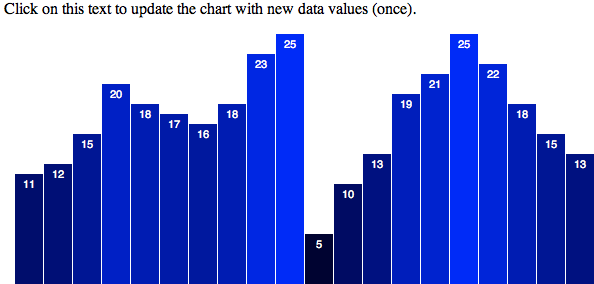
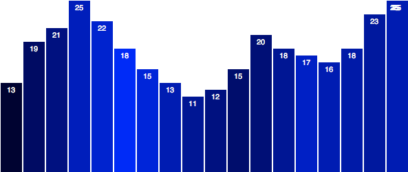
dataset=[11,12,15,20,18,17,16,18,23,25,5,10,13,19,21,25,22,18,15,13];
Step 2 is to rebind the new values to the existing elements. We can do
that by selecting those rects and simply calling data() one more
time:
svg.selectAll("rect").data(dataset);//New data successfully bound, sir!
Updating the Visuals
Finally, step 3 is to update the visual attributes, referencing the
(now-updated) data values. This is super easy, as we simply copy and
paste the relevant code that we’ve already written. In this case, the
rects can maintain their horizontal positions and widths; all we
really need to update are their heights and y positions. I’ve added
those lines here:
svg.selectAll("rect").data(dataset).attr("y",function(d){returnh-yScale(d);}).attr("height",function(d){returnyScale(d);});
Notice this looks almost exactly like the code that generates the
rects initially, only without enter() and append().
Putting it all together, here is all of our update code in one place:
//On click, update with new datad3.select("p").on("click",function(){//New values for datasetdataset=[11,12,15,20,18,17,16,18,23,25,5,10,13,19,21,25,22,18,15,13];//Update all rectssvg.selectAll("rect").data(dataset).attr("y",function(d){returnh-yScale(d);}).attr("height",function(d){returnyScale(d);});});
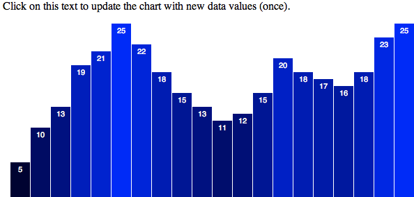
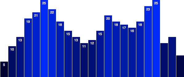
Check out the revised bar chart in 03_updates_all_data.html. It looks like Figure 9-4 to start.
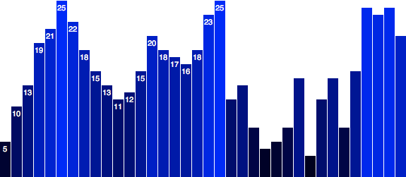
Then click anywhere on the paragraph, and it turns into Figure 9-5.
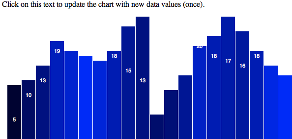
Good news: the values in dataset were modified, rebound, and used to
adjust the rects. Bad news: it looks weird because we forgot to
update the labels, and also the bar colors. Good news (because I
always like to end with good news): this is easy to fix.
To ensure the colors change on update, we just copy and paste in the
line where we set the fill:
svg.selectAll("rect").data(dataset).attr("y",function(d){returnh-yScale(d);}).attr("height",function(d){returnyScale(d);}).attr("fill",function(d){// <-- Down here!return"rgb(0, 0, "+(d*10)+")";});
To update the labels, we use a similar pattern, only here we adjust their text content and x/y values:
svg.selectAll("text").data(dataset).text(function(d){returnd;}).attr("x",function(d,i){returnxScale(i)+xScale.rangeBand()/2;}).attr("y",function(d){returnh-yScale(d)+14;});
Take a look at 04_updates_all_data_fixed.html. You’ll notice it looks the same to start, but click the trigger and now the bar colors and labels update correctly, as shown in Figure 9-6.
Transitions
Life transitions can be scary: the first day of school, moving to a new city, quitting your day job to do freelance data visualization full-time. But D3 transitions are fun, beautiful, and not at all emotionally taxing.
Making a nice, super smooth, animated transition is as simple as adding one line of code:
.transition()
Specifically, add this link in the chain below where your selection is made, and above where any attribute changes are applied:
//Update all rectssvg.selectAll("rect").data(dataset).transition()// <-- This is new! Everything else here is unchanged..attr("y",function(d){returnh-yScale(d);}).attr("height",function(d){returnyScale(d);}).attr("fill",function(d){return"rgb(0, 0, "+(d*10)+")";});
Now run the code in 05_transition.html, and click the text to see the transition in action. Note that the end result looks the same visually, but the transition from the chart’s initial state to its end state is much, much nicer.
Isn’t that insane? I’m not a psychologist, but I believe it is literally insane that we can add a single line of code, and D3 will animate our value changes for us over time.
Without transition(), D3 evaluates every attr() statement
immediately, so the changes in height and fill happen right away. When
you add transition(), D3 introduces the element of time. Rather than
applying new values all at once, D3 interpolates between the old
values and the new values, meaning it normalizes the beginning and
ending values, and calculates all their in-between states. D3 is also
smart enough to recognize and interpolate between different attribute
value formats. For example, if you specified a height of 200px to
start but transition to just 100 (without the px). Or if a blue
fill turns rgb(0,255,0). You don’t need to fret about being
consistent; D3 takes care of it.
Do you believe me yet? This is really insane. And super helpful.
duration(), or How Long Is This Going to Take?
So the attr() values are interpolated over time, but how much time?
It turns out the default is 250 milliseconds, or one-quarter second
(1,000 milliseconds = 1 second). That’s why the transition in
05_transition.html is so fast.
Fortunately, you can control how much time is spent on any transition by—again, I kid you not—adding a single line of code:
.duration(1000)
The duration() must be specified after the transition(), and durations are always specified in milliseconds, so duration(1000) is a one-second duration.
Here is that line in context:
//Update all rectssvg.selectAll("rect").data(dataset).transition().duration(1000)// <-- Now this is new!.attr("y",function(d){returnh-yScale(d);}).attr("height",function(d){returnyScale(d);}).attr("fill",function(d){return"rgb(0, 0, "+(d*10)+")";});
Open up 06_duration.html and see the difference. Now make a copy of
that file, and try plugging in some different numbers to slow or speed
the transition. For example, try 3000 for a three-second transition,
or 100 for one-tenth of a second.
The actual durations you choose will depend on the context of your design and what triggers the transition. In practice, I find that transitions of around 150 ms are useful for providing minor interface feedback (such as hovering over elements), and about 1,000 ms is ideal for many more significant visual transitions, such as switching from one view of the data to another. 1,000 ms (one second) is not too long, not too short.
In case you’re feeling lazy, I made 07_duration_slow.html, which uses
5000 for a five-second transition.
With such a slow transition, it becomes obvious that the value labels are not transitioning smoothly along with the bar heights. As you now know, we can correct that oversight by adding only two new lines of code, this time in the section where we update the labels:
//Update all labelssvg.selectAll("text").data(dataset).transition()// <-- This is new,.duration(5000)// and so is this..text(function(d){returnd;}).attr("x",function(d,i){returnxScale(i)+xScale.rangeBand()/2;}).attr("y",function(d){returnh-yScale(d)+14;});
Much better! Note in 08_duration_slow_labels_fixed.html how the labels now animate smoothly along with the bars.
ease()-y Does It
With a 5,000-ms, slow-as-molasses transition, we can also perceive the quality of motion. In this case, notice how the animation begins very slowly, then accelerates, then slows down again as the bars reach their destination heights. That is, the rate of motion is not linear, but variable.
The quality of motion used for a transition is called easing. In animation terms, we think about elements easing into place, moving from here to there.
With D3, you can specify different kinds of easing by using ease().
The default easing is "cubic-in-out", which produces the gradual
acceleration and deceleration we see in our chart. It’s a good default
because you generally can’t go wrong with a nice, smooth transition.
Contrast that smoothness to 09_ease_linear.html, which uses
ease("linear") to specify a linear easing function. Notice how the
rate of motion is constant. That is, there is no gradual acceleration
and deceleration—the elements simply begin moving at an even pace, and
then they stop abruptly. (Also, I lowered the duration to 2,000 ms.)
ease() must also be specified after transition(), but before the
attr() statements to which the transition applies. ease() can come
before or after duration(), but this sequence makes the most sense to
me:
…//Selection statement(s).transition().duration(2000).ease("linear")…//attr() statements
Fortunately, there are several other built-in easing functions to choose from. Some of my favorites are:
-
circle - Gradual ease in and acceleration until elements snap into place.
-
elastic - The best way to describe this one is “sproingy.”
-
bounce - Like a ball bouncing, then coming to rest.
Sample code files 10_ease_circle.html, 11_ease_elastic.html, and 12_ease_bounce.html illustrate these three functions. The complete list of easing functions is on the D3 wiki.
Wow, I already regret telling you about bounce. Please use
bounce only if you are making a satirical infographic that is mocking
other bad graphics. Perceptually, I don’t think there is a real case to
be used for bounce easing in visualization. cubic-in-out is the
default for a reason.
Please Do Not delay()
Whereas ease() controls the quality of motion, delay() specifies when
the transition begins.
delay() can be given a static value, also in milliseconds, as in:
….transition().delay(1000)//1,000 ms or 1 second.duration(2000)//2,000 ms or 2 seconds…
As with duration() and ease(), the order here is somewhat flexible,
but I like to include delay() before duration(). That makes more
sense to me because the delay happens first, followed by the transition
itself.
See 13_delay_static.html, in which clicking the text triggers first a 1,000-ms delay (in which nothing happens), followed by a 2,000-ms transition.
Static delays can be useful, but more exciting are delay values that we calculate dynamically. A common use of this is to generate staggered delays, so some elements transition before others. Staggered delays can assist with perception, as it’s easier for our eyes to follow an individual element’s motion when it is slightly out of sync with its neighboring elements’ motion.
To do this, instead of giving delay() a static value, we give it a
function, in typical D3 fashion:
….transition().delay(function(d,i){returni*100;}).duration(500)…
Just as we’ve seen with other D3 methods, when given an anonymous
function, the datum bound to the current element is passed into d,
and the index position of that element is passed into i. So, in this
case, as D3 loops through each element, the delay for each element is
set to i * 100, meaning each subsequent element will be delayed 100 ms
more than the preceding element.
All this is to say that we now have staggered transitions. Check out the beautifully animated bars in 14_delay_dynamic.html and see for yourself.
Note that I also decreased the duration to 500 ms to make it feel a bit
snappier. Also note that duration() sets the duration for each
individual transition, not for all transitions in aggregate. So, for
example, if 20 elements have 500-ms transitions applied with no delay,
then it will all be over in 500 ms, or one-half second. But if a 100-ms
delay is applied to each subsequent element (i * 100), then the total
running time of all transitions will be 2,400 ms:
Max value of i times 100ms delay plus 500ms duration =
19 * 100 + 500 =
2400
Because these delays are being calculated on a per-element basis, if you added more data, then the total running time of all transitions will increase. This is something to keep in mind if you have a dynamically loaded dataset with a variable array length. If you suddenly loaded 10,000 data points instead of 20, you could spend a long, long time watching those bars wiggle around (1,000,400 seconds or 11.5 days to be precise). Suddenly, they’re not so cute anymore.
Fortunately, we can scale our delay values dynamically to the length of the dataset. This isn’t fancy D3 stuff; it’s just math.
See 15_delay_dynamic_scaled.html, in which 30 values are included in the dataset. If you get out your stopwatch, you’ll see that the total transition time is 1.5 seconds, or around 1,500 ms.
Now see 16_delay_dynamic_scaled_fewer.html, which uses exactly the same transition code, but with only 10 data points. Notice how the delays are slightly longer (well, 200 percent longer), so the total transition time is the same: 1.5 seconds! How is this possible?
….transition().delay(function(d,i){returni/dataset.length*1000;// <-- Where the magic happens}).duration(500)…
The two preceding sample pages use the same delay calculations here. Instead
of multiplying i by some static amount, we first divide i by
dataset.length, in effect normalizing the value. Then, that normalized
value is multiplied by 1000, or 1 second. The result is that the
maximum amount of delay for the last element will be 1000, and all
prior elements will be delayed by some amount less than that. A max
delay of 1000 plus a duration of 500 equals 1.5 seconds total
transition time.
This approach to delays is great because it keeps our code scalable. The total duration will be tolerable whether we have only 10 data points or 10,000.
Randomizing the Data
Just to illustrate how cool this is, let’s repurpose our random number generating code from Chapter 5 here, so we can update the chart as many times as we want, with new data each time.
Down in our click-update function, let’s replace the static dataset
with a randomly generated one:
//New values for datasetvarnumValues=dataset.length;//Count original length of datasetdataset=[];//Initialize empty arrayfor(vari=0;i<numValues;i++){//Loop numValues timesvarnewNumber=Math.floor(Math.random()*25);//New random integer (0-24)dataset.push(newNumber);//Add new number to array}
This will overwrite dataset with an array of random integers with values between 0 and 24. The new array will be the same length as the original array.
Then, I’ll update the paragraph text:
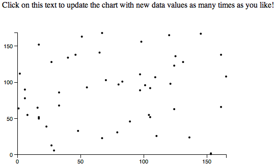
<p>Click on this text to update the chart with new data values
as many times as you like!</p>
Now open up 17_randomized_data.html, and you should see something like Figure 9-7.

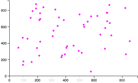
Every time you click the paragraph at top, the code will do the following:
- Generate new, random values.
- Bind those values to the existing elements.
- Transition elements to new positions, heights, and colors, using the new values (see Figure 9-8).
Pretty cool! If this does not feel pretty cool or even a little cool to you, please turn off your computer and go for a short walk to clear your head, thereby making room for all the coolness to come. If, however, you are sufficiently cooled by this knowledge, read on.
Updating Scales
Astute readers might take issue with this line from earlier:
varnewNumber=Math.floor(Math.random()*25);
Why 25? In programming, this is referred to as a magic number. I
know, it sounds fun, but the problem with magic numbers is that it’s
difficult to tell why they exist (hence, the “magic”). Instead of 25,
something like maxValue would be more meaningful:
varnewNumber=Math.floor(Math.random()*maxValue);
Ah, see, now the magic is gone, and I can remember that 25 was acting
as the maximum value that could be calculated and put into
newNumber. As a general rule, it’s best to avoid magic numbers, and
instead store those numbers inside variables with meaningful names, like
maxValue or numberOfTimesWatchedTheMovieTopSecret.
More important, I now remember that I arbitrarily chose 25 because
values larger than that exceeded the range of our chart’s scale, so
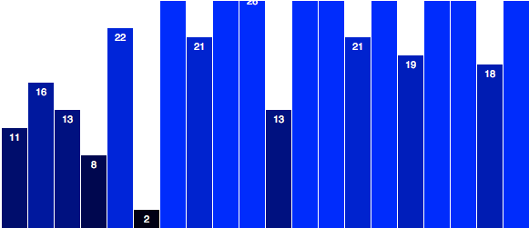
those bars were cut off. For example, in Figure 9-9, I replaced 25 with 50.
The real problem is not that I chose the wrong magic number; it’s that our scale needs to be updated whenever the dataset is updated. Whenever we plug in new data values, we should also recalibrate our scale to ensure that bars don’t get too tall or too short.
Updating a scale is easy. You’ll recall we created yScale with this
code:
varyScale=d3.scale.linear().domain([0,d3.max(dataset)]).range([0,h]);
The range can stay the same (as the visual size of our chart isn’t changing), but after the new dataset has been generated, we should update the scale’s domain:
//Update scale domainyScale.domain([0,d3.max(dataset)]);
This sets the upper end of the input domain to the largest data value in
dataset. Later, when we update all the bars and labels, we
already reference yScale to calculate their positions, so no other
code changes are necessary.
Check it out in 18_dynamic_scale.html. I went ahead and replaced our
magic number 25 with maxValue, which I set here to 100. So now
when we click to update, we get random numbers between 0 and 100. If the
maximum value in the dataset is 100, then yScale’s domain will go
up to 100, as we see in Figure 9-10.
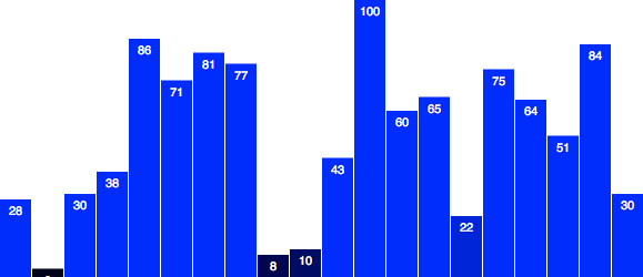
But because the numbers are random, they won’t always reach that maximum value of 100. In Figure 9-11, they top out at 85.
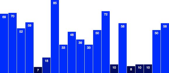
Note that the height of the 100 bar in the first chart is the same as the height of the 85 bar here. The data is changing; the scale input domain is changing; the output visual range does not change.
Updating Axes
The bar chart doesn’t have any axes, but our scatterplot from the last chapter does (Figure 9-12). I’ve brought it back, with a few tweaks, in 19_axes_static.html.
To summarize the changes to the scatterplot:
- You can now click the text at top to generate and update with new data.
- Animated transitions are used after data updates.
- I eliminated the staggered delay, and set all transitions to occur over a full second (1,000 ms).
- Both the x- and y-axis scales are updated, too.
- Circles now have a constant radius.
Try clicking the text and watch all those little dots zoom around. Cute! I sort of wish they represented some meaningful information, but hey, random data can be fun, too.
What’s not happening yet is that the axes aren’t updating. Fortunately, that is simple to do.
First, I am going to add the class names x and y to our x- and y-axes, respectively. This will help us select those axes later:
//Create x-axissvg.append("g").attr("class","x axis")// <-- Note x added here.attr("transform","translate(0,"+(h-padding)+")").call(xAxis);//Create y-axissvg.append("g").attr("class","y axis")// <-- Note y added here.attr("transform","translate("+padding+",0)").call(yAxis);
Then, down in our click function, we simply add:
//Update x-axissvg.select(".x.axis").transition().duration(1000).call(xAxis);//Update y-axissvg.select(".y.axis").transition().duration(1000).call(yAxis);
For each axis, we do the following:
- Select the axis.
- Initiate a transition.
- Set the transition’s duration.
- Call the appropriate axis generator.
Remember that each axis generator is already referencing a scale (either
xScale or yScale). Because those scales are being updated, the axis
generators can calculate what the new tick marks should be.
Open up 20_axes_dynamic.html and give it a try.
Once again, transition() handles all the interpolation magic for you—watch those ticks fade in and out. Just beautiful, and you barely had
to lift a finger.
each() Transition Starts and Ends
There will be times when you want to make something happen at the start
or end of a transition. In those times, you can use each() to execute
arbitrary code for each element in the selection.
each() expects two arguments:
-
Either
"start"or"end" - An anonymous function, to be executed either at the start of a transition, or as soon as it has ended
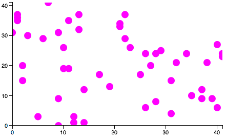
For example, here is our circle-updating code, with two each()
statements added:
//Update all circlessvg.selectAll("circle").data(dataset).transition().duration(1000).each("start",function(){// <-- Executes at start of transitiond3.select(this).attr("fill","magenta").attr("r",3);}).attr("cx",function(d){returnxScale(d[0]);}).attr("cy",function(d){returnyScale(d[1]);}).each("end",function(){// <-- Executes at end of transitiond3.select(this).attr("fill","black").attr("r",2);});
You can see this in action in 21_each.html.
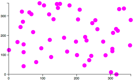
Now you click the trigger, and immediately each circle’s fill is set to magenta, and its radius is set to 3 (see Figure 9-13). Then the transition is run, per usual. When complete, the fills and radii are restored to their original values.
Something to note is that within the anonymous function passed to
each(), the context of this is maintained as “the current element.”
This is handy because then this can be referenced with the function
to easily reselect the current element and modify it, as done here:
.each("start",function(){d3.select(this)// Selects 'this', the current element.attr("fill","magenta")// Sets fill of 'this' to magenta.attr("r",3);// Sets radius of 'this' to 3})
Warning: Start carefully
You might be tempted to throw another transition in here, resulting in a smooth fade from black to magenta. Don’t do it! Or do it, but note that this will break:
.each("start",function(){d3.select(this).transition()// New transition.duration(250)// New duration.attr("fill","magenta").attr("r",3);})
If you try this, and I recommend that you do, you’ll find that the circles do indeed fade to pink, but they no longer change positions in space. That’s because, by default, only one transition can be active on any given element at any given time. Newer transitions interrupt and override older transitions.
This might seem like a design flaw, but D3 operates this way on purpose. Imagine if you had several different buttons, each of which triggered a different view of the data, and a visitor was clicking through them in rapid succession. Wouldn’t you want an earlier transition to be interrupted, so the last-selected view could be put in place right away?
If you’re familiar with jQuery, you’ll notice a difference here. By default, jQuery queues transitions, so they execute one after another, and calling a new transition doesn’t automatically interrupt any existing ones. This sometimes results in annoying interface behavior, like menus that fade in when you mouse over them, but won’t start fading out until after the fade-in has completed.
In this case, the code “breaks” because the first (spatial)
transition is begun, then each("start", …) is called on each element.
Within each(), a second transition is initiated (the fade to pink),
overriding the first transition, so the circles never make it to their
final destinations (although they look great, just sitting at home).
Because of this quirk of transitions, just remember that
each("start", …) should be used only for immediate transformations,
with no transitions.
End gracefully
each("end", …), however, does support transitions. By the time
each("end", …) is called, the primary transition has already ended, so
initiating a new transition won’t cause any harm.
See 22_each_combo_transition.html. Within the first each()
statement, I bumped the pink circle radius size up to 7. In the second,
I added two lines for transition and a duration:
.each("end",function(){d3.select(this).transition()// <-- New!.duration(1000)// <-- New!.attr("fill","black").attr("r",2);});
Watch that transition: so cool! Note the sequence of events:
-
You click the
ptext. - Circles turn pink and increase in size immediately.
- Circles transition to new positions.
- Circles transition to original color and size.
Also, try clicking on the p trigger several times in a row. Go ahead,
just go nuts, click as fast as you can. Notice how each click interrupts
the circles’ progress. (Sorry, guys!) You’re seeing each new transition
request override the old one. The circles will never reach their final
positions and fade to black unless you stop clicking and give them time
to rest.
As cool as that is, there is an even simpler way to schedule multiple transitions to run one after the other: we simply chain transitions together. (This is a new feature in version 3.0 and won’t work with older versions.) For example, instead of reselecting elements and calling a new transition on each one within each("end", …), we can just tack a second transition onto the end of the chain:
svg.selectAll("circle").data(dataset).transition()// <-- Transition #1.duration(1000).each("start",function(){d3.select(this).attr("fill","magenta").attr("r",7);}).attr("cx",function(d){returnxScale(d[0]);}).attr("cy",function(d){returnyScale(d[1]);}).transition()// <-- Transition #2.duration(1000).attr("fill","black").attr("r",2);
Try that code out in 23_each_combo_transition_chained.html, and you’ll see it has the same behavior.
When sequencing multiple transitions, I recommend this chaining approach. Then only use each() for immediate (nontransitioned) changes that need to occur right before or right after transitions. As you can imagine, it’s possible to create quite complex sequences of discrete and animated changes by chaining together multiple transitions, each of which can have its own calls to each("start", …) and each("end", …).
Transitionless each()
You can also use each() outside of a transition, just to execute
arbitrary code for each element in a selection. Outside of transitions,
just omit the "start" or "end" parameter, and only pass in the
anonymous function.
Although I didn’t do this here, you can also include references to d
and i within your function definition, and D3 will hand off those
values, as you’d expect:
….each(function(d,i){//Do something with d and i here});
Containing visual elements with clipping paths
On a slightly related note, you might have noticed that during these transitions, points with low x or y values would exceed the boundaries of the chart area, and overlap the axis lines, as displayed in Figure 9-14.
Fortunately, SVG has support for clipping paths, which might be more familiar to you as masks, as in Photoshop or Illustrator. A clipping path is an SVG element that contains visual elements that, together, make up the clipping path or mask to be applied to other elements. When a mask is applied to an element, only the pixels that land within that mask’s shape are displayed.
Much like g, a clipPath has no visual presence of its own, but it
contains visual elements (which are used to make the mask). For example,
here’s a simple clipPath:
<clipPathid="chart-area"><rectx="30"y="30"width="410"height="240"></rect></clipPath>
Note that the outer clipPath element has been given an ID of
chart-area. We can use that ID to reference it later. Within the
clipPath is a rect, which will function as the mask.
So there are three steps to using a clipping path:
-
Define the
clipPathand give it an ID. -
Put visual elements within the
clipPath(usually just arect, but this could becircles or any other visual elements). -
Add a reference to the
clipPathfrom whatever element(s) you wish to be masked.
Continuing with the scatterplot, I’ll define the clipping path with this new code (steps 1 and 2):
//Define clipping pathsvg.append("clipPath")//Make a new clipPath.attr("id","chart-area")//Assign an ID.append("rect")//Within the clipPath, create a new rect.attr("x",padding)//Set rect's position and size….attr("y",padding).attr("width",w-padding*3).attr("height",h-padding*2);
I want all of the circles to be masked by this clipPath. I could add
a clipPath reference to every single circle, but it’s much easier and
cleaner to just put all the circles into a g group, and then add the
reference to that (this is step 3).
So, I will modify this code:
//Create circlessvg.selectAll("circle").data(dataset).enter().append("circle")…
by adding three new lines, creating a new g, giving it an arbitrary
ID, and finally adding the reference to the chart-area clipPath:
//Create circlessvg.append("g")//Create new g.attr("id","circles")//Assign ID of 'circles'.attr("clip-path","url(#chart-area)")//Add reference to clipPath.selectAll("circle")//Continue as before….data(dataset).enter().append("circle")…
Notice that the attribute name is clip-path, and the element name is
clipPath. Argh! I know; it drives me crazy, too.
View the sample page 24_clip-path.html and open the web inspector.
Let’s look at that new rect in Figure 9-15.
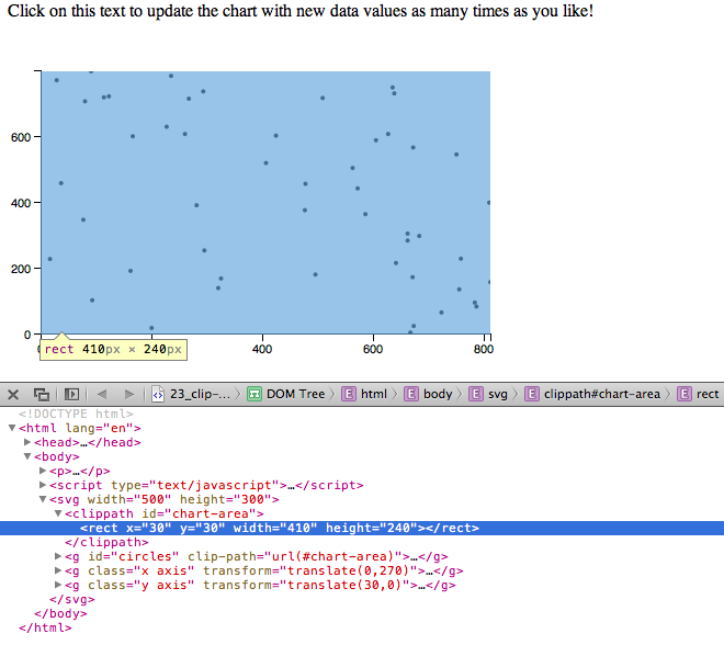
Because clipPaths have no visual rendering (they only mask other
elements), it’s helpful to highlight them in the web inspector, which
will then outline the path’s position and size with a blue highlight. In Figure 9-15 we can see that the clipPath rect is in the right place and is
the right size.
Notice, too, that now all the circles are grouped within a single g
element, whose clip-path attribute references our new clipping path,
using the slightly peculiar syntax url(#chart-area). Thanks for that,
SVG specification.
The end result is that our circles’ pixels get clipped when they get
too close to the edge of the chart area. Note the points at the extreme
top and right edges.
The clipping is easier to see midtransition, as in Figure 9-16.
Other Kinds of Data Updates
Until now, when updating data, we have taken the “whole kit-and-kaboodle” approach: changing values in the dataset array, and then rebinding that revised dataset, overwriting the original values bound to our DOM elements.
That approach is most useful when all the values are changing, and when the length of the dataset (i.e., the number of values) stays the same. But as we know, real-life data is messy, and calls for even more flexibility, such as when you only want to update one or two values, or you even need to add or subtract values. D3, again, comes to the rescue.
Adding Values (and Elements)
Let’s go back to our lovely bar chart, and say that some user
interaction (a mouse click) should now trigger adding a new value to
our dataset. That is, the length of the array dataset will increase
by one.
Well, generating a random number and pushing it to the array is easy enough:
//Add one new value to datasetvarmaxValue=25;varnewNumber=Math.floor(Math.random()*maxValue);dataset.push(newNumber);
Making room for an extra bar will require recalibrating our x-axis
scale. That’s just a matter of updating its input domain to reflect the
new length of dataset:
xScale.domain(d3.range(dataset.length));
That’s the easy stuff. Now prepare to bend your brain yet again, as we dive into the depths of D3 selections.
Select
By now, you are comfortable using select() and selectAll() to grab
and return DOM element selections. And you’ve even seen how, when these
methods are chained, they grab selections within selections, and so on,
as in:
d3.select("body").selectAll("p");//Returns all 'p' elements within 'body'
When storing the results of these selection methods, the most specific result—meaning the result of the last selector in the chain—is the reference handed off to the variable. For example:
varparagraphs=d3.select("body").selectAll("p");
Now paragraphs contains a selection of all p elements in the DOM,
even though we traversed through body to get there.
The twist here is that the data() method also returns a selection.
Specifically, data() returns references to all elements to which data
was just bound, which we call the update selection.
In the case of our bar chart, this means that we can select all the bars, then rebind the new data to those bars, and grab the update selection all in one fell swoop:
//Select…varbars=svg.selectAll("rect").data(dataset);
Now the update selection is stored in bars.
Enter
When we changed our data values, but not the length of the whole data set, we didn’t have to worry about an update selection—we simply rebound the data, and transitioned to new attribute values.
But now we have added a value. So dataset.length was originally 20,
but now it is 21. How can we address that new data value, specifically,
to draw a new rect for it? Stay with me here; your patience
will be rewarded.
The genius of the update selection is that it contains within it references to enter and exit subselections.
Entering elements are those that are new to the scene. It’s considered good form to welcome such elements to the neighborhood with a plate of cookies.
Whenever there are more data values than corresponding DOM elements, the
enter selection contains references to those elements that do not
yet exist. You already know how to access the enter selection: by using
enter() after binding the new data, as we do when first creating the
bar chart. You have already seen the following code:
svg.selectAll("rect")//Selects all rects (as yet nonexistent).data(dataset)//Binds data to selection, returns update selection.enter()//Extracts the enter selection, i.e., 20 placeholder elements.append("rect")//Creates a 'rect' inside each of the placeholder elements…
You have already seen this sequence of selectAll()→data()→enter()→append() many times, but only in the context of creating many elements at once, when the page first loads.
Now that we have added one value to dataset, we can use enter() to
address the one new corresponding DOM element, without touching all the
existing rects. Following the preceding Select code, I’ll add:
//Enter…bars.enter().append("rect").attr("x",w).attr("y",function(d){returnh-yScale(d);}).attr("width",xScale.rangeBand()).attr("height",function(d){returnyScale(d);}).attr("fill",function(d){return"rgb(0, 0, "+(d*10)+")";});
Remember, bars contains the update selection, so bars.enter()
extracts the enter selection from that. In this case, the enter
selection is one reference to one new DOM element. We follow that with
append() to create the new rect, and all the other attr()
statements as usual, except for the following line:
.attr("x",w)
You might notice that this sets the horizontal position of the new rect
to be just past the far right edge of the SVG. I want the new bar to be
created just out of sight, so I can use a nice, smooth transition to
move it gently into view.
Update
We made the new rect; now all that’s left is to update all rect’s
visual attributes. Again, bars here stores the complete update
selection (which includes the enter selection):
//Update…bars.transition().duration(500).attr("x",function(d,i){returnxScale(i);}).attr("y",function(d){returnh-yScale(d);}).attr("width",xScale.rangeBand()).attr("height",function(d){returnyScale(d);});
This has the effect of taking all the bars and transitioning them to their new x, y, width, and height values. Don’t believe me? See the working code in 25_adding_values.html.
Figure 9-17 shows the initial chart.
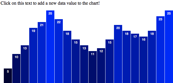
Figure 9-18 shows the chart after one click on the text. Note the new bar on the right.
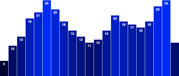
After two clicks, we get the chart shown in Figure 9-19. Figure 9-20 shows the result after three clicks.
After several more clicks, you’ll see the chart shown in Figure 9-21.
Not only are new bars being created, sized, and positioned, but on every click, all other bars are rescaled and moved into position as well.
What’s not happening is that new value labels aren’t being created and transitioned into place. I leave that as an exercise for you to pursue.
Removing Values (and Elements)
Whenever there are more DOM elements than data values, the exit
selection contains references to those elements without data. As you’ve
already guessed, we can access the exit selection with exit().
First, I’ll change our trigger text to indicate we’re removing values:
<p>Click on this text to remove a data value from the chart!</p>
Then, on click, instead of generating a new random value and adding it
to dataset, we’ll use shift(), which removes the first element from
the array:
//Remove one value from datasetdataset.shift();
Exit
Exiting elements are those that are on their way out. We should be polite and wish these elements a safe journey.
So we grab the exit selection, transition the exiting element off to the right side, and, finally, remove it:
//Exit…bars.exit().transition().duration(500).attr("x",w).remove();
remove() is a special transition method that waits until the
transition is complete, and then deletes the element from the DOM
forever. (Sorry, there’s no getting it back.)
Making a smooth exit
Visually speaking, it’s good practice to perform a transition first,
rather than simply remove() elements right away. In this case, we’re
moving the bar off to the right, but you could just as easily transition
opacity to zero, or apply some other visual transition.
That said, if you ever need to just get rid of an element ASAP, by all
means, you can use remove() without calling a transition first.
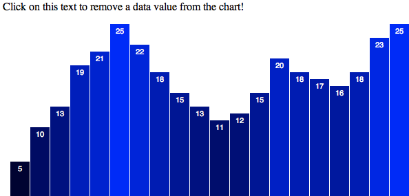
Okay, now try out the code in 26_removing_values.html. Figure 9-22 shows the initial view.
Then, after one click on the text, note the loss of one bar in Figure 9-23.
After two clicks, you’ll see the chart in Figure 9-24. Figure 9-25 shows what displays after three clicks.
After many clicks, the result is shown in Figure 9-26.
On each click, one bar moves off to the right, and then is removed from the DOM. (You can confirm this with the web inspector.)
But what’s not working as expected? For starters, the value labels aren’t being removed, so they clutter up the top right of our chart. Again, I will leave fixing this aspect as an exercise to you.
More important, although we are using the Array.shift() method to
remove the first value from the dataset array, it’s not the first
bar that is removed, is it? Instead, the last bar in the DOM, the one
visually on the far right, is always removed. Although the data values
are updating correctly (note how they move to the left with each click—5, 10, 13, 19, and so on), the bars are assigned new values, rather
than “sticking” with their intial values. That is, the anticipated
object constancy is broken—the “5” bar becomes the “10” bar, and so
on, yet perceptually we would prefer that the “5” bar simply scoot off
to the left and let all the other bars keep their original values.
Why, why, oh, why is this happening?! Not to worry; there’s a perfectly reasonable explanation. The key to maintaining object constancy is, well, keys. (On a side note, Mike Bostock has a very eloquent overview of the value of object constancy, which I recommend.)
Data Joins with Keys
Now that you understand update, enter, and exit selections, it’s time to dig deeper into data joins.
A data join happens whenever you bind data to DOM elements; that is,
every time you call data().
The default join is by index order, meaning the first data value is bound to the first DOM element in the selection, the second value is bound to the second element, and so on.
But what if the data values and DOM elements are not in the same order? Then you need to tell D3 how to join or pair values and elements. Fortunately, you can define those rules by specifying a key function.
This explains the problem with our bars. After we remove the first value
from the dataset array, we rebind the new dataset on top of the
existing elements. Those values are joined in index order, so the first
rect, which originally had a value of 5, is now assigned 10. The
former 10 bar is assigned 13, and so on. In the end, that leaves one
rect element without data—the last one on the far right.
We can use a key function to control the data join with more specificity and ensure that the right datum is bound to the right rect element.
Preparing the data
Until now, our dataset has been a simple array of values. But
to use a key function, each value must have some “key” associated with
it. Think of the key as a means of identifying the value without looking
at the value itself, as the values themselves might change or exist in
duplicate form. (If there were two separate values of 3, how could you tell them apart?)
Instead of an array of values, let’s use an array of objects, within which each object can contain both a key value and the actual data value:
vardataset=[{key:0,value:5},{key:1,value:10},{key:2,value:13},{key:3,value:19},{key:4,value:21},{key:5,value:25},{key:6,value:22},{key:7,value:18},{key:8,value:15},{key:9,value:13},{key:10,value:11},{key:11,value:12},{key:12,value:15},{key:13,value:20},{key:14,value:18},{key:15,value:17},{key:16,value:16},{key:17,value:18},{key:18,value:23},{key:19,value:25}];
Remember, hard brackets [] indicate an array, and curly brackets
{} indicate an object.
Note that the data values here are unchanged from our original
dataset. What’s new are the keys, which just enumerate each object’s
original position within the dataset array. (By the way, your chosen
key name doesn’t have to be key—the name can be anything, like id, year, or fruitType. I am using key here for simplicity.)
Updating all references
The next step isn’t fun, but it’s not hard. Now that our data values are
buried within objects, we can no longer just reference d. (Ah, the
good old days.) Anywhere in the code where we want to access the actual
data value, we now need to specify d.value. When we use anonymous
functions within D3 methods, d is handed whatever is in the current
position in the array. In this case, each position in the array now
contains an object, such as { key: 12, value: 15 }. So to get at the
value 15, we now must write d.value to reach into the object and
grab that value value. (I hope you see a lot of value in this
paragraph.)
First, that means a change to the yScale definition:
varyScale=d3.scale.linear().domain([0,d3.max(dataset,function(d){returnd.value;})]).range([0,h]);
In the second line, we used to have simply d3.max(dataset), but that
only works with a simple array. Now that we’re using objects, we have to
include an accessor function that tells d3.max() how to get at the
correct values to compare. So as d3.max() loops through all the
elements in the dataset array, now it knows not to look at d (which
is an object, and not easily compared to other objects), but d.value
(a number, which is easily compared to other numbers).
Note we also need to change the second reference to yScale, down in
our click-update function:
yScale.domain([0,d3.max(dataset,function(d){returnd.value;})]);
Next up, everywhere d is used to set attributes, we must change d to
d.value. For example, this:
….attr("y",function(d){returnh-yScale(d);// <-- d})…
becomes this:
….attr("y",function(d){returnh-yScale(d.value);// <-- d.value!})…
Key functions
Finally, we define a key function, to be used whenever we bind data to elements:
varkey=function(d){returnd.key;};
Notice that, in typical D3 form, the function takes d as input. Then
this very simple function specifies to take the key value of whatever
d object is passed into it.
Now, in all four places where we bind data, we replace this line:
.data(dataset)
with this:
.data(dataset,key)
Note that rather than defining the key function first, then referencing
it, you could of course simply write the key function directly into the
call to data() like so:
.data(dataset,function(d){returnd.key;})
But in this case, you’d have to write that four times, which is redundant, so I think defining the key function once at the top is cleaner.
That’s it! Consider your data joined.
Exit transition
One last tweak: Let’s set the exiting bar to scoot off to the left side instead of the right:
//Exit…bars.exit().transition().duration(500).attr("x",-xScale.rangeBand())// <-- Exit stage left.remove();
Great! Check out the sample code, with all of those changes, in 27_data_join_with_key.html. The initial view shown in Figure 9-27 is unchanged.
Try clicking the text, though, and the leftmost bar slides cleanly
off to the left, all other bars’ widths rescale to fit, and then the
exited bar is deleted from the DOM. (Again, you can confirm this by
watching the rects disappear one by one in the web inspector.)
Figure 9-28 shows the view after one bar is removed.
After two clicks, you’ll see the chart in Figure 9-29.
Figure 9-30 displays the results after three clicks, and after several clicks, you’ll see the result shown in Figure 9-31.
This is working better than ever. The only hitch is that the labels aren’t exiting to the left, and also are not removed from the DOM, so they clutter up the left side of the chart. Again, I leave this to you; put your new D3 chops to the test and clean up those labels.
Add and Remove: Combo Platter
We could stop there and be very satisfied with our newfound skills. But why not go all the way, and adjust our chart so data values can be added and removed?
This is easier than you might think. First, we’ll need two different triggers for the user interaction. I’ll split the one paragraph into two, and give each a unique ID, so we can tell which one is clicked:
<pid="add">Add a new data value</p><pid="remove">Remove a data value</p>
Later, down where we set up the click function, select() must become
selectAll(), now that we’re selecting more than one p element:
d3.selectAll("p").on("click",function(){…
Now that this click function will be bound to both paragraphs, we have to introduce some logic to tell the function to behave differently depending on which paragraph was clicked. There are many ways to achieve this; I’ll go with the most straightforward one.
Fortunately, within the context of our anonymous click function, this
refers to the element that was clicked—the paragraph. So we can get
the ID value of the clicked element by selecting this and inquiring
using attr():
d3.select(this).attr("id")
That statement will return "add" when p#add is clicked, and "remove"
when p#remove is clicked. Let’s store that value in a variable, and
use it to control an if statement:
//See which p was clickedvarparagraphID=d3.select(this).attr("id");//Decide what to do nextif(paragraphID=="add"){//Add a data valuevarmaxValue=25;varnewNumber=Math.floor(Math.random()*maxValue);varlastKeyValue=dataset[dataset.length-1].key;console.log(lastKeyValue);dataset.push({key:lastKeyValue+1,value:newNumber});}else{//Remove a valuedataset.shift();}
So, if p#add is clicked, we calculate a new random value, and then
look up the key value of the last item in dataset. Then we create a new
object with an incremented key (to ensure we don’t duplicate keys;
insert locksmith joke here) and the random data value.
No additional changes are needed! The enter/update/exit code we wrote is already flexible enough to handle adding or removing data values—that’s the beauty of it.
Try it out in 28_adding_and_removing.html. You’ll see that you can click to add or remove data points at will. Of course, real-world data isn’t created this way, but you can imagine these data updates being triggered by some other event—such as data refreshes being pulled from a server—and not mouse clicks.
Also see 29_dynamic_labels.html, which is the same thing, only I’ve updated the code to add, transition, and remove the labels as well.
Recap
That was a lot of information! Let’s review:
-
data()binds data to elements, but also returns the update selection. -
The update selection can contain enter and exit selections, which
can be accessed via
enter()andexit(). - When there are more values than elements, an enter selection will reference the placeholder, not-yet-existing elements.
- When there are more elements than values, an exit selection will reference the elements without data.
- Data joins determine how values are matched with elements.
- By default, data joins are performed by index, meaning in order of appearance.
- For more control over data joins, you can specify a key function.
As a final note, in the bar chart example, we used this sequence:
- Enter
- Update
- Exit
Although this worked well for us, this order isn’t set in stone. Depending on your design goals, you might want to update first, then enter new elements, and finally exit old ones. It all depends—just remember that once you have the update selection in hand, you can reach in to grab the enter and exit selections anytime. The order in which you do so is flexible and completely up to you.
Fantastic. You are well on your way to becoming a D3 wizard. Now let’s get to the really fun stuff: interactivity!
Get Interactive Data Visualization for the Web now with the O’Reilly learning platform.
O’Reilly members experience books, live events, courses curated by job role, and more from O’Reilly and nearly 200 top publishers.

