Chapter 7. Scales
“Scales are functions that map from an input domain to an output range.”
That’s Mike Bostock’s definition of D3 scales, and there is no clearer way to say it.
The values in any dataset are unlikely to correspond exactly to pixel measurements for use in your visualization. Scales provide a convenient way to map those data values to new values useful for visualization purposes.
D3 scales are functions with parameters that you define. Once they are
created, you call the scale function, pass it a data value, and it
nicely returns a scaled output value. You can define and use as many
scales as you like.
It might be tempting to think of a scale as something that appears visually in the final image—like a set of tick marks, indicating a progression of values. Do not be fooled! Those tick marks are part of an axis, which is a visual representation of a scale. A scale is a mathematical relationship, with no direct visual output. I encourage you to think of scales and axes as two different, yet related, elements.
This chapter addresses only linear scales, because they are most common and easiest understood. Once you understand linear scales, the others—ordinal, logarithmic, square root, and so on—will be a piece of cake.
Apples and Pixels
Imagine that the following dataset represents the number of apples sold at a roadside fruit stand each month:
vardataset=[100,200,300,400,500];
First of all, this is great news, as the stand is selling 100 additional apples each month! Business is booming. To showcase this success, you want to make a bar chart illustrating the steep upward climb of apple sales, with each data value corresponding to the height of one bar.
Until now, we’ve used data values directly as display values, ignoring unit differences. So if 500 apples were sold, the corresponding bar would be 500 pixels tall.
That could work, but what about next month, when 600 apples are sold? And a year later, when 1,800 apples are sold? Your audience would have to purchase ever-larger displays just to be able to see the full height of those very tall apple bars! (Mmm, apple bars!)
This is where scales come in. Because apples are not pixels (which are also not oranges), we need scales to translate between them.
Domains and Ranges
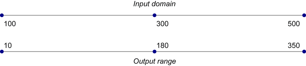
A scale’s input domain is the range of possible input data values. Given the preceding apples data, appropriate input domains would be either 100 and 500 (the minimum and maximum values of the dataset) or 0 and 500.
A scale’s output range is the range of possible output values, commonly used as display values in pixel units. The output range is completely up to you, as the information designer. If you decide the shortest apple bar will be 10 pixels tall, and the tallest will be 350 pixels tall, then you could set an output range of 10 and 350.
For example, create a scale with an input domain of [100,500] and an
output range of [10,350]. If you handed the low input value of 100 to
that scale, it would return its lowest range value, 10. If you gave it
500, it would spit back 350. If you gave it 300, it would hand
180 back to you on a silver platter. (300 is in the center of the
domain, and 180 is in the center of the range.)
We can visualize the domain and range as corresponding axes, side-by-side, displayed in Figure 7-1.
One more thing: to prevent your brain from mixing up the input domain and output range terminology, I’d like to propose a little exercise. When I say “input,” you say “domain.” Then I say “output,” and you say “range.” Ready? Okay:
Input! Domain!
Output! Range!
Input! Domain!
Output! Range!
Got it? Great.
Normalization
If you’re familiar with the concept of normalization, it might be helpful to know that, with a linear scale, that’s all that is really going on here.
Normalization is the process of mapping a numeric value to a new value between 0 and 1, based on the possible minimum and maximum values. For example, with 365 days in the year, day number 310 maps to about 0.85, or 85 percent of the way through the year.
With linear scales, we are just letting D3 handle the math of the normalization process. The input value is normalized according to the domain, and then the normalized value is scaled to the output range.
Creating a Scale
D3’s scale function generators are accessed with d3.scale followed by
the type of scale you want. I recommend opening up the sample code page
01_scale_test.html and typing each of the following into the console:
varscale=d3.scale.linear();
Congratulations! Now scale is a function to which you can pass input
values. (Don’t be misled by the var. Remember that in
JavaScript, variables can store functions.)
scale(2.5);//Returns 2.5
Because we haven’t set a domain and a range yet, this function will map input to output on a 1:1 scale. That is, whatever we input will be returned unchanged.
We can set the scale’s input domain to 100,500 by passing those values
to the domain() method as an array. Note the hard brackets indicating
an array:
scale.domain([100,500]);
Set the output range in similar fashion, with range():
scale.range([10,350]);
These steps can be done separately, as just shown, or chained together into one line of code:
varscale=d3.scale.linear().domain([100,500]).range([10,350]);
Either way, our scale is ready to use!
scale(100);//Returns 10scale(300);//Returns 180scale(500);//Returns 350
Typically, you will call scale functions from within an attr() method
or similar, not on their own. Let’s modify our scatterplot visualization
to use dynamic scales.
Scaling the Scatterplot
To revisit our dataset from the scatterplot:
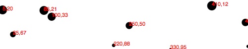
vardataset=[[5,20],[480,90],[250,50],[100,33],[330,95],[410,12],[475,44],[25,67],[85,21],[220,88]];
You’ll recall that this dataset is an array of arrays. We mapped the
first value in each array onto the x-axis, and the second value onto the
y-axis. Let’s start with the x-axis.
Just by eyeballing the x values, it looks like they range from 5 to 480,
so a reasonable input domain to specify might be 0,500, right?
Why are you giving me that look? Oh, because you want to keep your code flexible and scalable, so it will continue to work even if the data changes in the future. Very smart! Remember, if we were building a data dashboard for the roadside apple stand, we’d want our code to accommodate the enormous projected growth in apple sales. Our chart should work just as well with 5 apples sold as 5 million.
d3.min() and d3.max()
Instead of specifying fixed values for the domain, we can use the
convenient array functions d3.min() and d3.max() to analyze our data
set on the fly. For example, this loops through each of the x values in
our arrays and returns the value of the greatest one:
d3.max(dataset,function(d){returnd[0];//References first value in each subarray});
That code will return the value 480, because 480 is the largest x value in our dataset. Let me explain how it works.
Both min() and max() work the same way, and they can take either one or two arguments. The first argument must be a reference to the array of values you want evaluated, which is dataset, in this case. If you have a simple, one-dimensional array of numeric values, like [7, 8, 4, 5, 2], then it’s obvious how to compare the values against each other, and no second argument is needed. For example:
varsimpleDataset=[7,8,4,5,2];d3.max(simpleDataset);// Returns 8
The max() function simply loops through each value in the array, and
identifies the largest one.
But our dataset is not just an array of numbers; it is an array of
arrays. Calling d3.max(dataset) might produce unexpected results:
vardataset=[[5,20],[480,90],[250,50],[100,33],[330,95],[410,12],[475,44],[25,67],[85,21],[220,88]];d3.max(dataset);// Returns [85, 21]. What???
To tell max() which specific values we want compared, we must include a second argument, an accessor function:
d3.max(dataset,function(d){returnd[0];});
The accessor function is an anonymous function to which max() hands
off each value in the data array, one at a time, as d. The accessor
function specifies how to access the value to be used for the
comparison. In this case, our data array is dataset, and we want to
compare only the x values, which are the first values in each subarray,
meaning in position [0]. So our accessor function looks like this:
function(d){returnd[0];//Return the first value in each subarray}
Note that this looks suspiciously similar to the syntax we used when generating our scatterplot circles, which also used anonymous functions to retrieve and return values:
.attr("cx",function(d){returnd[0];}).attr("cy",function(d){returnd[1];})
This is a common D3 pattern. Soon you will be very comfortable with all manner of anonymous functions crawling all over your code.
Setting Up Dynamic Scales
Putting together what we’ve covered, let’s create the scale function for our x-axis:
varxScale=d3.scale.linear().domain([0,d3.max(dataset,function(d){returnd[0];})]).range([0,w]);
First, notice that I named it xScale. Of course, you can name your
scales whatever you want, but a name like xScale helps me remember
what this function does.
Second, notice that both the domain and range are specified as two-value arrays in hard brackets.
Third, notice that I set the low end of the input domain to 0.
(Alternatively, you could use min() to calculate a dynamic value.) The
upper end of the domain is set to the maximum value in dataset (which
is currently 480, but could change in the future).
Finally, observe that the output range is set to 0 and w, the SVG’s
width.
We’ll use very similar code to create the scale function for the y-axis:
varyScale=d3.scale.linear().domain([0,d3.max(dataset,function(d){returnd[1];})]).range([0,h]);
Note that the max() function here references d[1], the y value of
each subarray. Also, the upper end of range() is set to h instead
of w.
The scale functions are in place! Now all we need to do is use them.
Incorporating Scaled Values
Revisiting our scatterplot code, we now simply modify the original line
where we created a circle for each data value:
.attr("cx",function(d){returnd[0];//Returns original value bound from dataset})
to return a scaled value (instead of the original value):
.attr("cx",function(d){returnxScale(d[0]);//Returns scaled value})
Likewise, for the y-axis, this:
.attr("cy",function(d){returnd[1];})
is modified as:
.attr("cy",function(d){returnyScale(d[1]);})
For good measure, let’s make the same change where we set the coordinates for the text labels, so these lines:
.attr("x",function(d){returnd[0];}).attr("y",function(d){returnd[1];})
become this:
.attr("x",function(d){returnxScale(d[0]);}).attr("y",function(d){returnyScale(d[1]);})
And there we are!
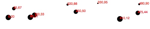
Check out the working code in 02_scaled_plot.html. Visually, the result in Figure 7-2 is disappointingly similar to our original scatterplot! Yet we are making more progress than might be apparent.
Refining the Plot
You might have noticed that smaller y values are at the top of the plot,
and the larger y values are toward the bottom. Now that we’re using D3
scales, it’s super easy to reverse that, so greater values are higher
up, as you would expect. It’s just a matter of changing the output range
of yScale from:
.range([0,h]);
to:
.range([h,0]);
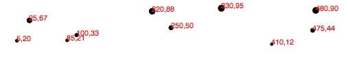
See 03_scaled_plot_inverted.html for the code that results in Figure 7-3.
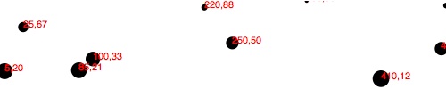
Yes, now a smaller input to yScale will produce a larger output
value, thereby pushing those circles and text elements down, closer
to the base of the image. I know, it’s almost too easy!
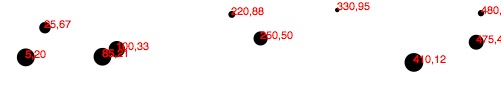
Yet some elements are getting cut off. Let’s introduce a padding
variable:
varpadding=20;
Then we’ll incorporate the padding amount when setting the range of
both scales. This will help push our elements in, away from the edges of
the SVG, to prevent them from being clipped.
The range for xScale was range([0, w]), but now it’s:
.range([padding,w-padding]);
The range for yScale was range([h, 0]), but now it’s:
.range([h-padding,padding]);
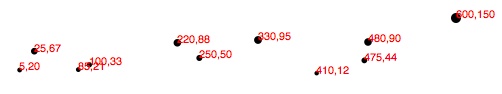
This should provide us with 20 pixels of extra room on the left, right, top, and bottom edges of the SVG. And it does (see Figure 7-4)!
But the text labels on the far right are still getting cut off, so I’ll
double the amount of xScale’s padding on the right side by multiplying
by two to achieve the result shown in Figure 7-5:
.range([padding,w-padding*2]);
Tip
The way I’ve introduced padding here is simple, but not elegant. Eventually, you’ll want more control over how much padding is on each side of your charts (top, right, bottom, left), and it’s useful to standardize how you specify those values across projects. Although I haven’t used Mike Bostock’s margin convention for the code samples in this book, I recommend taking a look to see if it could work for you.
Better! Reference the code so far in 04_scaled_plot_padding.html. But there’s
one more change I’d like to make. Instead of setting the radius of each
circle as the square root of its y value (which was a bit of a hack,
and not visually useful), why not create another custom scale?
varrScale=d3.scale.linear().domain([0,d3.max(dataset,function(d){returnd[1];})]).range([2,5]);
Then, setting the radius looks like this:
.attr("r",function(d){returnrScale(d[1]);});
This is exciting because we are guaranteeing that our radius values
will always fall within the range of 2,5. (Or almost always; see
reference to clamp() later.) So data values of 0 (the minimum input)
will get circles of radius 2 (or a diameter of 4 pixels). The very
largest data value will get a circle of radius 5 (diameter of 10
pixels).
Voila: Figure 7-6 shows our first scale used for a visual property other than an axis value. (See 05_scaled_plot_radii.html.)
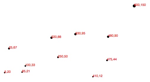
Finally, just in case the power of scales hasn’t yet blown your mind,
I’d like to add one more array to the dataset: [600, 150].
Boom! Check out 06_scaled_plot_big.html. Notice how all the old points in Figure 7-7 maintained their relative positions but have migrated closer together, down and to the left, to accommodate the newcomer in the top-right corner.
And now, one final revelation: we can now very easily change the size of
our SVG, and everything scales accordingly. In Figure 7-8, I’ve increased the
value of h from 100 to 300 and made no other changes.
Boom, again! See 07_scaled_plot_large.html. Hopefully, you are seeing this and realizing: no more late nights tweaking your code because the client decided the graphic should be 800 pixels wide instead of 600. Yes, you will get more sleep because of me (and D3’s brilliant built-in methods). Being well-rested is a competitive advantage. You can thank me later.
Other Methods
d3.scale.linear() has several other handy methods that deserve a brief
mention here:
-
nice() -
This tells the scale to take whatever input domain that you gave to
range()and expand both ends to the nearest round value. From the D3 wiki: “For example, for a domain of [0.20147987687960267, 0.996679553296417], the nice domain is [0.2, 1].” This is useful for normal people, who are not computers and find it hard to read numbers like 0.20147987687960267. -
rangeRound() -
Use
rangeRound()in place ofrange(), and all values output by the scale will be rounded to the nearest whole number. This is useful if you want shapes to have exact pixel values, to avoid the fuzzy edges that could arise with antialiasing. -
clamp() -
By default, a linear scale can return values outside of the specified range. For example, if given a value outside of its expected input domain, a scale will return a number also outside of the output range. Calling
clamp(true)on a scale, however, forces all output values to be within the specified range. This means excessive values will be rounded to the range’s low or high value (whichever is nearest).
To use any of these special methods, just tack them onto the chain in which you define the original scale function. For example, to use nice():
varscale=d3.scale.linear().domain([0.123,4.567]).range([0,500]).nice();
Other Scales
In addition to
linear scales (discussed earlier), D3 has several other built-in scale methods:
-
sqrt - A square root scale.
-
pow - A power scale (good for the gym, er, I mean, useful when working with exponential series of values, as in “to the power of” some exponent).
-
log - A logarithmic scale.
-
quantize - A linear scale with discrete values for its output range, for when you want to sort data into “buckets.”
-
quantile -
Similar to
quantize, but with discrete values for its input domain (when you already have “buckets”). -
ordinal - Ordinal scales use nonquantitative values (like category names) for output; perfect for comparing apples and oranges.
-
d3.scale.category10(),d3.scale.category20(),d3.scale.category20b(), andd3.scale.category20c() - Handy preset ordinal scales that output either 10 or 20 categorical colors.
-
d3.time.scale() - A scale method for date and time values, with special handling of ticks for dates.
Now that you have mastered the power of scales, it’s time to express them visually as, yes, axes!
Get Interactive Data Visualization for the Web now with the O’Reilly learning platform.
O’Reilly members experience books, live events, courses curated by job role, and more from O’Reilly and nearly 200 top publishers.

