Implementing Multicolumn Layouts
The two- and three-column layouts we see in such abundance and in Figure 6-7 are a result of inertia, to a degree. Before CSS became reasonably well supported, markup tables were the only available means of exercising any control whatsoever over page layout, short of abusing Flash or images with mapped links.
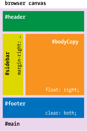
Figure 6-7. The source order of those elements is #mainâ#headerâ#bodyCopyâ#sidebarâ#footer; each ordinal is mated with the float and clear values that apply to that element
Once simplified, typical layout table markup often looked something like this:
<div align="center">

<table width="768">
  <tr>
    <td colspan="2">This is the page header.</td>
  </tr>
  <tr>
    <td width="160">This is the sidebar.</td>
    <td>This is the principal content.</td>
  </tr>
  <tr>
    <td colspan="2">This is the footer.</td>
  </tr>
</table>

</div>
In practice, the tables that were put into production were vastly more complicated. For one thing, they would include extra rows and cells populated with shim content and inserted to create negative space in page layouts. For example, in early 2002 I drew up a table intended for use in an email campaign that had 40 columns in it, although no section of the layout had more than 4 physical columns. The balance was required to account for rules and changes to the layout grid that were made from one section to the next.
Experienced markup technologists ...
Get HTML & CSS: The Good Parts now with the O’Reilly learning platform.
O’Reilly members experience books, live events, courses curated by job role, and more from O’Reilly and nearly 200 top publishers.

