Chapter 4. Layout
In this chapter we’ll explore how to enhance the appearance of Enyo apps by using various layout strategies to place controls where we want them. By combining the knowledge gained in the previous chapters with the layout tools in this chapter, you’ll have most of the knowledge you need to create compelling apps using Enyo. We’ll explore each of the layout tools using examples you can run in your browser.
As with visual controls, Enyo provides both core layout strategies and an optional library called Layout. The core strategies provide the “simpler” approach to layout while the Layout library provides some more advanced features. The Onyx library also provides a layout tool in the form of the Drawer component and the Moonstone library has a number of enhanced layout controls.
Responsive Design
Before we begin talking about layout strategies we should discuss responsive design. Responsive design means that an app or web page changes its appearance (or functionality) depending upon the device or display size it is used on. It’s important to consider how your app will look on different displays when designing a cross-platform app. Responsive web design is a topic that probably deserves a book of its own. You are encouraged to research the associated tools and techniques on the Web. Many of those same tools are used both within Enyo and by Enyo app developers. In particular, CSS media queries are often used in Enyo apps. We’ll discuss the tools that Enyo makes available for designing responsive apps, but you may need to supplement these tools in certain circumstances.
Core Layout Features
Enyo provides two useful mechanisms for layout in the core: scrollers and repeaters. The Scroller kind implements a section of the display that is scrollable by the user while the Repeater kind is useful for making repeating rows of items. There are also data-aware controls for list and grid layout that we will cover in Chapter 5.
Scrollers
One of the bigger challenges in a mobile app is presenting a scrolling area of information that would otherwise be too big to fit. While many solutions exist, their cross-platform performance varies greatly. The Enyo team has spent a considerable amount of time analyzing performance issues and bugs across various browsers to produce the Scroller component.
Scrollers require very little configuration but do have some settings you can control. The vertical and horizontal properties default to automatically allow scrolling if the content of the scroller exceeds its size. Setting either to 'hidden' disables scrolling in that direction while setting either to 'scroll' causes scroll thumbs to appear (if enabled) even if content otherwise fits. The touch property controls whether desktop browsers will also use a touch-based scrolling strategy (instead of thumb scrollers).
For more information on scrollers, visit the scroller documentation page.
Repeaters
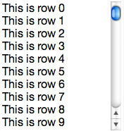
Another challenge is to display a list of repeating rows of information. The Repeater component is designed to allow for the easy creation of small lists (up to 100 or so items) of consistently formatted data. A repeater works by sending an event each time it needs data for a row. The method that subscribes to this event fills in the data required by that row as it is rendered. The following sample shows a repeater that lists the numbers 0 through 99:
enyo.kind({name:'RepeaterSample',kind:'Scroller',components:[{kind:'Repeater',count:100,components:[{name:'text'}],onSetupItem:'setupItem',ontap:'tapped'}],setupItem:function(sender,event){varitem=event.item;item.set('$.text.content','This is row '+event.index);return(true);},tapped:function(sender,event){enyo.log(event.index);}});
Tip
Try it out: jsFiddle.
You’ll notice that we placed the Repeater into a Scroller. As the contents would (likely) be too large to fit onto your screen, we needed the scroller to allow all the content to be viewable. The components block of the Repeater is the template for each row and can hold practically any component, though it is important to note that fittables (see Fittable) cannot be used inside a repeater.
Also of note is the fact that each time we respond to the onSetupItem event, we reference the component(s) in the components block directly off the item passed in through the event. The repeater takes care of instantiating new versions of the components for each row. If you need to update a specific row in a repeater, you should call the renderRow() method and pass in the index of that row.
Tip
To redraw the whole repeater, such as when the underlying data has changed, set a new value for the count property. It is a good idea to pass a truthy value for the third parameter to set() in the case where only the data but not the number of records has changed (e.g., this.set('$.repeater.count', 100, true);). Alternately, you can call the build() method to redraw the list.
Layout Library Features
The modular Layout library includes several kinds for arranging controls. Three of the kinds we’ll discuss are Fittable, List, and Panels. Visit the Enyo docs website to find out more information on the Layout library and the kinds not covered here.
Fittable
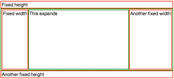
One aspect of layout that Enyo makes easier is designing elements that fill the size of a given space. Enyo provides two layout kinds, FittableColumnsLayout and FittableRowsLayout, to accomplish this. Fittable layouts allow for a set of components to be arranged such that one (and only one) component expands to fill the space available while the others retain their fixed size. FittableColumnsLayout arranges components horizontally while FittableRowsLayout arranges them vertically. To specify the child component that will expand to fit the space available, set the fit property to true.
To apply the fittable style to controls, set the layoutKind property. To make it easier to use, the Layout library includes two controls with the layout already applied: FittableColumns and FittableRows. Fittables can be arranged within each other, as the following code sample shows:
enyo.kind({name:'Columns',kind:'FittableColumns',components:[{content:'Fixed width',classes:'dont'},{content:'This expands',fit:true,classes:'do'},{content:'Another fixed width',classes:'dont'}]});enyo.kind({name:'FittableSample',layoutKind:'FittableRowsLayout',components:[{content:'Fixed height',classes:'dont'},{kind:'Columns',fit:true,classes:'do'},{content:'Another fixed height',classes:'dont'}]});
Tip
Try it out: jsFiddle.
In the previous sample, we used both styles of applying a fittable layout, using a layoutKind for the row layout and using the FittableColumns for the column layout. We applied a simple CSS style that added colored borders to the expanding regions. If you resize the browser window, you’ll see that the area in the middle will expand while the areas above and to the sides have fixed heights and widths, respectively.
Tip
Fittables only relayout their child controls in response to a resize event. If you need to relayout the controls because of changes in the sizes of components, call the resize() method on the fittable component.
While fittables provide an easy way to create specific layouts, they should not be overused. Reflows are performed in JavaScript and too many nested fittables can affect app performance.
Lists
Earlier we covered repeaters, which display a small number of repeating items. The List component serves a similar purpose but allows for a practically unlimited number of items. Lists include a built-in scroller and support the concept of selected items (including multiple selected items). Lists use a flyweight pattern to reduce the number of DOM elements that get created and, therefore, speed up performance on mobile browsers.
All this performance doesn’t come without downsides, though. Because list items are rendered on the fly it is difficult to have interactive components within them. It is recommended that only simple controls and images be used within lists:
enyo.kind({name:'ListSample',kind:'List',count:10000,handlers:{onSetupItem:'setupItem',ontap:'tapped'},components:[{name:'text'}],setupItem:function(sender,event){this.set('$.text.content','This is row '+event.index);return(true);},tapped:function(sender,event){enyo.log(event.index);}});
Tip
Try it out: jsFiddle.
In both this example and the Repeater example, we knew the number of items to display and set the count property when creating them. Often, you won’t know how many items to display while writing your app. In that case, leave the count property undefined and set() it once you have received the data. Once set, the List will render itself. If the underlying data changes, call refresh() to redraw at the current position or reset() to redraw from the start.
In order to make a List row interactive, you must first use the prepareRow() method. Then, a call to performOnRow() can be used to act on the row. Finally, lockRow() should be called to return the row to its non-interactive state. Let’s modify the tap handler from the last example to show how to add an interactive element to a row:
enyo.kind({name:'ListSample',kind:'List',count:1000,items:[],handlers:{onSetupItem:'setupItem'},components:[{name:'text',kind:'Input',ontap:'tapped',onchange:'changed',onblur:'blur'}],create:function(){this.inherited(arguments);for(vari=0;i<this.count;i++){this.items[i]='This is row '+i;}},setupItem:function(sender,event){this.$.text.setValue(this.items[event.index]);return(true);},tapped:function(sender,event){this.prepareRow(event.index);this.set('$.text.value',this.items[event.index]);this.$.text.focus();return(true);},changed:function(sender,event){this.items[event.index]=sender.getValue();},blur:function(sender,event){this.lockRow();}});
Tip
Try it out: jsFiddle.
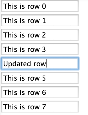
In this version, we detect a user tapping into a row and then lock that row so that we can make the Input editable. If we did not prepare the row, then the input control would not be properly associated with the row being edited and our changes would not be preserved. We look for the onblur event so we can call lockRow() to put the list back into non-interactive mode.
Tip
This sample isn’t complete, as there are ways to move out of fields without triggering the blur event correctly. A better way to handle this kind of situation would be to use Popup to open a dialog on top of the list in response to a click on the row.
List and Repeater have data-aware versions that are easier to work with. We’ll cover data-aware components in Chapter 5.
Panels
Panels are one the most flexible layout tools Enyo has to offer. Panels give you the ability to have multiple sections of content that can appear or disappear as needed. You can even control how the panels arrange themselves on the screen by using the arrangerKind property. The various arrangers allow for panels that collapse or fade as moved, or that are arranged into a carousel or even a grid.
Panels have an index property that indicates the active panel. Although the various arrangers can present more than one panel on the screen at a time and all such visible panels can be interactive, the active panel is important. You can easily transition the active panel by using the previous() and next() methods, or detect when a user has moved to a new panel (e.g., by swiping) by listening for the onTransitionFinish event.
A quick example of how to use Panels will help explain. In this example, we’ll set up a layout that can have up to three panels, depending on the available width. As the available width shrinks, the number of panels visible will also shrink, until only one remains:
enyo.kind({name:'PanelsSample',kind:'Panels',arrangerKind:'CollapsingArranger',classes:'panels-sample',narrowFit:false,handlers:{onTransitionFinish:'transitioned'},components:[{name:'panel1',style:'background-color: blue'},{name:'panel2',style:'background-color: grey'},{name:'panel3',style:'background-color: green'}],transitioned:function(){this.log(this.index);}});
In order to achieve the sizing, we’ll use a little CSS and some media queries to size the panels appropriately:
.panels-sample>*{width:200px;}@mediaalland(max-width:500px){.panels-sample>*{min-width:200px;max-width:100%;width:50%;}}@mediaalland(max-width:300px){.panels-sample>*{min-width:100%;max-width:100%;}}
Tip
Try it out: jsFiddle.

For this sample, we set the narrowFit property to false. By default, the individual panels in a CollapsingArranger panel will fill the available space when the screen size is below 800px. We overrode the default in order to use 200px as the minimum width of a panel. The CSS we used detects when the screen gets below 500px and we limit each panel to half the space. Then, when the screen gets below 300px, we cause the panels to take up all the space. The user can still swipe left and right to reveal panels that aren’t currently visible.
We have only touched on the power of the Panels component. You should check out the Panels documentation for more ideas on how to use them.
Summary
You are now well on your way to producing beautiful apps that perform well on mobile and desktop platforms. We looked at some techniques for designing responsive apps that make the best use of a user’s display size. In the next chapter we’ll learn how to create data-driven applications using Enyo.
Get Enyo: Up and Running now with the O’Reilly learning platform.
O’Reilly members experience books, live events, courses curated by job role, and more from O’Reilly and nearly 200 top publishers.

