Chapter 4. Contextual Tools
Interaction in Context
Most desktop applications separate functionality from data. Menu bars, toolbars, and palettes form islands of application functionality. Either the user chooses a tool to use on the data or makes a selection and then applies the tool.
Early websites were just the opposite. They were completely content-oriented. Rich tool sets were not needed for simply viewing and linking to content pages. Even in e-commerce sites like Amazon or eBay, the most functionality needed was the hyperlink and “Submit” button.
However, this simplistic approach no longer exists in the current web application landscape. As the Web has matured, a wide variety of application styles has emerged.
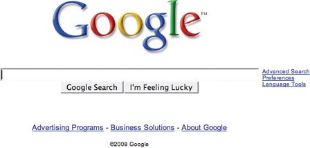
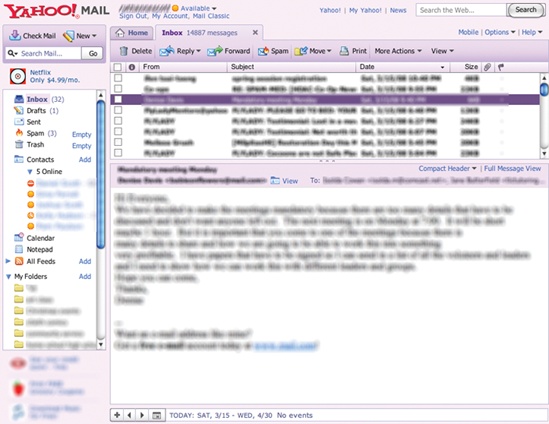
On one end of the spectrum there are simple sites that need no more functionality than the hyperlink and a “Submit” button. On the other end of the spectrum there are full applications hosted as a website. Google Search and Yahoo! Mail are two typical applications that illustrate this variation (Figure 4-1).
Between these two opposites are a lot of sites that need to mix content and functionality. It is to this intersection that we turn our attention in this chapter.
Think for a moment where user interfaces are headed.
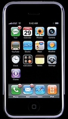
Touch-based interfaces were the stuff of research labs and, more recently, interesting You-Tube videos. But now they’re as close as our phones. Most notably, the Apple iPhone brought touch to the masses (Figure 4-2). Gesture-based interfaces seemed even further out. Yet these became reality with the Nintendo Wii.
With both gesture and touch-based interfaces, interaction happens directly with the content.
Tip
The content is the interface. Instead of being contained in separate areas of functionality, the actions feel close to the objects being interacted with.
This concept also informs our current challenge. How do we bring tools nearer to the content to make the interaction as lightweight as possible?
Fitts’s Law
Fitts’s Law is an ergonomic principle that ties the size of a target and its contextual proximity to ease of use. Bruce Tognazzini restates it simply as:
The time to acquire a target is a function of the distance to and size of the target.
In other words, if a tool is close at hand and large enough to target, then we can improve the user’s interaction. Putting tools in context makes for lightweight interaction.
Contextual Tools
We could simply isolate our functionality into islands of tools (toolbars and menus). But this would work against Fitts’s Law by requiring more effort from the user. It would also add more visual weight to the page. Instead of interacting with the functionality separately, we can bring the functionality into the content with Contextual Tools.
Contextual Tools are the Web’s version of the desktop’s right-click menus. Instead of having to right-click to reveal a menu, we can reveal tools in context with the content. We can do this in a number of ways:
Always-Visible Tools
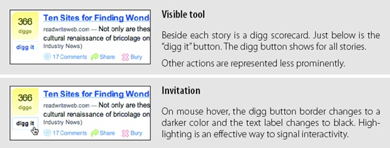
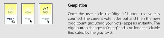
The simplest version of Contextual Tools is to use Always-Visible Tools. Digg is an example of making Contextual Tools always visible (Figure 4-3).
Considerations
The “digg it” button and Digg scorecard provide Always-Visible Tools next to each story.
Clear call to action
Why not hide the tools and only reveal them when the mouse is over the story? Since digging stories is central to the business of Digg, always showing the tool provides a clear call to action. There are other actions associated with news stories (comments, share, bury, etc.) but they are represented less prominently. In the case of Digg, the designers chose to show these at all times. An alternate approach would be to hide them and show them on mouse hover (we will discuss this approach in the next section).
It turns out that voting and rating systems are the most common places to make tools always visible. Netflix was the earliest to use a one-click rating system (Figure 4-4).
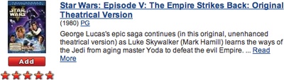
Just as with Digg, rating movies is central to the health of Netflix. The Cinematch™ recommendation engine is driven largely by the user’s ratings. So a clear call to action (to rate) is important. Not only do the stars serve as a strong call to action to rate movies, but they also provide important information for the other in-context tool: the “Add” button. Adding movies to your movie-shipping queue is key to having a good experience with the Netflix service.
Relative importance
One way to clarify this process is to decide on the relative importance of each exposed action. Is the “digg it” action as important as the “bury it” action? In the case of Digg, the answer is no. The “digg it” action is represented as a button and placed prominently in the context of the story. The “bury it” action is represented as a hyperlink along with other “minor” actions just below the story. The contrast of a button and a hyperlink as well as its placement gives a strong indication as to the relative importance of each action.
Tip
If an action is critical, expose it directly in the interface.
Discoverability
Discoverability is a primary reason to choose Always-Visible Tools. On the flip side, it can lead to more visual clutter. In the case of Digg and Netflix, there is a good deal of visual space given to each item (story, movie). But what happens when the items you want to act on are in a list or table?
Generally Contextual Tools in a list work well when the number of actions is kept to a minimum. Gmail provides a single Always-Visible Tool in its list of messages—the star rating—for flagging emails (Figure 4-5).
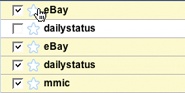
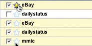
Simply clicking the star flags the message as important. The unstarred state is rendered in a visually light manner, which minimizes the visual noise in the list.
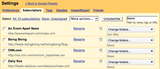
The following list, from Google Reader, takes a different approach. It shows several tools for managing subscriptions: rename, delete, and change folders for each subscription in the list. This is convenient but is definitely heavier visually (Figure 4-6).
Sometimes concerns over visual noise must take a back seat to discoverability. The Yahoo! India Our City team struggled with a design early on. They wanted to hide the “email this” icon and only show it on hover. However, since the site was specifically for India, they were concerned with how much exposure the population had with simple web interactions like mouse rollover. So instead of hiding the icon, they chose to show it for every story (Figure 4-7).
Hover-Reveal Tools
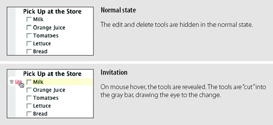
Instead of making Contextual Tools always visible, we can show them on demand. One way to do this is to reveal the tools when the user pauses the mouse over an object. The Hover-Reveal Tools pattern is most clearly illustrated by 37 Signal’s Backpackit (Figure 4-8). To-do items may be deleted or edited directly in the interface. The tools to accomplish this are revealed on mouse hover.
Considerations
The gray bar on the left is a nice visual reinforcement for the interaction. By allowing the tools to “cut” into the sidebar, the designers draw your eye to the available tools. The light yellow background draws attention to the to-do item being acted on. These two simple treatments make it clear which line has the focus and that additional tools have been revealed.
Tip
To reduce visual clutter, hide non-primary actions until they are needed.
Visual noise
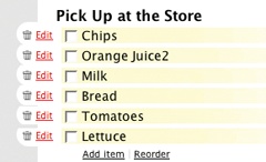
Showing the items on hover decreases the visual noise in the interface. Imagine if instead the delete and edit actions were always shown for all to-do items. Figure 4-9 shows just how visually noisy that approach would have been.
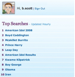
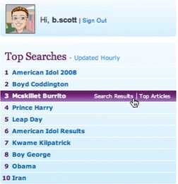
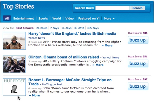
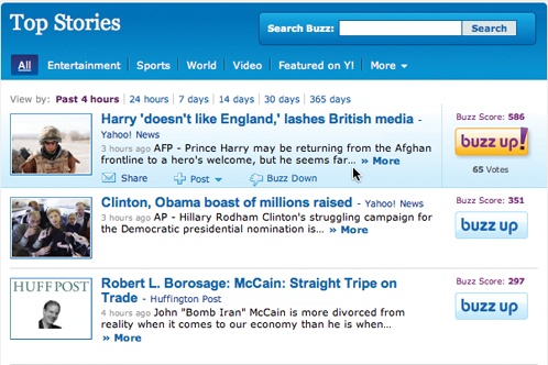
Yahoo! Buzz reveals its tools on mouse hover for both its Top Searches (Figure 4-10) and Top Stories (Figure 4-11).
For Top Searches, it is important to keep the top-ten list as simple as possible. Showing tools would compete with the list itself. Since the actions “Search Results” and “Top Articles” (Figure 4-10, right) are less important, they are revealed on hover. The actions may be important, but making the content clear and readable is a higher priority.
Similarly, for Top Stories, Yahoo! Buzz shows only “Share”, “Post”, and “Buzz Down” tools on hover. “Buzz Up” is shown at all times, but gets extra visual treatment on mouse hover (Figure 4-11, right). “Buzz Up” is important enough to show at all times, but can be toned down when not the focus.
Discoverability
A serious design consideration for Hover-Reveal Tools is just how discoverable the additional functionality will be. In the earlier Backpackit example (Figure 4-8), while the Contextual Tools are revealed on hover, the checkbox is always visible for each to-do item. To check off an item, users have to move the mouse over it. When they do, they will discover the additional functionality.
Flickr provides a set of tools for contacts. To avoid clutter, contact profile photos are shown without any tool adornment. When the mouse hovers over the contact’s photo, a drop-down arrow is revealed (Figure 4-12). Clicking reveals a menu with a set of actions for the contact. This works because users often know to click on an image to get more information. Being drawn to the content is a good way to get the user to move the mouse over the area and discover the additional functionality.
Tip
Help users understand revealed tools by using familiar idioms (such as hyperlinks for actions or drop-down arrows to expose additional functionality).
Yahoo! Mail’s flagging feature is revealed when the user hovers over the flagged column on a mail message (Figure 4-13). Contrast this to Google’s always-revealed star approach we discussed earlier (Figure 4-5).
The Yahoo! approach is visually cleaner, but less discoverable. We will have more to say about making tools discoverable in Chapter 10 when we discuss Dynamic Invitations.
Contextual Tools in an overlay
Sometimes there are several actions available for a focused object. Instead of placing tools beside the object being acted on, the revealed tools can be placed in an overlay. However, there can be issues with showing contextual tools in an overlay:
Providing an overlay feels heavier. An overlay creates a slight contextual switch for the user’s attention.
The overlay will usually cover other information—information that often provides context for the tools being offered.
Most implementations shift the content slightly between the normal view and the overlay view, causing the users to take a moment to adjust to the change.
The overlay may get in the way of navigation. Because an overlay hides at least part of the next item, it becomes harder to move the mouse through the content without stepping into a “landmine.”
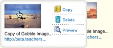
Anti-pattern: Hover and Cover
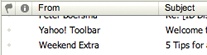
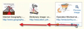
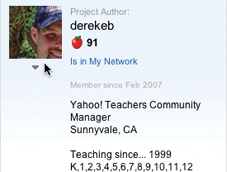
Figure 4-14 illustrates all four of these situations. In an early version of Yahoo! for Teachers,[19] hovering over a clipped item brought in three tools: copy, delete, and preview. However, when these tools were placed in an overlay, it covered the item to the right, making it hard to see that content and even navigate to it. In addition, since the overlay had some additional padding (as well as rounded corners), the image shown in the overlay was about two pixels off from the non-overlay version. This slight jiggle was distracting. To add insult to injury, the overlay was sluggish to bring into view.
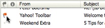
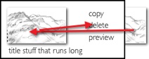
The final straw was if users wanted to delete several items, they would hover over the image, wait for the overlay, click Delete, then be forced to move out and back in again to activate the next image’s Contextual Tools (Figure 4-15). Hover and Cover is a common anti-pattern that occurs when exposing an overlay on hover and hiding important context or further navigation.
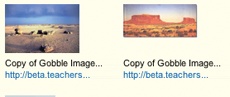
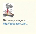
Hover and Cover was resolved by no longer using an overlay. Instead, additional margin space was added to each image, and the Contextual Tools were hidden. On mouse hover, the tools were simply revealed, along with a border defining the image being acted on (Figure 4-16).
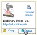
The difference (Figure 4-14 versus Figure 4-16) is dramatic. Not only is the experience improved, but overall page performance is improved as well. On mouse hover, the image no longer shifts in a distracting manner. In redesign, the delete always shows up in the same place relative to the image; this means the user “remembers spatially” where the command is, making it easier to target (Figure 4-17).
Tip
Be careful when using overlays to expose additional information or tools. The overlay can get in the way of normal navigation or hide important information.
Anti-pattern: Mystery Meat
Have you ever found a can in the back of the pantry whose label has long since fallen off? The only way to identify this mystery meat is to open it. Unidentifiable icons are pretty much the same as a row of unlabeled cans. You have to hover over each icon and hope for a tool tip to label it. Even worse is when no tool tip is available. The easiest way to avoid this predicament is to use either a text label or combine an icon with a text label. Mystery Meat is a common anti-pattern that occurs when you have to hover over an item to understand how to use it.
Tip
Don’t make users hover over your tools in order to figure out what they mean.
Figure 4-18 illustrates this in an early version of Zooomr. The only recourse for the user was to pause over each icon and wait a second or so to read a tool tip about the purpose of the icon. This does not create a lightweight interaction!


Activation
Tool overlays should activate immediately. The tools are an extension of the interface, and any delay creates too much of a delay between the activation and invocation of the action. In Chapter 5, we will discuss Dialog Overlays. In that discussion we suggest a delay before showing informational overlays. Why the difference? Since information may not be needed to understand the object, and given the fact that activation might be accidental, it is best to place a small delay when showing the additional information (usually a half-second delay is sufficient). But actions are different. Following the suggestions just mentioned (avoid Hover and Cover anti-pattern), the actions can be revealed without a lot of disruption. And if they show immediately, the user can access the additional commands almost as quickly as with Always-Visible Tools.
Toggle-Reveal Tools
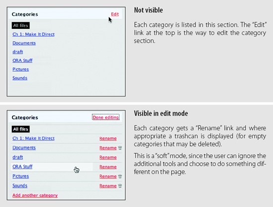
A variation on the two previous approaches is to not show any Contextual Tools until a special mode is set on the page. A good example of Toggle-Reveal Tools is in Basecamp’s category editing, which we discussed in Chapter 1 (Figure 4-19).
Considerations
Here are a few considerations to keep in mind when using Toggle-Reveal Tools.
Soft mode
Generally, it is a good thing to avoid specific modes in an interface. However, if a mode is soft it is usually acceptable. By “soft” we mean the user is not trapped in the mode. With Basecamp, the user can choose to ignore the tools turned on. It just adds visual noise and does not restrict the user from doing other actions. This is a nice way to keep the interaction lightweight.
Tip
Interfaces should strive to be modeless. Often, though, a “soft mode” can be employed to provide context for an action that is easy to activate and easy to remove.
When would you use this technique? When the actions are not the main thing and you want to reduce visual noise. This fits the category example perfectly. Items are renamed or deleted occasionally. It is common, however, to want to click through and see the contents of a category (the category is always hyperlinked). Hence, make it readable and easily navigable in the normal case—but still give the user a way to manage the items in context.
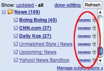
Google Reader could potentially be improved in this manner. In the current interface, clicking “Manage Subscriptions” takes the user to another page to edit subscriptions. One possible change is the addition of an “edit” button that toggles in a set of context tools for each subscription (Figure 4-20). This would allow the user to rename and unsubscribe without leaving the context of the reading pane.

Multi-Level Tools
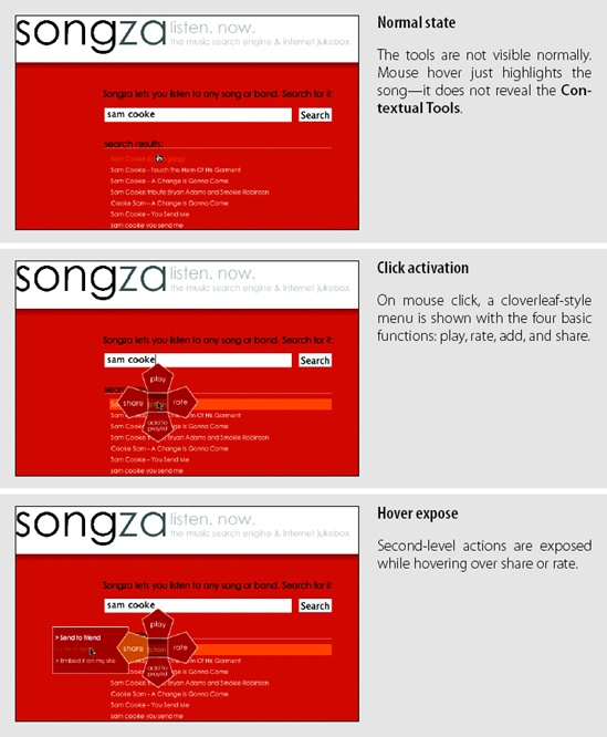
Contextual Tools can be revealed progressively with Multi-Level Tools. Songza[20] provides a set of tools that get revealed after a user clicks on a song. Additional tools are revealed when hovering over the newly visible tools (Figure 4-21).
Considerations
Songza reveals the four options “play”, “rate”, “share”, and “add to playlist” after the user clicks on a song title. Hovering over “share” or “rate” reveals a secondary set of menu items (Figure 14-21, center).
Radial menus
Radial menus[21] such as in Songza have been shown to have some advantages over more traditional menus. First, experienced users can rely on muscle memory rather than having to look directly at the menu items. Second, the proximity and targeting size make the menu easy to navigate since the revealed menu items are all equally close at hand (recall Fitts’s Law).
The one potential downside to this approach is that rating a song requires several steps: an initial click on the song, moving the mouse over the “rate” menu item, then clicking either the thumbs up or thumbs down option. If rating songs was an important activity, the extra effort might prevent some users from doing so. An alternate approach would be to replace “rate” directly with the thumbs up and the thumbs down options.
Activation
Another interesting decision Songza made was to not activate the radial menu on hover. Instead, the user must click on a song to reveal the menu. Activating on click makes the user intent more explicit.
Making activation more explicit avoids the issues described earlier in the Hover and Cover anti-pattern. The user has chosen to interact with the song. Conversely, with a mouse hover, it’s never quite clear if the user meant to activate the menu or just happened to pause over a song title.
Default action
However, this does mean there is no way to start a song playing with just a simple click. Playing a song requires moving to the top leaf. One possible solution would be to place the “play” option in the middle of the menu (at the stem) instead of in one of the leaves. Clicking once would activate the menu. Clicking a second time (without moving the mouse) would start playing the song. This interaction is very similar to one commonly used in desktop applications: allowing a double-click to activate the first item (default action) in a right-click menu.
Tip
Keep the most common actions as near to the activation point as possible.
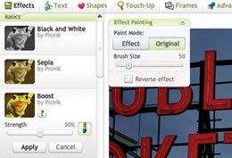
Contextual toolbar
Picnik is an online photo-editing tool that integrates with services like Flickr. In all, there are six sets of tools, each with a wide range of palette choices. Picnik uses Multiple-Level Tools to expose additional functionality. By wrapping the photo with tools in context and progressively revealing the levels of each tool, Picnik makes editing straightforward (Figure 4-22).
Muttons
Another variation on Multi-Level Tools is the “mutton” (menu + button = mutton). Muttons are useful when there are multiple actions and we want one of the actions to be the default. Yahoo! Mail uses a mutton for its “Reply” button (Figure 4-23).
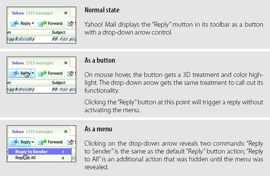
Clicking “Reply” performs the individual reply. To reply to all, the menu has to be activated by clicking on the drop-down arrow to show the menu.
Muttons are used to:
Provide a default button action (“Reply to Sender”)
Provide a clue that there are additional actions
Provide additional actions in the drop-down
If muttons are not implemented correctly, they can be problematic for those using accessibility technologies. Because an earlier version of Yahoo! Mail did not make the mutton keyboard accessible, Yahoo!’s accessibility guru, Victor Tsaran, was convinced that there was no “Reply to All” command in the Yahoo! Mail interface. Only after the mutton was made more accessible could he find the “Reply” command.
Anti-pattern: Tiny Targets
At the beginning of this chapter, we discussed Fitts’s Law. Recall that the time it takes to acquire a target is a function of both distance and size. Even if tools are placed close by in context, don’t forget to make them large enough to target.
Both Flickr and Yahoo! Mail provide a reasonable-size target for the drop-down arrow. Compare this with the expand/collapse arrow used in an early version of Yahoo! for Teachers (Figure 4-24).
The arrow is tiny (8×8 pixels). It is exposed only on hover. Providing Tiny Targets makes interaction much more difficult. An alternate approach would be to always show a “more info” link. Clicking it could toggle the additional profile information. Alternatively, providing a larger target for the arrow would improve its findability and targeting.
Secondary Menu
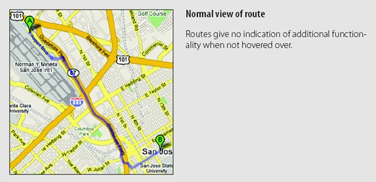
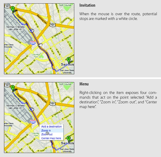
Desktop applications have provided Contextual Tools for a long time in the form of Secondary Menus. These menus have been rare on the Web. Google Maps uses a secondary menu that is activated by a right-click on a route. It shows additional route commands (Figure 4-25).
Considerations
Secondary Menus have not been common in web applications.
Conflict with browser menu
One problem is the browser inserts its own right-click menu. Replacing the menu in normal content areas can confuse users, as they may not know if the standard browser menu or the application-specific menu will be shown. It will depend on whether it is clear that an object exists in the interface (as in the route line above), and if the menu is styled differently enough to disambiguate the menus.
Discoverability
As a general rule, never put anything in the Secondary Menu that can’t be accomplished elsewhere. Secondary Menus are generally less discoverable. More advanced items or shortcuts, however, can be placed in the Secondary Menu as an alternate way to accomplish the same task.
Accessibility
Right-click is not the only way to activate a Secondary Menu. You can activate the menu by holding down the mouse for about one second. This provides a more accessible approach to popping up a Secondary Menu. This technique is used in the Macintosh Dock. Clicking and holding down on an application in the dock will reveal the Secondary Menu without requiring a right-click activation.
Acting on multiple objects
Keep in mind that all of the other Contextual Tools presented in this chapter have a limitation on the number of items they can operate on. Always-Visible Tools, Hover-Reveal Tools, Toggle-Reveal Tools, and Multi-Level Tools all operate on a single item at a time (even Toggle-Reveal Tools just shows a tool per item). Secondary Menus are different. They can be combined with a selection model (as described in Chapter 3) to perform actions on selected set of items.
[19] Yahoo! for Teachers was only released in beta and never widely publicized. It was recently closed down, and another company (edtuit.com) will be launching a similar site.
[20] Aza Raskin is the designer of Songza, founder of Humanized. He is the son of the late human-computer interface expert Jef Raskin.
[21] Also known as pie menus. See Jack Callahan et al. (1988), “An empirical comparison of pie vs. linear menus.” Proceedings of ACM CHI Conference on Human Factors in Computing Systems: 95–100.
Get Designing Web Interfaces now with the O’Reilly learning platform.
O’Reilly members experience books, live events, courses curated by job role, and more from O’Reilly and nearly 200 top publishers.

