Chapter 6. Intermezzo: A Data Analysis Session
OCCASIONALLY I GET THE QUESTION: “HOW DO YOU ACTUALLY WORK?” OR “HOW DO YOU COME UP WITH THIS stuff?” As an answer, I want to take you on a tour through a new data set. I will use gnuplot, which is my preferred tool for this kind of interactive data analysis—you will see why. And I will share my observations and thoughts as we go along.
A Data Analysis Session
The data set is a classic: the CO2 measurements above Mauna Loa on Hawaii. The inspiration for this section comes from Cleveland’s Elements of Graphical Analysis,[12] but the approach is entirely mine.
First question: what’s in the data set? I see that the first column represents the date (month and year) while the second contains the measured CO2 concentration in parts per million. Here are the first few lines:
Jan-1959      315.42
Feb-1959      316.32
Mar-1959      316.49
Apr-1959      317.56
...
The measurements are regularly spaced (in fact, monthly), so I don’t need to parse the date in the first column; I simply plot the second column by itself. (In the figure, I have added tick labels on the horizontal axis for clarity, but I am omitting the commands required here—they are not essential.)
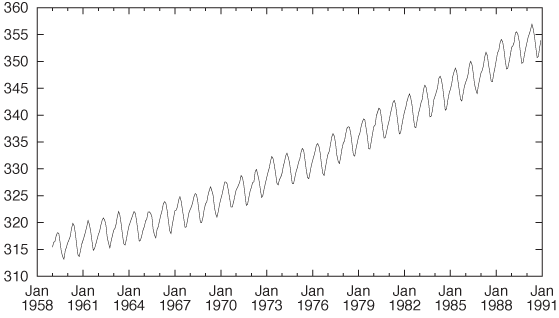
plot "data" u 2 w l
The plot shows a rather regular short-term variation overlaid on a nonlinear upward trend. (See Figure 6-1.)
The coordinate system is not convenient ...
Get Data Analysis with Open Source Tools now with the O’Reilly learning platform.
O’Reilly members experience books, live events, courses curated by job role, and more from O’Reilly and nearly 200 top publishers.

