Chapter 4. Time As a Variable: Time-Series Analysis
IF WE FOLLOW THE VARIATION OF SOME QUANTITY OVER TIME, WE ARE DEALING WITH A TIME SERIES. TIME series are incredibly common: examples range from stock market movements to the tiny icon that constantly displays the CPU utilization of your desktop computer for the previous 10 seconds. What makes time series so common and so important is that they allow us to see not only a single quantity by itself but at the same time give us the typical “context” for this quantity. Because we have not only a single value but a bit of history as well, we can recognize any changes from the typical behavior particularly easily.
On the face of it, time-series analysis is a bivariate problem (see Chapter 3). Nevertheless, we are dedicating a separate chapter to this topic. Time series raise a different set of issues than many other bivariate problems, and a rather specialized set of methods has been developed to deal with them.
Examples
To get started, let’s look at a few different time series to develop a sense for the scope of the task.
Figure 4-1 shows the concentration of carbon dioxide (CO2) in the atmosphere, as measured by the observatory on Mauna Loa on Hawaii, recorded at monthly intervals since 1959.
This data set shows two features we often find in a time-series plot: trend and seasonality. There is clearly a steady, long-term growth in the overall concentration of CO2; this is the trend. In addition, there is also a regular periodic pattern; this is the seasonality. If we look closely, we see that the period in this case is exactly 12 months, but we will use the term “seasonality” for any regularly recurring feature, regardless of the length of the period. We should also note that the trend, although smooth, does appear to be nonlinear, and in itself may be changing over time.
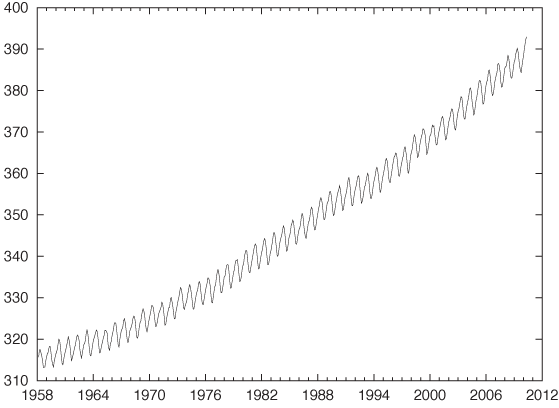
Figure 4-2 displays the concentration of a certain gas in the exhaust of a gas furnace over time. In many ways, this example is the exact opposite of the previous example. Whereas the data in Figure 4-1 showed a lot of regularity and a strong trend, the data in Figure 4-2 shows no trend but a lot of noise.
Figure 4-3 shows the dramatic drop in the cost of a typical long-distance phone call in the U.S. over the last century. The strongly nonlinear trend is obviously the most outstanding feature of this data set. As with many growth or decay processes, we may suspect an exponential time development; in fact, in a semi-logarithmic plot (Figure 4-3, inset) the data follows almost a straight line, confirming our expectation. Any analysis that fails to account explicitly for this behavior of the original data is likely to lead us astray. We should therefore work with the logarithms of the cost, rather than with the absolute cost.
There are some additional questions that we should ask when dealing with a long-running data set like this. What exactly is a “typical” long-distance call, and has that definition changed over the observation period? Are the costs adjusted for inflation or not? The data itself also begs closer scrutiny. For instance, the uncharacteristically low prices for a couple of years in the late 1970s make me suspicious: are they the result of a clerical error (a typo), or are they real? Did the breakup of the AT&T system have anything to do with these low prices? We will not follow up on these questions here because I am presenting this example only as an illustration of an exponential trend, but any serious analysis of this data set would have to follow up on these questions.
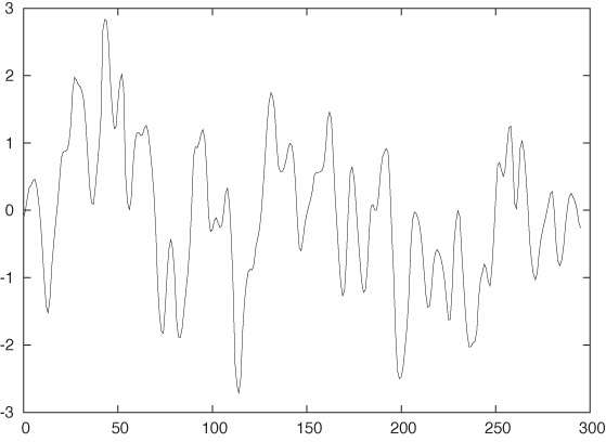
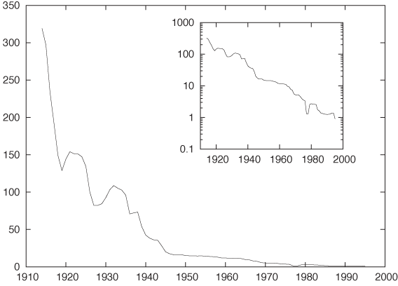
Figure 4-4 shows the development of the Japanese stock market as represented by the Nikkei Stock Index over the last 40 years, an example of a time series that exhibits a marked change in behavior. Clearly, whatever was true before the New Year’s Day 1990 was no longer true afterward. (In fact, by looking closely, you can make out a second change in behavior that was more subtle than the bursting of the big Japanese bubble: its beginning, sometime around 1985–1986.)
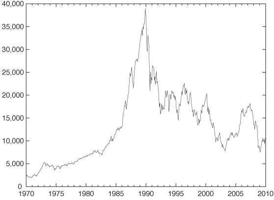
This data set should serve as a cautionary example. All time-series analysis is based on the assumption that the processes generating the data are stationary in time. If the rules of the game change, then time-series analysis is the wrong tool for the task; instead we need to investigate what caused the break in behavior. More benign examples than the bursting of the Japanese bubble can be found: a change in sales or advertising strategy may significantly alter a company’s sales patterns. In such cases, it is more important to inquire about any further plans that the sales department might have, rather than to continue working with data that is no longer representative!
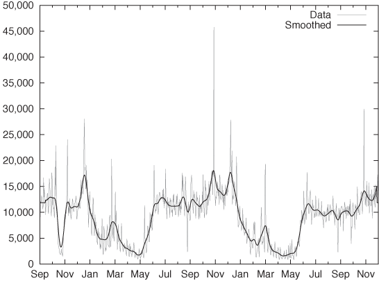
After these examples that have been chosen for their “textbook” properties, let’s look at a “real-world” data set. Figure 4-5 shows the number of daily calls placed to a call center for a time period slightly longer than two years. In comparison to the previous examples, this data set has a lot more structure, which makes it hard to determine even basic properties. We can see some high-frequency variation, but it is not clear whether this is noise or has some form of regularity to it. It is also not clear whether there is any sort of regularity on a longer time scale. The amount of variation makes it hard to recognize any further structure. For instance, we cannot tell if there is a longer-term trend in the data. We will come back to this example later in the chapter.
The Task
After this tour of possible time-series scenarios, we can identify the main components of every time series:
Trend
Seasonality
Noise
Other(!)
The trend may be linear or nonlinear, and we may want to investigate its magnitude. The seasonality pattern may be either additive or multiplicative. In the first case, the seasonal change has the same absolute size no matter what the magnitude of the current baseline of the series is; in the latter case, the seasonal change has the same relative size compared with the current magnitude of the series. Noise (i.e., some form of random variation) is almost always part of a time series. Finding ways to reduce the noise in the data is usually a significant part of the analysis process. Finally, “other” includes anything else that we may observe in a time series, such as particular significant changes in overall behavior, special outliers, missing data—anything remarkable at all.
Given this list of components, we can summarize what it means to “analyze” a time series. We can distinguish three basic tasks:
Description attempts to identify components of a time series (such as trend and seasonality or abrupt changes in behavior). Prediction seeks to forecast future values. Control in this context means the monitoring of a process over time with the purpose of keeping it within a predefined band of values—a typical task in many manufacturing or engineering environments. We can distinguish the three tasks in terms of the time frame they address: description looks into the past, prediction looks to the future, and control concentrates on the present.
Requirements and the Real World
Most standard methods of time-series analysis make a number of assumptions about the underlying data.
Data points have been taken at equally spaced time steps, with no missing data points.
The time series is sufficiently long (50 points are often considered as an absolute minimum).
The series is stationary: it has no trend, no seasonality, and the character (amplitude and frequency) of any noise does not change with time.
Unfortunately, most of these assumptions will be more or less violated by any real-world data set that you are likely to encounter. Hence you may have to perform a certain amount of data cleaning before you can apply the methods described in this chapter.
If the data has been sampled at irregular time steps or if some of the data points are missing, then you can try to interpolate the data and resample it at equally spaced intervals. Time series obtained from electrical systems or scientific experiments can be almost arbitrarily long, but most series arising in a business context will be quite short and contain possibly no more than two dozen data points. The exponential smoothing methods introduced in the next section are relatively robust even for relatively short series, but somewhere there is a limit. Three or four data points don’t constitute a series! Finally, most interesting series will not be stationary in the sense of the definition just given, so we may have to identify and remove trend and seasonal components explicitly (we’ll discuss how to do that later). Drastic changes in the nature of the series also violate the stationarity condition. In such cases we must not continue blindly but instead deal with the break in the data—for example, by treating the data set as two different series (one before and one after the event).
Smoothing
An important aspect of most time series is, the presence of noise—that is, random (or apparently random) changes in the quantity of interest. Noise occurs in many real-world data sets, but we can often reduce the noise by improving the apparatus used to measure the data or by collecting a larger sample and averaging over it. But the particular structure of time series makes this impossible: the sales figures for the last 30 days are fixed, and they constitute all the data we have. This means that removing noise, or at least reducing its influence, is of particular importance in time-series analysis. In other words, we are looking for ways to smooth the signal.
Running Averages
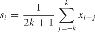
The simplest smoothing algorithm that we can devise is the running, moving, or floating average. The idea is straightforward: for any odd number of consecutive points, replace the centermost value with the average of the other points (here, the {xi} are the data points and the smoothed value at position i is si):
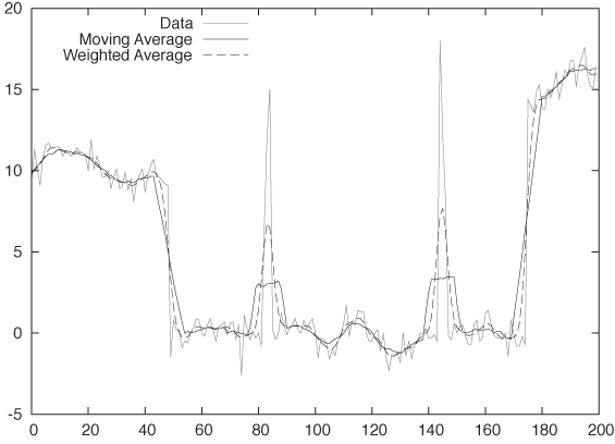
This naive approach has a serious problem, as you can see in Figure 4-6. The figure shows the original signal together with the 11-point moving average. Unfortunately, the signal has some sudden jumps and occasional large “spikes,” and we can see how the smoothed curve is affected by these events: whenever a spike enters the smoothing window, the moving average is abruptly distorted by the single, uncommonly large value until the outlier leaves the smoothing window again—at which point the floating average equally abruptly drops again.
We can avoid this problem by using a weighted moving average, which places less weight on the points at the edge of the smoothing window. Using such a weighted average, any new point that enters the smoothing window is only gradually added to the average and then gradually removed again:
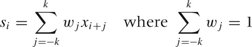
Here the wj are the weighting factors. For example, for a 3-point moving average, we might use (1/4, 1/2, 1/4). The particular choice of weight factors is not very important provided they are peaked at the center, drop toward the edges, and add up to 1. I like to use the Gaussian function:
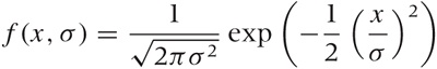
to build smoothing weight factors. The parameter σ in the Gaussian controls the width of the curve, and the function is essentially zero for values of x larger than about 3.5σ. Hence f(x, 1) can be used to build a 9-point kernel by evaluating f(x, 1) at the positions [–4, –3, –2, –1, 0, 1, 2, 3, 4]. Setting σ = 2, we can form a 15-point kernel by evaluating the Gaussian for all integer arguments between –7 and +7. And so on.
Exponential Smoothing
All moving-average schemes have a number of problems.
They are painful to evaluate. For each point, the calculation has to be performed from scratch. It is not possible to evaluate weighted moving averages by updating a previous result.
Moving averages can never be extended to the true edge of the available data set, because of the finite width of the averaging window. This is especially problematic because often it is precisely the behavior at the leading edge of a data set that we are most interested in.
Similarly, moving averages are not defined outside the range of the existing data set. As a consequence, they are of no use in forecasting.
Fortunately, there exists a very simple calculational scheme that avoids all of these problems. It is called exponential smoothing or Holt–Winters method. There are various forms of exponential smoothing: single exponential smoothing for series that have neither trend nor seasonality, double exponential smoothing for series exhibiting a trend but no seasonality, and triple exponential smoothing for series with both trend and seasonality. The term “Holt–Winters method” is sometimes reserved for triple exponential smoothing alone.
All exponential smoothing methods work by updating the result from the previous time step using the new information contained in the data of the current time step. They do so by “mixing” the new information with the old one, and the relative weight of old and new information is controlled by an adjustable mixing parameter. The various methods differ in terms of the number of quantities they track and the corresponding number of mixing parameters.
The recurrence relation for single exponential smoothing is particularly simple:
si = αxi + (1 – α)si – 1 | with 0 ≤ α ≤ 1 |
Here si is the smoothed value at time step i, and xi is the actual (unsmoothed) data at that time step. You can see how si is a mixture of the raw data and the previous smoothed value si–1. The mixing parameter α can be chosen anywhere between 0 and 1, and it controls the balance between new and old information: as α approaches 1, we retain only the current data point (i.e., the series is not smoothed at all); as α approaches 0, we retain only the smoothed past (i.e., the curve is totally flat).
Why is this method called “exponential” smoothing? To see this, simply expand the recurrence relation:
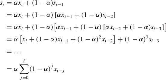
What this shows is that in exponential smoothing, all previous observations contribute to the smoothed value, but their contribution is suppressed by increasing powers of the parameter α. That observations further in the past are suppressed multiplicatively is characteristic of exponential behavior. In a way, exponential smoothing is like a floating average with infinite memory but with exponentially falling weights. (Also observe that the sum of the weights, Σj α(1 – α)j, equals 1 as required by virtue of the geometric series Σi qi = 1/(1 – q) for q < 1. See Appendix B for information on the geometric series.)
The results of the simple exponential smoothing procedure can be extended beyond the end of the data set and thereby used to make a forecast. The forecast is extremely simple:
xi+h = si
where si is the last calculated value. In other words, single exponential smoothing yields a forecast that is absolutely flat for all times.
Single exponential smoothing as just described works well for time series without an overall trend. However, in the presence of an overall trend, the smoothed values tend to lag behind the raw data unless α is chosen to be close to 1; however, in this case the resulting curve is not sufficiently smoothed.
Double exponential smoothing corrects for this shortcoming by retaining explicit information about the trend. In other words, we maintain and update the state of two quantities: the smoothed signal and the smoothed trend. There are two equations and two mixing parameters:
si = αxi + (1 – α)(si–1 + ti–1)
ti = β(si – si–1) + (1 – β)ti–1
Let’s look at the second equation first. This equation describes the smoothed trend. The current unsmoothed “value” of the trend is calculated as the difference between the current and the previous smoothed signal; in other words, the current trend tells us how much the smoothed signal changed in the last step. To form the smoothed trend, we perform a simple exponential smoothing process on the trend, using the mixing parameter β. To obtain the smoothed signal, we perform a similar mixing as before but consider not only the previous smoothed signal but take the trend into account as well. The last term in the first equation is the best guess for the current smoothed signal—assuming we followed the previous trend for a single time step.
To turn this result into a forecast, we take the last smoothed value and, for each additional time step, keep adding the last smoothed trend to it:
xi+h = si + h ti
Finally, for triple exponential smoothing we add yet a third quantity, which describes the seasonality. We have to distinguish between additive and multiplicative seasonality. For the additive case, the equations are:
si | = α(xi – pi–k) + (1 – α)(si–1 + ti–1) |
ti | = β(si – si–1) + (1 – β)ti–1 |
pi | = γ(xi – si) + (1 – γ) pi–k |
xi+h | = si + hti + pi–k+h |
For the multiplicative case, they are:
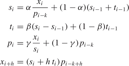
Here, pi is the “periodic” component, and k is the length of the period. I have also included the expressions for forecasts.
All exponential smoothing methods are based on recurrence relations. This means that we need to fix the start-up values in order to use them. Luckily, the specific choice for these values is not very critical: the exponential damping implies that all exponential smoothing methods have a short “memory,” so that after only a few steps, any influence of the initial values is greatly diminished. Some reasonable choices for start-up values are:
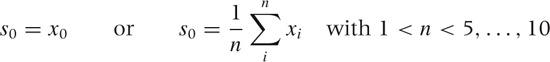
and:
t0 = 0 | or | t0 = x1 – x0 |
For triple exponential smoothing we must provide one full season of values for start-up, but we can simply fill them with 1s (for the multiplicative model) or 0s (for the additive model). Only if the series is short do we need to worry seriously about finding good starting values.
The last question concerns how to choose the mixing parameters α, β, and γ. My advice is trial and error. Try a few values between 0.2 and 0.4 (very roughly), and see what results you get. Alternatively, you can define a measure for the error (between the actual data and the output of the smoothing algorithm), and then use a numerical optimization routine to minimize this error with respect to the parameters. In my experience, this is usually more trouble than it’s worth for at least the following two reasons. The numerical optimization is an iterative process that is not guaranteed to converge, and you may end up spending way too much time coaxing the algorithm to convergence. Furthermore, any such numerical optimization is slave to the expression you have chosen for the “error” to be minimized. The problem is that the parameter values minimizing that error may not have some other property you want to see in your solution (e.g., regarding the balance between the accuracy of the approximation and the smoothness of the resulting curve) so that, in the end, the manual approach often comes out ahead. However, if you have many series to forecast, then it may make sense to expend the effort and build a system that can determine the optimal parameter values automatically, but it probably won’t be easy to really make this work.
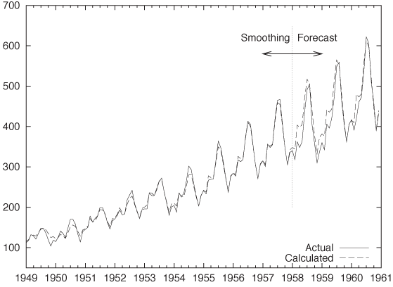
Finally, I want to present an example of the kind of results we can expect from exponential smoothing. Figure 4-7 is a classical data set that shows the monthly number of international airline passengers (in thousands of passengers).[8] The graph shows the actual data together with a triple exponential approximation. The years 1949 through 1957 were used to “train” the algorithm, and the years 1958 through 1960 are forecasted. Note how well the forecast agrees with the actual data—especially in light of the strong seasonal pattern—for a rather long forecasting time frame (three full years!). Not bad for a method as simple as this.
Don’t Overlook the Obvious!
On a recent consulting assignment, I was discussing monthly sales numbers with the client when he made the following comment: “Oh, yes, sales for February are always somewhat lower—that’s an after effect of the Christmas peak.” Sales are always lower in February? How interesting.
Sure enough, if you plotted the monthly sales numbers for the last few years, there was a rather visible dip from the overall trend every February. But in contrast, there wasn’t much of a Christmas spike! (The client’s business was not particularly seasonal.) So why should there be a corresponding dip two months later?
By now I am sure you know the answer already: February is shorter than any of the other months. And it’s not a small effect, either: with 28 days, February is about three days shorter than the other months (which have 30–31 days). That’s about 10 percent—close to the size of the dip in the client’s sales numbers.
When monthly sales numbers were normalized by the number of days in the month, the February dip all but disappeared, and the adjusted February numbers were perfectly in line with the rest of the months. (The average number of days per month is 365/12 = 30.4.)
Whenever you are tracking aggregated numbers in a time series (such as weekly, monthly, or quarterly results), make sure that you have adjusted for possible variation in the aggregation time frame. Besides the numbers of days in the month, another likely candidate for hiccups is the number of business days in a month (for months with five weekends, you can expect a 20 percent drop for most business metrics). But the problem is, of course, much more general and can occur whenever you are reporting aggregate numbers rather than rates. (If the client had been reporting average sales per day for each month, then there would never have been an anomaly.)
This specific problem (i.e., nonadjusted variations in aggregation periods) is a particular concern for all business reports and dashboards. Keep an eye out for it!
The Correlation Function
The autocorrelation function is the primary diagnostic tool for time-series analysis. Whereas the smoothing methods that we have discussed so far deal with the raw data in a very direct way, the correlation function provides us with a rather different view of the same data. I will first explain how the autocorrelation function is calculated and will then discuss what it means and how it can be used.
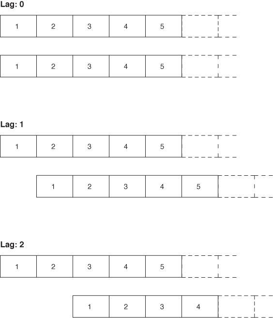
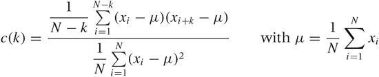
The basic algorithm works as follows: start with two copies of the data set and subtract the overall average from all values. Align the two sets, and multiply the values at corresponding time steps with each other. Sum up the results for all time steps. The result is the (unnormalized) correlation coefficient at lag 0. Now shift the two copies against each other by a single time step. Again multiply and sum: the result is the correlation coefficient at lag 1. Proceed in this way for the entire length of the time series. The set of all correlation coefficients for all lags is the autocorrelation function. Finally, divide all coefficients by the coefficient for lag 0 to normalize the correlation function, so that the coefficient for lag 0 is now equal to 1.
All this can be written compactly in a single formula for c(k)—that is the correlation function at lag k:
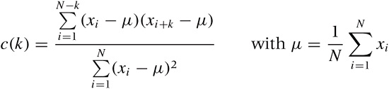
Here, N is the number of points in the data set. The formula follows the mathematical convention to start indexing sequences at 1, rather than the programming convention to start indexing at 0. Notice that we have subtracted the overall average μ from all values and that the denominator is simply the expression of the numerator for lag k = 0. Figure 4-8 illustrates the process.
The meaning of the correlation function should be clear. Initially, the two signals are perfectly aligned and the correlation is 1. Then, as we shift the signals against each other, they slowly move out of phase with each other, and the correlation drops. How quickly it drops tells us how much “memory” there is in the data. If the correlation drops quickly, we know that, after a few steps, the signal has lost all memory of its recent past. However, if the correlation drops slowly, then we know that we are dealing with a process that is relatively steady over longer periods of time. It is also possible that the correlation function first drops and then rises again to form a second (and possibly a third, or fourth,...) peak. This tells us that the two signals align again if we shift them far enough—in other words, that there is periodicity (i.e., seasonality) in the data set. The position of the secondary peak gives us the number of time steps per season.
Examples
Let’s look at a couple of examples. Figure 4-9 shows the correlation function of the gas furnace data in Figure 4-2. This is a fairly typical correlation function for a time series that has only short time correlations: the correlation falls quickly, but not immediately, to zero. There is no periodicity; after the initial drop, the correlation function does not exhibit any further significant peaks.
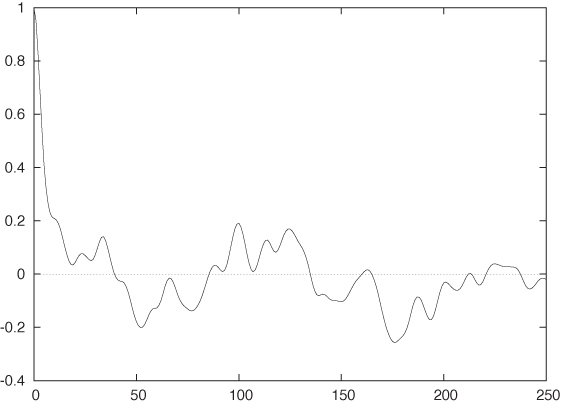
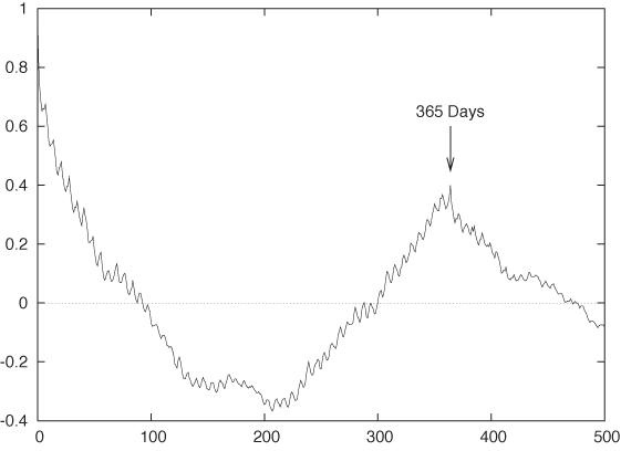
Figure 4-10 is the correlation function for the call center data from Figure 4-5. This data set shows a very different behavior. First of all, the time series has a much longer “memory”: it takes the correlation function almost 100 days to fall to zero, indicating that the frequency of calls to the call center changes more or less once per quarter but not more frequently. The second notable feature is the pronounced secondary peak at a lag of 365 days. In other words, the call center data is highly seasonal and repeats itself on a yearly basis. The third feature is the small but regular sawtooth structure. If we look closely, we will find that the first peak of the sawtooth is at a lag of 7 days and that all repeating ones occur at multiples of 7. This is the signature of the high-frequency component that we could see in Figure 4-5: the traffic to the call center exhibits a secondary seasonal component with 7-day periodicity. In other words, traffic is weekday dependent (which is not too surprising).
Implementation Issues
So far I have talked about the correlation function mostly from a conceptual point of view. If we want to proceed to an actual implementation, there are some fine points we need to worry about.
The autocorrelation function is intended for time series that do not exhibit a trend and have zero mean. Therefore, if the series we want to analyze does contain a trend, then we must remove it first. There are two ways to do this: we can either subtract the trend or we can difference the series.
Subtracting the trend is straightforward—the only problem is that we need to determine the trend first! Sometimes we may have a “model” for the expected behavior and can use it to construct an explicit expression for the trend. For instance, the airline passenger data from the previous section, describes a growth process, and so we should suspect an exponential trend (a exp(x/b)). We can now try guessing values for the two parameters and then subtract the exponential term from the data. For other data sets, we might try a linear or power-law trend, depending on the data set and our understanding of the process generating the data. Alternatively, we might first apply a smoothing algorithm to the data and then subtract the result of the smoothing process from the raw data. The result will be the trend-free “noise” component of the time series.
A different approach consists of differencing the series: instead of dealing with the raw data, we instead work with the changes in the data from one time step to the next. Technically, this means replacing the original series xi with one consisting of the differences of consecutive elements: xi+1 – xi. This process can be repeated if necessary, but in most cases, single differencing is sufficient to remove the trend entirely.
Making sure that the time series has zero mean is easier: simply calculate the mean of the (de-trended!) series and subtract it before calculating the correlation function. This is done explicitly in the formula for the correlation function given earlier.
Another technical wrinkle concerns how we implement the sum in the formula for the numerator. As written, this sum is slightly messy, because its upper limit depends on the lag. We can simplify the formula by padding one of the data sets with N zeros on the right and letting the sum run from i = 1 to i = N for all lags. In fact, many computational software packages assume that the data has been prepared in this way (see the Workshop section in this chapter).
The last issue you should be aware of is that there are two different normalization conventions for the autocorrelation function, which are both widely used. In the first variant, numerator and denominator are not normalized separately—this is the scheme used in the previous formula. In the second variant, the numerator and denominator are each normalized by the number of nonzero terms in their respective sum. With this convention, the formula becomes:
Both conventions are fine, but if you want to compare results from different sources or different software packages, then you will have to make sure you know which convention each of them is following!
Optional: Filters and Convolutions
Until now we have always spoken of time series in a direct fashion, but there is also a way to describe them (and the operations performed on them) on a much higher level of abstraction. For this, we borrow some concepts and terminology from electrical engineering, specifically from the field of digital signal processing (DSP).
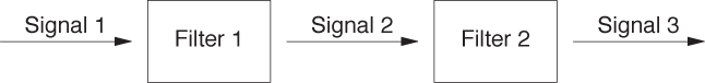
In the lingo of DSP, we deal with signals (time series) and filters (operations). Applying a filter to a signal produces a new (filtered) signal. Since filters can be applied to any signal, we can apply another filter to the output of the first and in this way chain filters together (see Figure 4-11). Signals can also be combined and subtracted from each other.
As it turns out, many of the operations we have seen so far (smoothing, differencing) can be expressed as filters. We can therefore use the convenient high-level language of DSP when referring to the processes of time-series analysis. To make this concrete, we need to understand how a filter is represented and what it means to “apply” a filter to a signal.
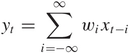
Each digital filter is represented by a set of coefficients or weights. To apply the filter, we multiply the coefficients with a subset of the signal. The sum of the products is the value of the resulting (filtered) signal:
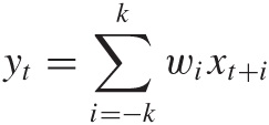
This should look familiar! We used a similar expression when talking about moving averages earlier in the chapter. A moving average is simply a time series run through an n-point filter, where every coefficient is equal to 1/n. A weighted moving average filter similarly consists of the weights used in the expression for the average.
The filter concept is not limited to smoothing operations. The differencing step discussed in the previous section can be viewed as the application of the filter [1, –1]. We can even shift an entire time series forward in time by using the filter [0, 1].
The last piece of terminology that we will need concerns the peculiar sum of a product that we have encountered several times by now. It’s called a convolution. A convolution is a way to combine two sequences to yield a third sequence, which you can think of as the “overlap” between the original sequences. The convolution operation is usually defined as follows:
Symbolically, the convolution operation is often expressed through an asterisk: y = w * x, where y, w, and x are sequences.
Of course, if one or both of the sequences have only a finite number of elements, then the sum also contains only a finite number of terms and therefore poses no difficulties. You should be able to convince yourself that every application of a filter to a time series that we have done was in fact a convolution of the signal with the filter. This is true in general: applying a filter to a signal means forming the convolution of the two. You will find that many numerical software packages provide a convolution operation as a built-in function, making filter operations particularly convenient to use.
I must warn you, however, that the entire machinery of digital signal processing is geared toward signals of infinite (or almost infinite) length, which makes good sense for typical electrical signals (such as the output from a microphone or a radio receiver). But for the rather short time series that we are likely to deal with, we need to pay close attention to a variety of edge effects. For example, if we apply a smoothing or differencing filter, then the resulting series will be shorter, by half the filter length, than the original series. If we now want to subtract the smoothed from the original signal, the operation will fail because the two signals are not of equal length. We therefore must either pad the smoothed signal or truncate the original one. The constant need to worry about padding and proper alignment detracts significantly from the conceptual beauty of the signal-theoretic approach when used with time series of relatively short duration.
Workshop: scipy.signal
The scipy.signal package
provides functions and operations for digital signal processing that
we can use to good effect to perform calculations for time-series
analysis. The scipy.signal package
makes use of the signal processing terminology introduced in the
previous section.
The listing that follows shows all the commands used to create graphs like Figure 4-5 and Figure 4-10, including the commands required to write the results to file. The code is heavily commented and should be easy to understand.
from scipy import *
from scipy.signal import *
from matplotlib.pyplot import *

filename = 'callcenter'


# Read data from a text file, retaining only the third column.
# (Column indexes start at 0.)
# The default delimiter is any whitespace.
data = loadtxt( filename, comments='#', delimiter=None, usecols=(2,) )

# The number of points in the time series. We will need it later.
n = data.shape[0]

# Finding a smoothed version of the time series:
# 1) Construct a 31-point Gaussian filter with standard deviation = 4
filt = gaussian( 31, 4 )
# 2) Normalize the filter through dividing by the sum of its elements
filt /= sum( filt )
# 3) Pad data on both sides with half the filter length of the last value
#    (The function ones(k) returns a vector of length k, with all elements 1.)
padded = concatenate( (data[0]*ones(31//2), data, data[n-1]*ones(31//2)) )
# 4) Convolve the data with the filter. See text for the meaning of "mode".
smooth = convolve( padded, filt, mode='valid' )

# Plot the raw data together with the smoothed data:
# 1) Create a figure, sized to 7x5 inches
figure( 1, figsize=( 7, 5 ) )
# 2) Plot the raw data in red
plot( data, 'r' )
# 3) Plot the smoothed data in blue
plot( smooth, 'b' )
# 4) Save the figure to file
savefig( filename + "_smooth.png" )
# 5) Clear the figure
clf()

# Calculate the autocorrelation function:
# 1) Subtract the mean
tmp = data - mean(data)
# 2) Pad one copy of data on the right with zeros, then form correlation fct
#    The function zeros_like(v) creates a vector with the same dimensions
#    as the input vector v but with all elements zero.
corr = correlate( tmp, concatenate( (tmp, zeros_like(tmp)) ), mode='valid' )
# 3) Retain only some of the elements
corr = corr[:500]
# 4) Normalize by dividing by the first element
corr /= corr[0]


# Plot the correlation function:
figure( 2, figsize=( 7, 5 ) )
plot( corr )
savefig( filename + "_corr.png" )
clf()
The package provides the Gaussian filter as well as many others. The filters are not normalized, but this is easy enough to accomplish.
More attention needs to be paid to the appropriate padding and
truncating. For example, when forming the smoothed version of the
data, I pad the data on both sides by half the filter length to ensure
that the smoothed data has the same length as the original set. The
mode argument to the convolve() and correlate functions determines which pieces
of the resulting vector to retain. Several modes are possible. With
mode="same", the returned vector
has as many elements as the largest input vector (in our case, as the
padded data vector), but the elements closest to the ends would be
corrupted by the padded values. In the listing, I therefore use
mode="valid", which retains only
those elements that have full overlap between the data and the
filter—in effect, removing the elements added in the padding
step.
Notice how the signal processing machinery leads in this application to very compact code. Once you strip out the comments and plotting commands, there are only about 10 lines of code that perform actual operations and calculations. However, we had to pad all data carefully and ensure that we kept only those pieces of the result that were least contaminated by the padding.
Further Reading
The Analysis of Time Series. Chris Chatfield. 6th ed., Chapman & Hall. 2003.
This is my preferred text on time-series analysis. It combines a thoroughly practical approach with mathematical depth and a healthy preference for the simple over the obscure. Highly recommended.
[8] This data is available in the “airpass.dat” data set from R. J. Hyndman’s Time Series Data Library at http://www.robjhyndman.com/TSDL.
Get Data Analysis with Open Source Tools now with the O’Reilly learning platform.
O’Reilly members experience books, live events, courses curated by job role, and more from O’Reilly and nearly 200 top publishers.

