Your audience will not see the code behind your website. They will see the user interface to your application through the web pages on your site. The goal of this chapter is to help you understand the difference between the visual approach to creating a web page and the visual approach to building a web application.
Before we explore how application design is changing, let me make an admission first: I’m not a visual designer. I can pick colors for the interior design of my house, but I know the final visual look of a website is best left to others. I know typography, copy, whitespace, and layout are critical to the understanding and emotional appeal of a website, but this book won’t tell you how to create fantastic visual designs for the Web. For that, see Transcending CSS by Andy Clarke (New Riders Press) or CSS Mastery by Andy Budd (Friends of Ed).
Note
Jesse James Garrett distinguishes the code and the visual elements as the skeleton and surface planes in his book, The Elements of User Experience (Peachpit Press).
Instead, I will examine the uppermost layers of a web application and how they interact with the underlying code. So, I’ll be talking about the HTML, JavaScript, and CSS that get delivered to the browser your reader is using, as opposed to the code that gets executed on your web server. This chapter serves as the introduction to Chapter 7, where we’ll look more closely at what is actually going to happen in your application. This chapter is more about why visual design is important than how to implement good visual design.
The user interface for a community website is not the same as the user interface for a desktop application, and it performs more complex tasks than simple web pages. Nevertheless, web design lacks the tools that are required to create the sophisticated and consistent user interfaces we see in desktop applications. There are no NetBeans, Microsoft Visual Studio, or Apple Interface Builder-like tools that provide a simple graphical user interface builder for web applications. Dreamweaver filled this role for creating websites built from static pages, but web applications are more complicated than that.
This in-between application space has evolved from the ability to
reload only part of a web page. Reloading only part of a page speeds up
website interaction; there is less to (re)download, and usually it means
fewer pages to navigate to achieve the same result. In-place editing has
become a popular approach for maintaining content, such as profile
pages, as opposed to going to a separate edit page. Google’s Gmail popularized the use of the XMLHttpRequest
JavaScript object, which lets you update only the parts of a web page
that change instead of reloading the entire page. XMLHttpRequest was originally built into
Microsoft Internet Explorer to support Outlook Web Access 2000, but then it was implemented
in Mozilla 1.0 in 2002; today, it is available in Safari, Firefox, and other browsers.
Note
In his essay, “Ajax: A New Approach to Web Applications” (http://www.adaptivepath.com/ideas/essays/archives/000385.php),
Jesse James Garrett introduced the term Ajax to
describe the combined use of XMLHttpRequest with other technologies
to create a better web experience.
Partial page reloads mean your interactions move from being based on pages to being based on the main element the page is about: for instance, the photograph, scientific paper, or song. This shift moves the design relationship away from pages and toward data, elements, and templates. This means that rethinking how design is practiced and identifying elements that can be recombined, as opposed to whole pages, is a better approach.
Traditionally, web design looked at entire pages and focused heavily on the content and visual look of the site’s home page. Thanks to Google and other search engines, visitors to your site are much more likely to arrive on an internal page. People are also much more likely to link to an internal page. Again, the focus moves to the elements that become recombined with other content—in this case, the content provided by your community. It is arguably a harder design challenge to generate elements that can be recombined than to generate whole pages at a time.
The visual look of a site changes when it is built from templates with community-generated content and a more flowing style of interaction. Small numbers of pages designed with a more illustrated or handcrafted look give way to a lighter, less graphical layout that relies much more on CSS and icons than on single page designs with large graphical elements. The choice between a fluid or stretchy page layout versus a fixed-width design remains. A fixed layout with flexible internal sections is a popular choice for web application development, while setting a maximum width means that special coherency between elements can be maintained.
The unpredictability of the actual content to be displayed within templates means that these page layouts need to be more accommodating than typical static pages. Each page in a web application tends to be the result of someone’s interaction with the site or be filled with content that your community creates. The majority of pages on a site will be for public display, but a site can also include a range of private pages for content upload and account management. Anything that is generated uniquely for a person is usually a private page. Such pages can have a different design treatment. A good example is the Flickr Organizr, which feels more like an application than a set of publicly viewable web pages.
These newer types of websites offer visitors the chance to do something. Often, a person can do several things on a page, and can get to a page from several different paths. To make sense of this, what becomes relevant are the people, the objects in the content, the actions, and the connections between them. On a page about a music track, for example, the tags might relate to the actual track, whereas on a page about the artist, they will relate to the artist and her entire body of work. The ability to comment means nothing unless it is clear what is being commented on. Identifying who owns or created something gives a lot of clarity to a page. The music track on an album page means one thing; the same track appearing on my own listening page means something different.
Finally, the idea of a page having a fixed position in a hierarchy also becomes less relevant. There is no longer a single contents page and a set order for exploring the site. Any route through the site can make sense, and most journeys will not start at the site’s home page. In Chapter 13, we’ll examine the kinds of navigation that are required to support browsing and discovery in social web applications.
The reams of heavy graphical designs from previous years, which looked more like illustrations from a book than web pages, are largely in the past, though some of these applications, such as Fire Eagle, do have beautiful artwork. Today, social web applications tend to have minimal designs that let the content contributed by the community shine through. Figures 4-1 through 4-4 show some well-thought-out, well-designed social sites.

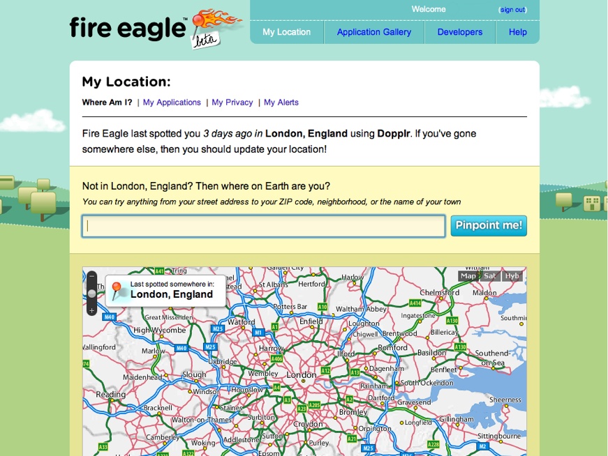
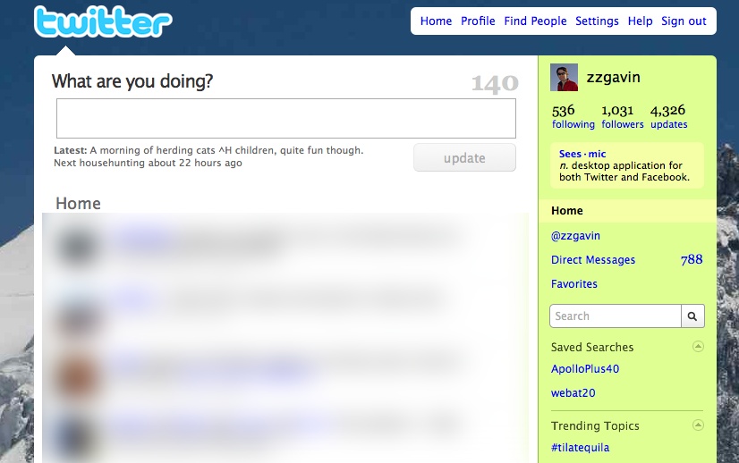
Figure 4-3. Twitter showing its pared-down visual look; messages from other people have been made anonymous (I provided the snowy mountain image in the background)
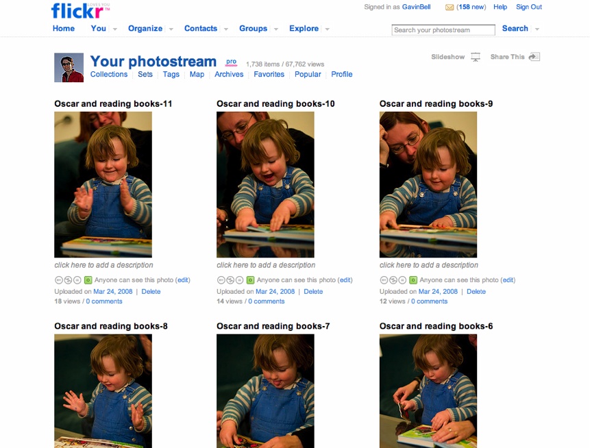
Figure 4-4. Flickr, which lets the photographs shine, keeping the page furniture minimal and out of the way
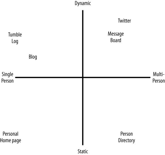
The shift from static to dynamic pages has impacted the work of the visual designer. Figure 4-5 shows this shift.
Depending on the type of application you are making, the amount of dynamic behavior that your site can express will vary. The more people that use your site in a social manner, the more likely it is to behave more like an application and less like a document-based website.
A social network is the most application-like of these examples. In these social communities, the entry points are generally internal pages—often a person’s profile page—and the navigation flows from the content on the page rather than from any sort of hierarchy. However, such pages often include directions to the main centers of activity, as shown in Figures 4-6 and 4-7.
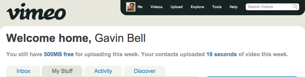
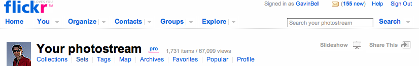
Figure 4-7. The main navigation elements from Flickr; these are enough for you to start exploring the site
The main navigation of a site should include four to five key elements at most. These should focus on the site’s primary objects: people, groups of people, and the content, usually emphasizing recent and relevant activity. The Flickr example shown in Figure 4-7 actually shows two levels of navigation: the main navigation elements, as well as the navigation for my photostream. The navigation elements on a site will change as the site grows and new functionality is added. For instance, the Map link on the Flickr site is a recent addition.
The Nature Network website, shown in Figure 4-8, has three levels of navigation. Nature Network is the social application that supports Nature.com, a science journal.[11] The left side of the page has two main links: one to the Nature.com home page and the other to the Nature Network home page via the logo.
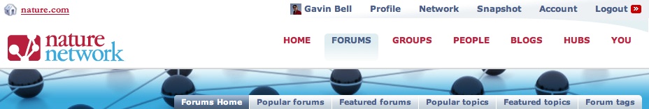
On the right side of the figure, there are three levels of navigation. The topmost level is a common form of navigation that appears on other sites across Nature.com, and it provides a common reference for the social activities on Nature.com. For instance, Profile shows you your own profile page, Network shows you your list of friends, Snapshot gives you updates from everyone in your network, and Account takes you to your Nature.com account admin page.
The next level down is the Nature Network sitewide navigation showing each main content area, as well as a page to get to the private activity pages, labeled “You.” Each of these sections has a submenu with specific options for that area. We decided not to use drop-down menus, so all navigation options are always visible.
This type of navigation represents a common compromise: how to provide navigation that shows off the functionality of a site for newcomers, how to show the relevant view of a site for a specific person, and how to represent the parent company, in this case Nature.com. The topmost menu allows Nature Network to act as a coordinating influence across other sites and brings all the social activity together.
Note
The Smashing Magazine website provides many more examples of navigation menus: http://www.smashingmagazine.com/2008/02/26/navigation-menus-trends-and-examples/.
The focus is not on the pages per se, but on the people and the content on those pages. The navigation is spurred by the relationships between the content and the people who created it. This is a different way of thinking about site design. Jyri Engeström of Jaiku coined the term social object to describe something with which people have a relationship, be it a football team, a photograph on Flickr, or a scientific paper. You can have all the social elements in place and have modeled the relationship perfectly, but if the site is unappealing, confusing, or hard to use, people will fail to engage and drift away.
Creating and using affordances helps to link activity to content. An affordance is something that is manifested in the object—for instance, a door affords walking through, a window affords opening, and a cup affords holding. The term comes from James J. Gibson[12] and his theories on visual perception. It works well in terms of social application design. Creating simple, obvious prompts for action gives people clear cues regarding what it is possible to do on a page. The ability to add a comment and to clearly show what is being commented on is one example. In terms of navigation, placing elements so that they can be used as navigational tools works well, particularly for tags.
The core object page should have a clear purpose: to link to the creator and his content, and to provide a means for social interaction around that content.
A usability study found that people make up their minds about a site in seconds.[13] They don’t take time to read the detailed copy before judging your site. They look for the next actions they can take, based on a quick, visual survey of the page. Good visual design is essential for making sites that people want to use.
The warmth and emotional context of a site come from the visual design. How you choose to portray your content, your use of whitespace and color, and your choice of typography all communicate what your site is about. Changing the color palette and typography can radically change the mood of your site. Visual designers are the people who will create this at-a-glance communication.
There are several different types of pages to design for in a web application. The most obvious is the home page. On the home page, you want to summarize the purpose and attraction of your site. There are commonly two versions of a home page: one for people who have logged in and one for people who are just visiting (see Chapter 13). A lot of undue attention gets focused on the home page—it is an important page, just not the most important page. A home page for people who are not logged in acts as an advertisement, showing off the functionality and content of your site. An important aim is to get people to sign up for your site. In Chapter 18, I’ll show several examples of home pages to help you decide which one might be right for your product.
The most important types of pages are those that represent a person to the rest of the site and those that host the her content. There will be tens of thousands of each of these pages on your site, and they will make up the bulk of your traffic. Spend time on these pages and iterate them gradually. These are the pages your members will regard as their own.
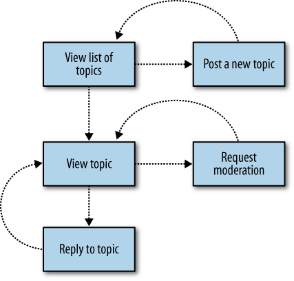
There are also two additional groups of pages. The static pages contain your help text, guidelines, API notes, and terms of service; the actual application pages are the forms-based pages that drive your site. The static pages are easy to deal with. Many resources are available to help you design flat pages of content. From a design point of view, the application pages are the most difficult to get right. These pages are tied to the code base once you have launched, and they have multiple paths and error states. A thumbnail flowchart is very helpful in documenting the flow of application pages (see Figure 4-9). Quick pencil sketches of each page can indicate which pages will need a full design and which can be created from a combination of elements. Chapter 7 explores the benefits of lightweight prototypes versus full graphical mockups.
Forms in HTML can be difficult to do well, particularly when adding elements or explanatory text between form elements. It is worth having face-to-face discussions with the frontend developer, visual designer, and product owner before settling on a layout. In particular, be sure to explore the cost of changing or adding elements to a design.
The Amazon payment process is a good example of a complex forms-based application. It has changed quite a lot over the past five years, and it alters its behavior depending on whether you have ordered something from the site in the past. Several years ago, the Amazon site would always take you through all five stages of the order process. Now it will note your preferences from previous purchases and will give you the option to alter any detail from an order confirmation page. This reduces the number of pages you need to navigate from five to two or three, in most cases.
Search is also an area that can become complex very quickly. Many people adhere to the idea that a good search interface is one with many fields and buttons. Clever choice of default fields to search can simplify this radically. Chapters 7 and 16 explore search in more depth.
Designers who can write valid HTML and CSS are preferable, but first and foremost they need to be good visual designers. Designers inhabit a complex world. They need to wrangle with color, space, and typography, but they also need to design for applications. Ideally, your designer will be able to produce HTML and CSS pages rather than Photoshop JPEGs, but if not, he must at least understand how his design can be implemented in CSS across the main browsers. If he produces visual designs that require your frontend developer to spend days writing CSS, the product lead needs to assess the resulting complexity, which can be difficult or impossible to implement in CSS across all browsers. The frontend developer will have enough work ensuring browser compatibility across CSS and JavaScript. Note that some frontend people do just want the Photoshop file, but that does not obviate your designer from thinking about the CSS implementation as well.
Different teams work in different ways. The web application company 37signals focuses on team collaboration tools and espouses a strong stance of getting the visual design done first and the code done second. Apple uses a similar approach (see the sidebar ). However, these approaches can often be the wrong place to start. We all have preconceived ideas of what makes something work visually, so we can get stuck debating color and font choice before we have worked out what the site should be doing. If your team has not agreed on the basic functionality of your site, you may end up debating surface issues and not understanding the underlying problem you are attempting to solve for your readers.
The 37signals and Apple approaches work for different reasons. In the 37signals case, with its “No Functional Spec” (http://www.37signals.com/svn/archives/001050.php) and “Interface First” (http://gettingreal.37signals.com/ch09_Interface_First.php) articles, it is easy to miss that the site is about the user experience, not the visual design. A preferable approach is one that avoids documenting human behavior, and instead focuses on creating experiences for humans to assess. Make something that is functional, not a (non)functional spec, to paraphrase the Apple and 37signals philosophies. This is a good idea, but first you need to get to the place where you know what you are attempting to build. In Chapter 7, I will introduce you to the service functionality diagram, which is a one-page document that you can use to get a basic understanding of what the new feature or service should be doing.
At Apple, these are mainly internal discussions. The company rarely uses focus groups or consultants, so the process it uses is exploratory, looking at different ways to implement high-level functionality. The Photoshop files resulting from Apple’s 10-3-1 model are both the functional spec and the interface.
Design-led approaches might well work for your company. They can certainly give you a quicker sense of what the application might feel like compared to the more traditional approaches.
If an interface reveals that the backend solution is lacking after the specification has been written and developed against and the interface has been polished, it can be expensive to fix. Developing the backend solution first often leads to a very data-centric view of the world, in which the user interface is there to provide the controls to the database. The person using the site is not the primary focus of the site. The users should be driving the application, not making decisions based on the need to fulfill parameters for a database function call.
A halfway house in design terms is often the wireframe. Wireframes present a complex mix of the content, layout, and functionality of a page. They give a sense of what will be on the page, but fall short of specifying an actual design. Capturing the content and functionality is important. Capturing the positional layout can constrain the visual designer in terms of how he might choose to position the elements.
Wireframes can also be as detailed as a full design, and as a result they can be time-consuming to produce. The page description diagram discussed in Chapter 7 allows non-design staff members to communicate what the page needs to do and say without resorting to wireframes. Lastly, wireframes are often produced by non-designers, so they tend to replicate existing designs or cram extra functionality onto the same page.
Wireframes fall between two positions: they are not as detailed as a visual design, nor are they functionally useful. If you feel you must use them, treat them as low-fidelity designs to be disposed of before launch. A mocked-up prototype is often a better choice.
Sketching on paper or whiteboard is a final way of working to figure out the high-level structure of your site’s design. This approach holds to the same principle as the design first approaches. You want to understand the problem quickly and not build something ill-founded and expensive. Writing code is costly, inflexible, and time-consuming. Sketching out the basic interface on paper, then sharing it and amending it face to face with designers, developers, and product management is a rapid way to explore prototypes. I have used this approach a lot, and it acts as a good replacement for informal wireframing, but you can miss important details with this approach, as it is rarely based on real examples. I would recommend it as a first approach to determining the flow of interaction in your application.
When doing design work, it is important to use real example copy. If you encourage the use of “Lorem ipsum” as a stand-in for real copy, you can miss details regarding how real people will interact with your site. This is also true if you repeat the same piece of real copy throughout the site. Make sure the product or editorial people on your team supply the designers with plenty of well-thought-out sample copy. This process will also help the product people solve potentially hidden problems. Generating this sample copy prompts the answering of many issues related to sourcing the content or understanding the roles involved in managing an item of content. An example might be a designer being supplied with dates for events—one case might have a range spanning many months, whereas another might have only a few weeks. The different time ranges will suggest different product and design solutions. Only when you get real sample data will you know which date range is going to be the common case. This upfront preparatory work will create a better product. The same is true in software testing, as we will see in Chapter 16.
As first mentioned in Chapter 3, the copy (descriptive and functional text) on your site matters, too. Getting the language right is critical, but too often it is left to the designer or the developer to sort out the details. What you label things matters to the user, which, by the way, is a dreadful word, but (so runs the joke) is commonplace in software and drug dealing. I have tried to avoid the word user in this book as much as possible. It is easy to make similar mistakes in the copy for your site. For some good examples, look at the language used on the sites referenced in this chapter.
Copywriting, interface design, and software development run hand in hand, but come from different people. Agreeing on the right language is important, and deciding on the copy often helps you understand the problem at a more fundamental level. It can make sense to agree on the copy before or in parallel with the detailed design work. Depending on the size of the site you are working on, you might have a single person whose role is to write the copy, or you might have a team working on it. Finally, all the copy on your site needs to be written from the point of view of a person using it. Therefore, explain and explain again. Make the language simple and clear, not gimmick-laden or too cute. From the main pages to all the help and recovery pages, it is important to get the copy right.
Note
37signals has an excellent book, Defensive Design for the Web (Peachpit Press), that you might find useful when writing copy.
A good visual design for your website will help you to clearly communicate what your site is about. Web application design shifts the task to making templates that respond dynamically to what people on your site are doing. Hiring good visual designers who understand how their designs will be implemented makes the design work easier.
Understanding what you are going to build and then starting with a full visual user interface or a solid prototype is generally the fastest way to deploy a site. Save writing the code until you understand what you are making and how it will be used. Lastly, make sure you have your site’s audience firmly in mind; think about the site from their perspective and use language and examples from their lives.
[11] Nature Network is the social community brand from Nature, the science journal. I created some of the interaction design for social software for Nature, in particular the navigational elements in Figure 4-8.
Get Building Social Web Applications now with the O’Reilly learning platform.
O’Reilly members experience books, live events, courses curated by job role, and more from O’Reilly and nearly 200 top publishers.

