Chapter 5. Mapping Information: Redesigning the New York City Subway Map
as told to Julie Steele
MAPS ARE ONE OF THE MOST BASIC DATA VISUALIZATIONS THAT WE HAVE; we've been making them for millennia. But we still haven't perfected them as a tool for understanding complex systems—and with 26 lines and 468 stations across five boroughs, the New York City subway system certainly is complex. The KickMap™ is the result of my quest to design a more effective subway map, and ultimately to encourage increased ridership.
The Need for a Better Tool
I was born in Queens and raised in Brooklyn. The first subway map I saw was my father's, circa 1960. It made a vivid impression on me because it intimidated me. I saw a gray New York with red, green, and black lines running all over it like a grid (see Figure 5-1), and hundreds of station names attached.[29] It reminded me of a complex electrical diagram that I couldn't understand; it looked very "adult-serious" and even a little scary. I hoped I'd never have to deal with it.
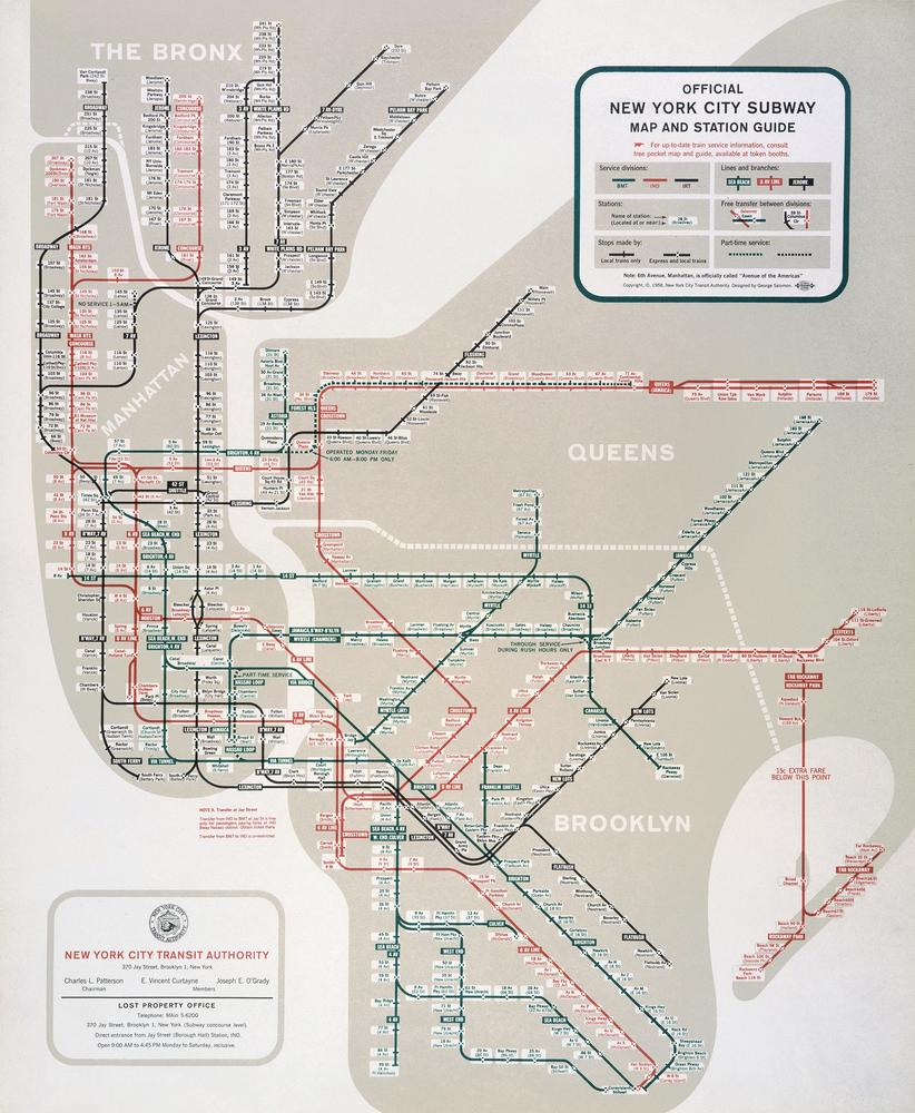
Figure 5-1. The 1958 New York City Subway map designed by George Salomon. 1958 New York City Subway Map © MTA New York City Transit. Used with permission.
London Calling
In college I majored in design, and I spent half a year studying at the University of London. I was all on my own in a huge city I had never been to before. I quickly learned that the London Underground ...
Get Beautiful Visualization now with the O’Reilly learning platform.
O’Reilly members experience books, live events, courses curated by job role, and more from O’Reilly and nearly 200 top publishers.

