Age, Attractiveness, and Gender
We want to zoom in on interactions of some of the most interesting perceived attributes: age, gender, and attractiveness. Whenever we have a table with a few interesting columns, it's straightforward and often informative to throw it up as a scatterplot (see Figure 17-5):
Draw a scatterplot of age vs. attractiveness,   > plot(d$age, d$attractive,
using gender to define the points' colors.          col = ifelse(d$male, 'blue', 'deeppink'))
This plot is suggestive; for example, women seem to be more attractive than men. But it's hard to tell anything for sure, since tens of thousands of points are being drawn over one another. When there is an overload of data, scatterplots can be misleading. One way to deal with this is to smooth the data, by plotting an estimated distribution rather than the points themselves (see Figure 17-6). We use a standard technique called kernel density estimation:
Lay out side-by-side plots.   > par(mfrow=c(1,2))
For males and females,        > dm = d[d$male,];  df = d[d$female,]
draw smoothed plots,          > smoothScatter(df$age, df$attractive,
with a color gradient,            colramp = colorRampPalette(c("white", "deeppink")),
and aligned axes.                 ylim=c(0,4))
                              > smoothScatter(dm$age, dm$attractive,
                                  colramp = colorRampPalette(c("white", "blue")),
                                  ylim=c(0,4))
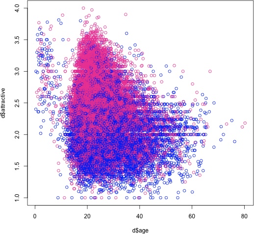
Figure 17-5. Scatterplot of attractiveness versus age, colored by gender. (See Color Plate 59.)
Figure 17-6. Smoothed ...
Get Beautiful Data now with the O’Reilly learning platform.
O’Reilly members experience books, live events, courses curated by job role, and more from O’Reilly and nearly 200 top publishers.

