
Professor Shenbop is now ready to greet his students with his ap-
parently terrifying music quiz; the fi nal art is shown in Figure 4-41.
Note that these techniques work for any path, not only simple arcs—
you could just as easily wrap text around spirals or polygons. Now
that you’ve completed your break with the academic frog, it’s time
to return to the land of sock poetry for the fi nal exercise in this les-
son. Save or discard your fi le as you like.
Advanced Formatting, OpenType
Fonts, and Special Characters
In this last exercise, I’ll show you some advanced type formatting,
including area type options and the Adobe line composers, Open-
Figure 4-40 .
Gravity
1
9
7
0
’
s
P
o
p
M
u
s
i
c
Q
u
i
z
Stair Step
1
9
7
0
’
s
P
o
p
M
u
s
i
c
Q
u
i
z
3D Ribbon
1
9
7
0
’
s
P
o
p
M
u
s
i
c
Q
u
i
z
Skew
1
9
7
0
’
s
P
o
p
M
u
s
i
c
Q
u
i
z
Rainbow
1
9
7
0
’
s
P
o
p
M
u
s
i
c
Q
u
i
z
P
r
o
f
e
s
s
o
r
S
h
e
n
b
o
p
’
s
1
9
7
0
’
s
P
o
p
M
u
s
i
c
Q
u
i
z
It’s Much, Much Scarier
It’s Not Disco.
Figure 4-41 .
129
Advanced Formatting, OpenType Fonts, and Special Characters
Type features, and a myriad of special characters and how to access
them. This time, you’ll be working on a full version of the “That
Sock” poem and focusing exclusively on advanced type features.
1.
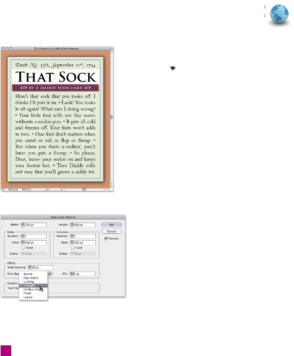
Open the full poem artwork. Open the fi le Full poem.ai
located inside the Lesson 04 folder. The document
should look like that pictured in Figure 4-42.
2. Examine the document layers. Bring up the Layers panel by
pressing F7. This document has three layers: Background, Final
Text, and Raw Text. Final Text shows what the text should
look like at the end of this exercise; hide the Final Text layer
by clicking the
icon next to the layer name. Next, turn on
the Raw Text layer; we’ll be working with this text.
3.
Select the text frame. Using the black arrow tool, select the main
text frame by clicking a line of type. Note that the text block is
the same size as the artboard; the edges of the bounding box
have been snapped to the artboard. This ensures that the text
is aligned, but leaves no margin around the text—something
we can remedy in the next step.
4. Update the area type options. Choose Type➝Area Type Op-
tions to bring up the Area Type Options dialog box, shown in
Figure 4-43. This dialog box allows you to specify the size of
the text block, as well as the number of rows and columns—
but for now we’ll focus on the Offset options.
Figure 4-42 .
Figure 4-43 .
•
First, make sure the Preview box is checked. Next,
change the Inset Spacing value to 30 pt. This brings
all the margins—top, left, right, and bottom—in by
30 points.
•
Next, change the First Baseline pop-up value to x
Height, allowing the fi rst line to fl oat up slightly out-
side the margin and vertically align the rest of the text.
With each change, you’ll see your document update. After
you’ve made the changes, click OK to accept them. Your text
should now look like that in Figure 4-44 on the facing page.
5.
Justify all the lines of the type. That small change has
made a big difference, but the alignment of the type is
still all wrong. Bring up the Paragraph panel either from
the control panel or by pressing Ctrl+Alt+T (-Option-
T), and select the last of the alignment icons, as shown in
130
Lesson 4: Creating and Formatting Text
Get Adobe Illustrator CS5 One-on-One now with the O’Reilly learning platform.
O’Reilly members experience books, live events, courses curated by job role, and more from O’Reilly and nearly 200 top publishers.

